مرحبًا بك في قسم أعلى الخطوط — حيث تلتقي الشعبية بالجودة. هذه هي الخطوط الأكثر تنزيلًا واستخدامًا هذا العام من قبل مجتمعنا. إذا كنت بحاجة إلى اختيار موثوق للشعارات أو الويب أو وسائل التواصل، فابدأ من هنا.
يتميز كل خط رائج بتوازن جيد وقابلية قراءة وتعدد استخدامات. ستجد سان سيريف حديثة، وسكريبتات أنيقة، وسيريف كلاسيكية، وخطوط عرض minimal مختارة بعناية.
-
( Copyright 2016 The Saira Project Authors (omnibus.type@gmail.com), with reserved font name "Saira". )
A clean, modern, semi-condensed font with consistent stroke thickness and balanced spacing.
 تنزيل 531 التنزيلات@WebFont
 -
( Fonts by K_IN Studio )
A bold, handwritten-style font with dynamic, slanted characters and high contrast.
![SlimSummerRegular تنزيل الخطوط]() تنزيل 531 التنزيلات@WebFont
تنزيل 531 التنزيلات@WebFont -
( Fonts by Mans Greback - Personal-use only. For commercial use please contact owner. )
A bold, playful font with thick strokes and a whimsical design.
![Kurri Island Caps PERSONAL Bold تنزيل الخطوط]() تنزيل 531 التنزيلات@WebFont
تنزيل 531 التنزيلات@WebFont -
( Fonts by Original fonts by Christian Thalmann (Catharsis Fonts), Modifications by Cristiano Sobral - Personal-use only. For commercial use please contact owner. )
A modern, light sans-serif font with clean lines and balanced proportions.
![Isabella Sans Light تنزيل الخطوط]() تنزيل 531 التنزيلات@WebFont
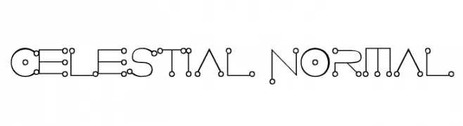
تنزيل 531 التنزيلات@WebFont -
![Celestial Normal تنزيل الخطوط]() تنزيل 531 التنزيلات@WebFont
تنزيل 531 التنزيلات@WebFont -
-
( ViactionType - Lukman Hidayat - www.myfonts.com/foundry/Viaction_Type/ )
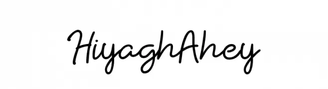
A playful, casual handwritten font with smooth, flowing lines.
![HiyaghAhey تنزيل الخطوط]() تنزيل 531 التنزيلات@WebFont
تنزيل 531 التنزيلات@WebFont -
( Copyright (c) 2010, Danh Hong (khmertype.blogspot.com) )
A clean, modern font with smooth curves and balanced structure.
![Freehand تنزيل الخطوط]() تنزيل 531 التنزيلات@WebFont
تنزيل 531 التنزيلات@WebFont -
( Fonts by www.kimberlygeswein.com - Kimberly Geswein )
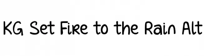
A playful, hand-drawn font with rounded edges and a casual style.
![KG Set Fire to the Rain Alt تنزيل الخطوط]() تنزيل 531 التنزيلات@WebFont
تنزيل 531 التنزيلات@WebFont -
( Fonts by Manfred Klein - manfred-klein.ina-mar.com )
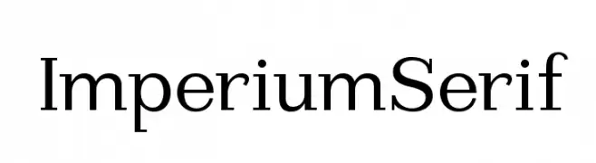
A classic serif typeface with sharp serifs and balanced proportions, ideal for formal and professional use.
![ImperiumSerif تنزيل الخطوط]() تنزيل 531 التنزيلات@WebFont
تنزيل 531 التنزيلات@WebFont -
![Georginas Hand تنزيل الخطوط]() تنزيل 531 التنزيلات@WebFont
تنزيل 531 التنزيلات@WebFont

ما هي أبرز الخطوط الآن؟
تحظى Saira SemiCondensed Light, SlimSummerRegular, Kurri Island Caps PERSONAL Bold, Isabella Sans Light and Celestial Normal بشعبية لخطوطها النظيفة وتطبيقاتها الواسعة — من الهوية البصرية إلى الصفحات المقصودة والملصقات.
أي الخطوط تُستخدم كثيرًا في الشعارات؟
تُعد السان سيريف الهندسية (مثل Poppins وعائلات على نمط Gotham) خيارًا شائعًا لعلامات نظيفة قابلة للتوسع. ولإضفاء طابع ودي، تبقى السكريبت واليدوية خيارًا كلاسيكيًا. اجمع عنوانًا بارزًا مع خط نصي محايد لتحقيق التوازن والتميّز.
كم مرة يتم تحديث قائمة أعلى الخطوط؟
نحدّثها بانتظام استنادًا إلى التنزيلات والنشاط الفعلي. عُد إليها كثيرًا لاكتشاف النجوم الصاعدة مبكرًا.
💡 نصيحة: أضف هذه الصفحة إلى العلامات — تتغير الاتجاهات بسرعة وقد تُلهم خطوط اليوم الرائجة إعادة العلامة غدًا.