مرحبًا بك في قسم أعلى الخطوط — حيث تلتقي الشعبية بالجودة. هذه هي الخطوط الأكثر تنزيلًا واستخدامًا هذا العام من قبل مجتمعنا. إذا كنت بحاجة إلى اختيار موثوق للشعارات أو الويب أو وسائل التواصل، فابدأ من هنا.
يتميز كل خط رائج بتوازن جيد وقابلية قراءة وتعدد استخدامات. ستجد سان سيريف حديثة، وسكريبتات أنيقة، وسيريف كلاسيكية، وخطوط عرض minimal مختارة بعناية.
-
 تنزيل 1878 التنزيلات
 -
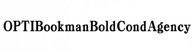
( Fonts by Castcraft Software - opti.netii.net - check the website before use )
A bold, classic serif font with strong, authoritative strokes.
![OPTIBookmanBoldCondAgency تنزيل الخطوط]() تنزيل 1877 التنزيلات@WebFont
تنزيل 1877 التنزيلات@WebFont -
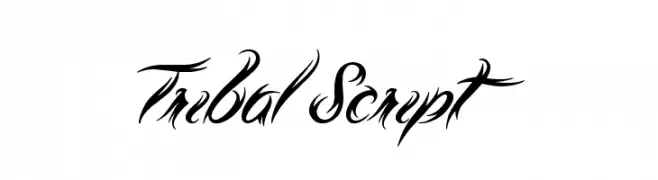
( Font by Jonathan Harris - www.tattoowoo.com )
A bold, decorative font with tribal-inspired elements and intricate detailing.
![Tribal Script تنزيل الخطوط]() تنزيل 1877 التنزيلات@WebFont
تنزيل 1877 التنزيلات@WebFont -
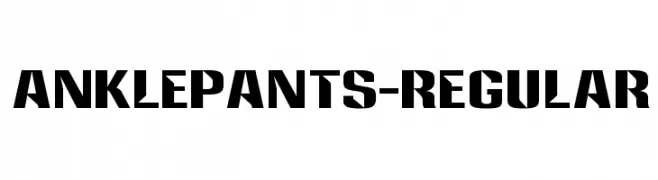
( Fonts by www.typodermicfonts.com - Ray Larabie )
A bold, geometric font with strong angles and high contrast, ideal for impactful designs.
![Anklepants-Regular تنزيل الخطوط]() تنزيل 1877 التنزيلات@WebFont
تنزيل 1877 التنزيلات@WebFont -
![Gradl تنزيل الخطوط]() تنزيل 1877 التنزيلات@WebFont
تنزيل 1877 التنزيلات@WebFont -
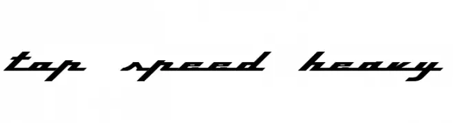
![Top Speed Heavy تنزيل الخطوط]() تنزيل 1877 التنزيلات@WebFont
تنزيل 1877 التنزيلات@WebFont -
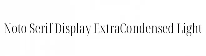
( Noto is a trademark of Google Inc. Noto fonts are open source. All Noto fonts are published under the SIL Open Font License, Version 1.1 )
A refined, extra condensed serif font with a light weight and high contrast.
![Noto Serif Display ExtraCondensed Light تنزيل الخطوط]() تنزيل 1876 التنزيلات@WebFont
تنزيل 1876 التنزيلات@WebFont -
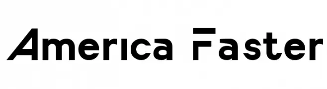
( Fonts by a Typeface Leone - www.tipografialeone.net. Personal-use only. For commercial use please contact owner. )
A bold, modern font with geometric and futuristic elements.
![America Faster تنزيل الخطوط]() تنزيل 1876 التنزيلات@WebFont
تنزيل 1876 التنزيلات@WebFont -
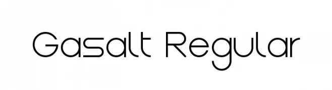
( Fonts by Remi Lagast. Personal-use only. For commercial use please contact owner. )
A modern, geometric font with a clean and minimalistic design.
![Gasalt Regular تنزيل الخطوط]() تنزيل 1876 التنزيلات@WebFont
تنزيل 1876 التنزيلات@WebFont -
( Fonts by Daniel Zadorozny - www.iconian.com )
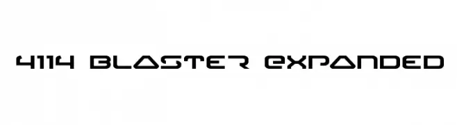
A futuristic, angular font with bold, geometric forms and an expanded width.
![4114 Blaster Expanded تنزيل الخطوط]() تنزيل 1876 التنزيلات@WebFont
تنزيل 1876 التنزيلات@WebFont -
![Sosa Regular تنزيل الخطوط]() تنزيل 1875 التنزيلات@WebFont
تنزيل 1875 التنزيلات@WebFont -
( Fonts by David Espinosa - http://issuu.com/davidespinosa5/ )
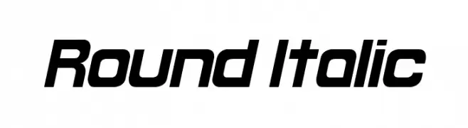
A modern, italicized font with rounded edges and a sleek, dynamic appearance.
![Round Italic تنزيل الخطوط]() تنزيل 1875 التنزيلات@WebFont
تنزيل 1875 التنزيلات@WebFont -
( Copyright (c) 2010, 2011, Natalia Raices )
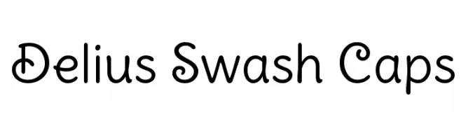
A playful, swash-style font with rounded, flowing letterforms.
![Delius Swash Caps تنزيل الخطوط]() تنزيل 1875 التنزيلات@WebFont
تنزيل 1875 التنزيلات@WebFont -
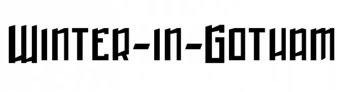
( Fonts by Nate Piekos - www.blambot.com )
A bold, angular font with a Gothic influence, ideal for dramatic and eye-catching designs.
![Winter-in-Gotham تنزيل الخطوط]() تنزيل 1875 التنزيلات@WebFont
تنزيل 1875 التنزيلات@WebFont -
![Funland Park JL تنزيل الخطوط]() تنزيل 1875 التنزيلات@WebFont
تنزيل 1875 التنزيلات@WebFont -
( Fonts by Dan P. Lyons - Personal-use only. For commercial use please contact owner. )
A sleek, modern font with an italic slant and consistent stroke width.
![Turbo تنزيل الخطوط]() تنزيل 1874 التنزيلات@WebFont
تنزيل 1874 التنزيلات@WebFont -
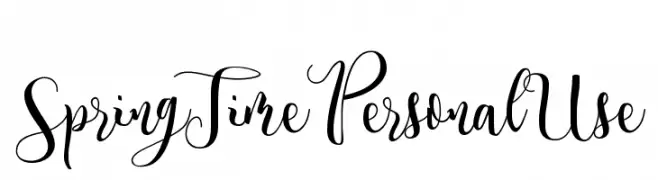
( Fonts by Billy Argel - www.billyargel.com - Personal-use only. For commercial use please contact owner. )
An elegant, flowing script font with intricate loops and swirls.
![Spring Time Personal Use تنزيل الخطوط]() تنزيل 1874 التنزيلات@WebFont
تنزيل 1874 التنزيلات@WebFont -
( Copyright (c) 2014, Indian Type Foundry (info@indiantypefoundry.com). )
A modern, geometric sans-serif font with clean lines and uniform strokes.
![Sarpanch Medium تنزيل الخطوط]() تنزيل 1874 التنزيلات@WebFont
تنزيل 1874 التنزيلات@WebFont -
![Tempus Regular تنزيل الخطوط]() تنزيل 1874 التنزيلات@WebFont
تنزيل 1874 التنزيلات@WebFont -
![Hero Regular تنزيل الخطوط]() تنزيل 1874 التنزيلات@WebFont
تنزيل 1874 التنزيلات@WebFont -
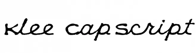
( K-Type Freebies (Free for Personal Use Only) FROM http://www.k-type.com )
A playful, artistic script font with fluid, connected letterforms and medium contrast.
![Klee CapScript تنزيل الخطوط]() تنزيل 1874 التنزيلات@WebFont
تنزيل 1874 التنزيلات@WebFont -
( Fonts by www.norfok.com - Norfok® Incredible Font Design - Thomas W. Otto )
A bold, hand-drawn font with a rugged, graffiti-inspired style.
![Friday13 Bonus NFI تنزيل الخطوط]() تنزيل 1874 التنزيلات@WebFont
تنزيل 1874 التنزيلات@WebFont -
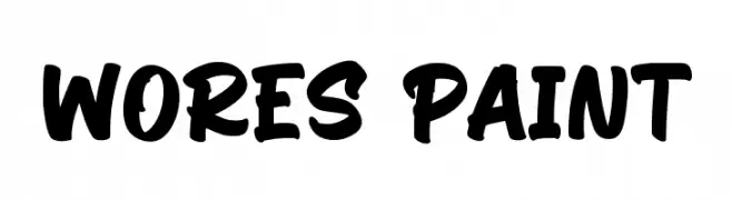
( Fonts by Kotak Kuning Studio )
A bold, brush-style font with a hand-painted, artistic appearance.
![Wores Paint تنزيل الخطوط]() تنزيل 1873 التنزيلات@WebFont
تنزيل 1873 التنزيلات@WebFont -
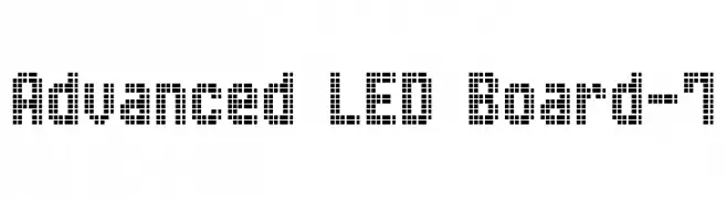
( www.styleseven.com/ )
A pixelated, grid-based font resembling LED displays with a digital, modern look.
![Advanced LED Board-7 تنزيل الخطوط]() تنزيل 1873 التنزيلات@WebFont
تنزيل 1873 التنزيلات@WebFont -
![verdana-hand تنزيل الخطوط]() تنزيل 1873 التنزيلات@WebFont
تنزيل 1873 التنزيلات@WebFont -
![Heart Font تنزيل الخطوط]() تنزيل 1873 التنزيلات
تنزيل 1873 التنزيلات -
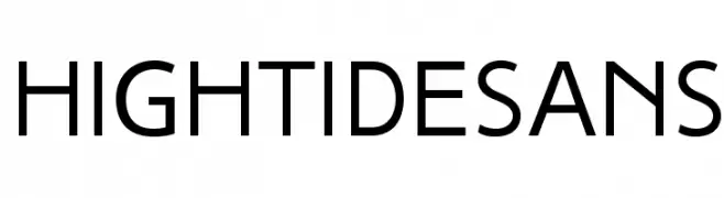
( Fonts by a www.fontfabric.com. Personal-use only. For commercial use please contact owner. )
A clean, modern sans-serif font with medium contrast and balanced spacing.
![HighTideSans تنزيل الخطوط]() تنزيل 1872 التنزيلات@WebFont
تنزيل 1872 التنزيلات@WebFont -
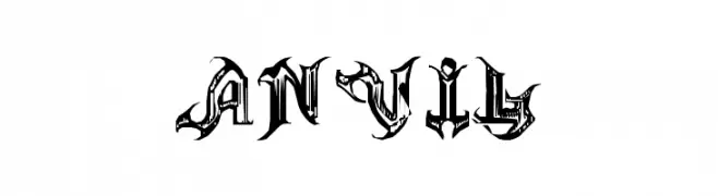
( Fonts by Greg Smith )
A bold, Gothic-inspired font with intricate, angular designs.
![ANVIL تنزيل الخطوط]() تنزيل 1872 التنزيلات@WebFont
تنزيل 1872 التنزيلات@WebFont -
( Fonts by Amos Jerbi - ajerbi.com - Personal-use only. For commercial use please contact owner. )
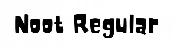
A bold, playful font with a hand-drawn, whimsical style.
![Noot Regular تنزيل الخطوط]() تنزيل 1871 التنزيلات@WebFont
تنزيل 1871 التنزيلات@WebFont -
( Fonts by dot colon - Personal-use only. For commercial use please contact owner. )
A bold, modern sans-serif font with a strong, impactful presence.
![Route159-Heavy تنزيل الخطوط]() تنزيل 1871 التنزيلات@WebFont
تنزيل 1871 التنزيلات@WebFont -
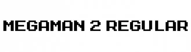
![MegaMan 2 Regular تنزيل الخطوط]() تنزيل 1871 التنزيلات@WebFont
تنزيل 1871 التنزيلات@WebFont -
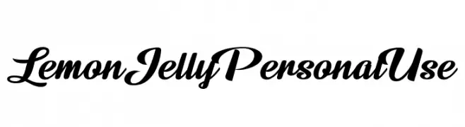
![Lemon Jelly Personal Use تنزيل الخطوط]() تنزيل 1870 التنزيلات@WebFont
تنزيل 1870 التنزيلات@WebFont -
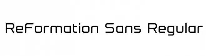
( Fonts by Steve Gardner - www.explogos.com. Personal-use only. For commercial use please contact owner. )
A modern, geometric sans-serif font with clean lines and uniform strokes.
![ReFormation Sans Regular تنزيل الخطوط]() تنزيل 1870 التنزيلات@WebFont
تنزيل 1870 التنزيلات@WebFont -
( Fonts by Bartek Nowak - www.nowak.tv/fontoholic/ )
A bold, geometric font with a modern and structured design.
![Opeln2001 Szeroki Metro تنزيل الخطوط]() تنزيل 1870 التنزيلات@WebFont
تنزيل 1870 التنزيلات@WebFont -
![Cthulhu Glyphs تنزيل الخطوط]() تنزيل 1869 التنزيلات@WebFont
تنزيل 1869 التنزيلات@WebFont


ما هي أبرز الخطوط الآن؟
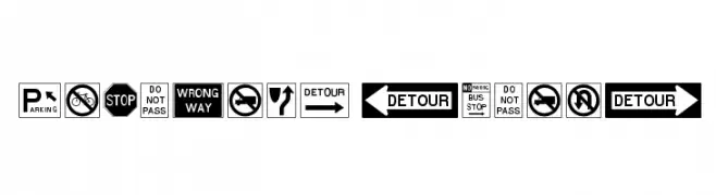
تحظى RoadSign Medium, OPTIBookmanBoldCondAgency, Tribal Script, Anklepants-Regular and Gradl بشعبية لخطوطها النظيفة وتطبيقاتها الواسعة — من الهوية البصرية إلى الصفحات المقصودة والملصقات.
أي الخطوط تُستخدم كثيرًا في الشعارات؟
تُعد السان سيريف الهندسية (مثل Poppins وعائلات على نمط Gotham) خيارًا شائعًا لعلامات نظيفة قابلة للتوسع. ولإضفاء طابع ودي، تبقى السكريبت واليدوية خيارًا كلاسيكيًا. اجمع عنوانًا بارزًا مع خط نصي محايد لتحقيق التوازن والتميّز.
كم مرة يتم تحديث قائمة أعلى الخطوط؟
نحدّثها بانتظام استنادًا إلى التنزيلات والنشاط الفعلي. عُد إليها كثيرًا لاكتشاف النجوم الصاعدة مبكرًا.
💡 نصيحة: أضف هذه الصفحة إلى العلامات — تتغير الاتجاهات بسرعة وقد تُلهم خطوط اليوم الرائجة إعادة العلامة غدًا.