مرحبًا بك في قسم أعلى الخطوط — حيث تلتقي الشعبية بالجودة. هذه هي الخطوط الأكثر تنزيلًا واستخدامًا هذا العام من قبل مجتمعنا. إذا كنت بحاجة إلى اختيار موثوق للشعارات أو الويب أو وسائل التواصل، فابدأ من هنا.
يتميز كل خط رائج بتوازن جيد وقابلية قراءة وتعدد استخدامات. ستجد سان سيريف حديثة، وسكريبتات أنيقة، وسيريف كلاسيكية، وخطوط عرض minimal مختارة بعناية.
-
( Fonts by Manfred Klein. Free for private and charity use. Free for commercial with donation to organizations )
A playful, handwritten-style font with bold, rounded characters.
 تنزيل 620 التنزيلات@WebFont
 -
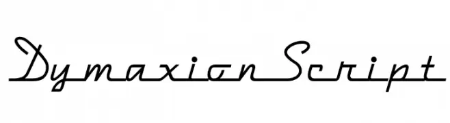
( Fonts by Nick's Fonts )
A fluid and elegant script font with smooth, flowing lines.
![DymaxionScript تنزيل الخطوط]() تنزيل 620 التنزيلات
تنزيل 620 التنزيلات -
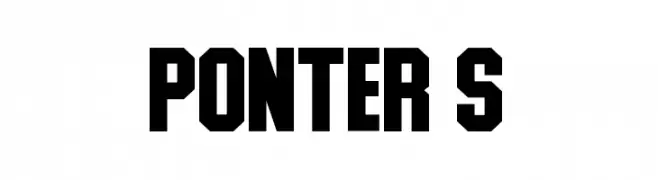
( Fonts by Daymarius - Personal-use only. For commercial use please contact owner. )
A bold, geometric font with sharp angles and a modern, assertive style.
![Ponter S تنزيل الخطوط]() تنزيل 620 التنزيلات@WebFont
تنزيل 620 التنزيلات@WebFont -
( Fonts by Leonard Posavec )
A bold, expressive script font with flowing, cursive letterforms and elegant flourishes.
![Gullias تنزيل الخطوط]() تنزيل 620 التنزيلات@WebFont
تنزيل 620 التنزيلات@WebFont -
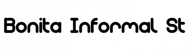
![Bonita Informal St تنزيل الخطوط]() تنزيل 620 التنزيلات@WebFont
تنزيل 620 التنزيلات@WebFont -
-
( Fonts by Tokopress )
A playful, hand-drawn font with a whimsical and informal style.
![Breakfast-Club تنزيل الخطوط]() تنزيل 620 التنزيلات@WebFont
تنزيل 620 التنزيلات@WebFont -
( Audry Kitoko Makelele - www.facebook.com/aukimvisuel )
A bold, geometric font with a modern and clean aesthetic.
![Kitoko تنزيل الخطوط]() تنزيل 620 التنزيلات@WebFont
تنزيل 620 التنزيلات@WebFont -
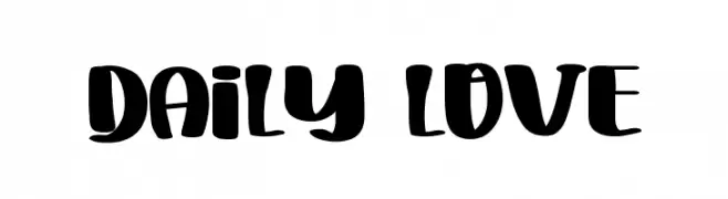
( Fonts by FreshtypeINK )
A bold, playful font with rounded strokes and a friendly appearance.
![Daily Love تنزيل الخطوط]() تنزيل 620 التنزيلات@WebFont
تنزيل 620 التنزيلات@WebFont -
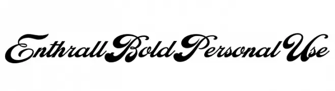
( Fonts by Billy Argel - www.billyargel.com - Personal-use only. For commercial use please contact owner. )
A bold, elegant script font with flowing cursive letters and high contrast.
![Enthrall Bold Personal Use تنزيل الخطوط]() تنزيل 620 التنزيلات@WebFont
تنزيل 620 التنزيلات@WebFont -
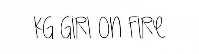
( Fonts by www.kimberlygeswein.com - Kimberly Geswein )
A playful, handwritten font with tall, narrow characters and a casual style.
![KG Girl On Fire تنزيل الخطوط]() تنزيل 619 التنزيلات@WebFont
تنزيل 619 التنزيلات@WebFont


ما هي أبرز الخطوط الآن؟
تحظى MKOCR, DymaxionScript, Ponter S, Gullias and Bonita Informal St بشعبية لخطوطها النظيفة وتطبيقاتها الواسعة — من الهوية البصرية إلى الصفحات المقصودة والملصقات.
أي الخطوط تُستخدم كثيرًا في الشعارات؟
تُعد السان سيريف الهندسية (مثل Poppins وعائلات على نمط Gotham) خيارًا شائعًا لعلامات نظيفة قابلة للتوسع. ولإضفاء طابع ودي، تبقى السكريبت واليدوية خيارًا كلاسيكيًا. اجمع عنوانًا بارزًا مع خط نصي محايد لتحقيق التوازن والتميّز.
كم مرة يتم تحديث قائمة أعلى الخطوط؟
نحدّثها بانتظام استنادًا إلى التنزيلات والنشاط الفعلي. عُد إليها كثيرًا لاكتشاف النجوم الصاعدة مبكرًا.
💡 نصيحة: أضف هذه الصفحة إلى العلامات — تتغير الاتجاهات بسرعة وقد تُلهم خطوط اليوم الرائجة إعادة العلامة غدًا.