مرحبًا بك في قسم أعلى الخطوط — حيث تلتقي الشعبية بالجودة. هذه هي الخطوط الأكثر تنزيلًا واستخدامًا هذا العام من قبل مجتمعنا. إذا كنت بحاجة إلى اختيار موثوق للشعارات أو الويب أو وسائل التواصل، فابدأ من هنا.
يتميز كل خط رائج بتوازن جيد وقابلية قراءة وتعدد استخدامات. ستجد سان سيريف حديثة، وسكريبتات أنيقة، وسيريف كلاسيكية، وخطوط عرض minimal مختارة بعناية.
-
 تنزيل 630 التنزيلات@WebFont
 -
( Fonts by Octotype - www.foundmyfont.com - Personal-use only. For commercial use please contact owner. )
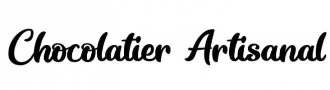
A flowing, cursive font with elegant and interconnected letters.
![Chocolatier Artisanal تنزيل الخطوط]() تنزيل 630 التنزيلات@WebFont
تنزيل 630 التنزيلات@WebFont -
( Fonts by Altsys Metamorphosis )
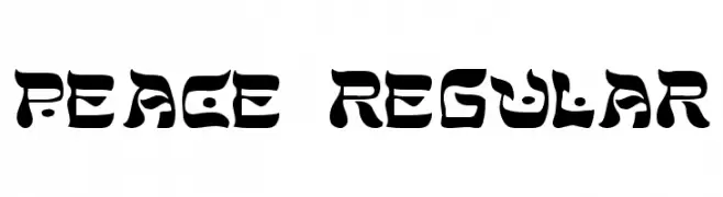
A bold, decorative font with high contrast and a unique, artistic style.
![Peace Regular تنزيل الخطوط]() تنزيل 630 التنزيلات@WebFont
تنزيل 630 التنزيلات@WebFont -
( Carrot Rope - typewhatyouloveandletitkillyou.tumblr.com/ )
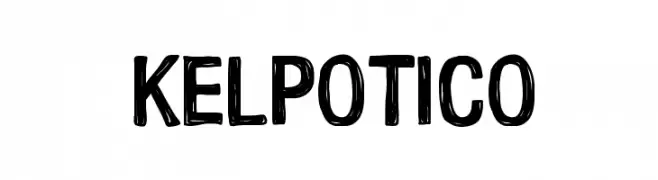
A bold, hand-drawn font with a playful and informal style.
![Kelpotico تنزيل الخطوط]() تنزيل 630 التنزيلات@WebFont
تنزيل 630 التنزيلات@WebFont -
![Richa Wide تنزيل الخطوط]() تنزيل 630 التنزيلات
تنزيل 630 التنزيلات -
-
( Fonts by Syaf Rizal - Khurasan - Personal-use only. For commercial use please contact owner. )
A bold, playful handwritten font with flowing strokes and a lively appearance.
![Pig Year تنزيل الخطوط]() تنزيل 630 التنزيلات@WebFont
تنزيل 630 التنزيلات@WebFont -
( Fonts by Castcraft Software - OPTI Fonts Archive - opti.netii.net - Personal-use only. For commercial use please contact owner. )
A modern, light sans-serif font with clean lines and a minimalist style.
![OPTIVenus-Light تنزيل الخطوط]() تنزيل 630 التنزيلات@WebFont
تنزيل 630 التنزيلات@WebFont -
( Fonts by Fontfabric - Personal-use only. For commercial use please contact owner. )
A semi-bold, slanted script font with a modern, handwritten style.
![Zing Script Rust SemiBold Demo Base تنزيل الخطوط]() تنزيل 630 التنزيلات@WebFont
تنزيل 630 التنزيلات@WebFont -
( Fonts by Zetafonts - Personal-use only. For commercial use please contact owner. )
A bold, modern sans-serif font with strong, thick strokes.
![Milligram Trial Extrabold تنزيل الخطوط]() تنزيل 630 التنزيلات@WebFont
تنزيل 630 التنزيلات@WebFont -
( Fonts by Kong Font - https://fontkong.com/ - Personal-use only. For commercial use please contact owner. )
A classic serif font with bold strokes and elegant curves, offering timeless appeal.
![The Texterius تنزيل الخطوط]() تنزيل 630 التنزيلات@WebFont
تنزيل 630 التنزيلات@WebFont


ما هي أبرز الخطوط الآن؟
تحظى Schrofer, Chocolatier Artisanal, Peace Regular, Kelpotico and Richa Wide بشعبية لخطوطها النظيفة وتطبيقاتها الواسعة — من الهوية البصرية إلى الصفحات المقصودة والملصقات.
أي الخطوط تُستخدم كثيرًا في الشعارات؟
تُعد السان سيريف الهندسية (مثل Poppins وعائلات على نمط Gotham) خيارًا شائعًا لعلامات نظيفة قابلة للتوسع. ولإضفاء طابع ودي، تبقى السكريبت واليدوية خيارًا كلاسيكيًا. اجمع عنوانًا بارزًا مع خط نصي محايد لتحقيق التوازن والتميّز.
كم مرة يتم تحديث قائمة أعلى الخطوط؟
نحدّثها بانتظام استنادًا إلى التنزيلات والنشاط الفعلي. عُد إليها كثيرًا لاكتشاف النجوم الصاعدة مبكرًا.
💡 نصيحة: أضف هذه الصفحة إلى العلامات — تتغير الاتجاهات بسرعة وقد تُلهم خطوط اليوم الرائجة إعادة العلامة غدًا.