مرحبًا بك في قسم أعلى الخطوط — حيث تلتقي الشعبية بالجودة. هذه هي الخطوط الأكثر تنزيلًا واستخدامًا هذا العام من قبل مجتمعنا. إذا كنت بحاجة إلى اختيار موثوق للشعارات أو الويب أو وسائل التواصل، فابدأ من هنا.
يتميز كل خط رائج بتوازن جيد وقابلية قراءة وتعدد استخدامات. ستجد سان سيريف حديثة، وسكريبتات أنيقة، وسيريف كلاسيكية، وخطوط عرض minimal مختارة بعناية.
-
( weknow - Wino S Kadir - www.creativefabrica.com/designer/weknow/ )
A modern, futuristic font with bold, rounded strokes and a playful yet sophisticated style.
 تنزيل 122 التنزيلات@WebFont
 -
( Fonts by Indi(e)ra )
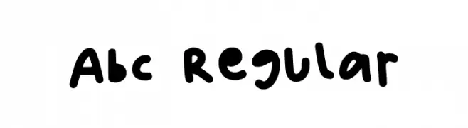
A playful, hand-drawn font with bold, rounded strokes and a casual vibe.
![Abc Regular تنزيل الخطوط]() تنزيل 122 التنزيلات@WebFont
تنزيل 122 التنزيلات@WebFont -
( Fonts by Chequered Ink - chequered.ink - Personal-use only. For commercial use please contact owner. )
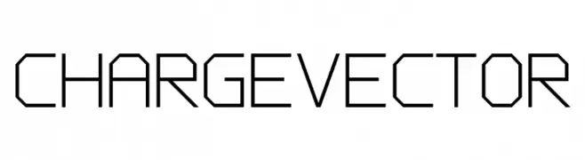
A geometric, angular font with a futuristic and technical appearance.
![Charge Vector تنزيل الخطوط]() تنزيل 122 التنزيلات@WebFont
تنزيل 122 التنزيلات@WebFont -
( Iconian Fonts - Daniel Zadorozny - www.iconian.com )
A bold, twisted, and playful font with a hand-drawn, energetic style.
![Mister Twisted Leaning تنزيل الخطوط]() تنزيل 122 التنزيلات@WebFont
تنزيل 122 التنزيلات@WebFont -
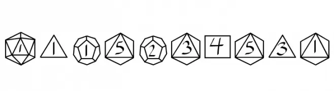
![GamingDice تنزيل الخطوط]() تنزيل 122 التنزيلات@WebFont
تنزيل 122 التنزيلات@WebFont -
![BOSTHON Swash تنزيل الخطوط]() تنزيل 122 التنزيلات@WebFont
تنزيل 122 التنزيلات@WebFont -
( Fonts by Darrell Flood - Personal-use only. For commercial use please contact owner. )
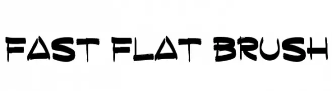
A bold, brush-stroke font with a dynamic and textured appearance.
![Fast Flat Brush تنزيل الخطوط]() تنزيل 122 التنزيلات@WebFont
تنزيل 122 التنزيلات@WebFont -
( Fonts by Manfred Klein. Free for private and charity use. Free for commercial with donation to organizations )
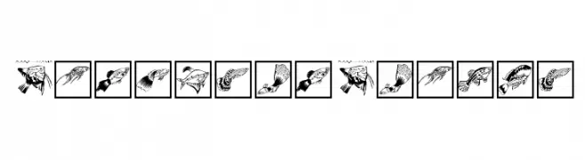
A whimsical decorative font using fish illustrations as characters.
![FischersFritze تنزيل الخطوط]() تنزيل 122 التنزيلات@WebFont
تنزيل 122 التنزيلات@WebFont -
( Fonts by Khurasan )
A bold, handwritten font with a playful and casual style.
![Long Today تنزيل الخطوط]() تنزيل 122 التنزيلات@WebFont
تنزيل 122 التنزيلات@WebFont -
( Fonts by Daniel Zadorozny - www.iconian.com )
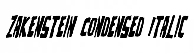
A bold, condensed, and italicized font with sharp angles and strong visual impact.
![Zakenstein Condensed Italic تنزيل الخطوط]() تنزيل 122 التنزيلات@WebFont
تنزيل 122 التنزيلات@WebFont -
![Oh_Hello_Dya تنزيل الخطوط]() تنزيل 122 التنزيلات@WebFont
تنزيل 122 التنزيلات@WebFont -
( Fonts by Daniel Zadorozny - www.iconian.com )
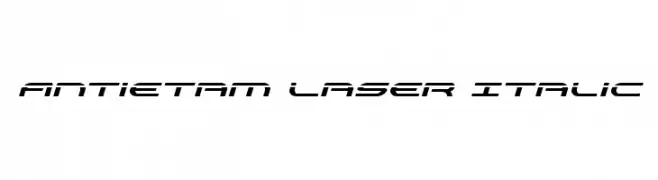
A futuristic, italic font with sharp, angular lines and a sleek design.
![Antietam Laser Italic تنزيل الخطوط]() تنزيل 122 التنزيلات@WebFont
تنزيل 122 التنزيلات@WebFont -
( Fonts by APG Studios )
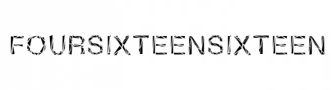
A geometric, fragmented font with a bold, angular design.
![FourSixteenSixteen تنزيل الخطوط]() تنزيل 122 التنزيلات@WebFont
تنزيل 122 التنزيلات@WebFont -
( Fonts by Manfred Klein. Free for private and charity use. Free for commercial with donation to organizations )
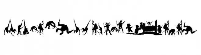
Silhouette font illustrating human and primate evolution scenes.
![MKapishTwo تنزيل الخطوط]() تنزيل 122 التنزيلات@WebFont
تنزيل 122 التنزيلات@WebFont -
( Fonts by Zetafonts - Personal-use only. For commercial use please contact owner. )
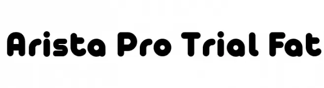
A bold, rounded font with a playful and modern style.
![Arista Pro Trial Fat تنزيل الخطوط]() تنزيل 122 التنزيلات@WebFont
تنزيل 122 التنزيلات@WebFont -
( Fonts by Misti`s Fonts - mistifonts.com - Personal-use only. For commercial use please contact owner. )
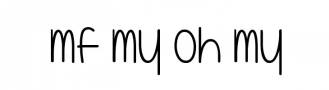
A playful, rounded font with elongated letterforms and even spacing.
![Mf My Oh My تنزيل الخطوط]() تنزيل 122 التنزيلات@WebFont
تنزيل 122 التنزيلات@WebFont -
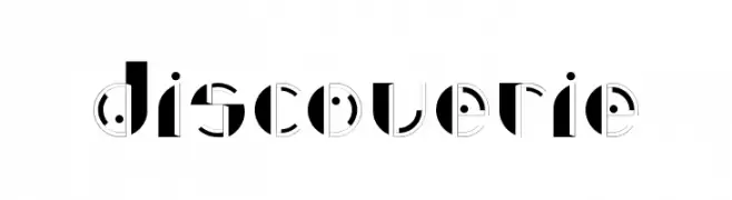
![Discoverie تنزيل الخطوط]() تنزيل 122 التنزيلات@WebFont
تنزيل 122 التنزيلات@WebFont -
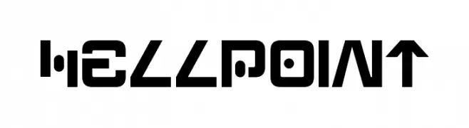
( Fonts by a Neale Davidson - www.pixelsagas.com. Personal-use only. For commercial use please contact owner. )
A bold, futuristic font with geometric shapes and sharp angles.
![Hellpoint تنزيل الخطوط]() تنزيل 122 التنزيلات@WebFont
تنزيل 122 التنزيلات@WebFont -
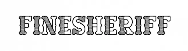
( Fonts by www.woodcutter.es - woodcutter Manero - Personal-use only. For commercial use please contact owner. )
A bold, decorative font with a Western, woodcut style.
![Fine Sheriff تنزيل الخطوط]() تنزيل 122 التنزيلات@WebFont
تنزيل 122 التنزيلات@WebFont -
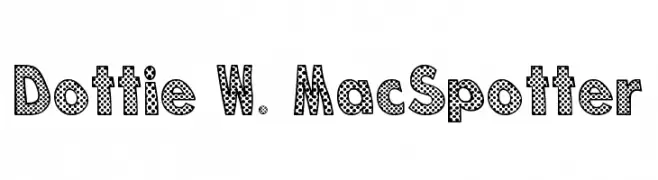
( Fonts by Untitled Motion )
A bold, dotted font with a playful and dynamic pop art style.
![Dottie W. MacSpotter تنزيل الخطوط]() تنزيل 122 التنزيلات@WebFont
تنزيل 122 التنزيلات@WebFont -
( Fonts by Vunira Design - Personal-use only. For commercial use please contact owner. )
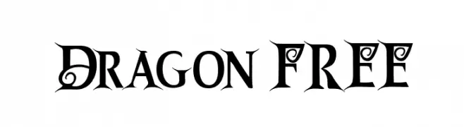
An ornate and decorative font with medieval-inspired flourishes.
![Dragon FREE تنزيل الخطوط]() تنزيل 122 التنزيلات@WebFont
تنزيل 122 التنزيلات@WebFont -
( Fonts by Manfred Klein. Free for private and charity use. Free for commercial with donation to organizations )
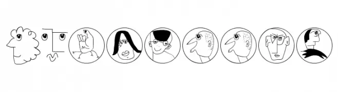
Playful hand-drawn cartoon character font with unique illustrations for each glyph.
![MKartoons تنزيل الخطوط]() تنزيل 122 التنزيلات@WebFont
تنزيل 122 التنزيلات@WebFont -
( Fonts by Bloknote.nl - Personal-use only. For commercial use please contact owner. )
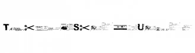
A distressed, grunge-style font with a textured, urban appearance.
![Ticket Scraps Urban تنزيل الخطوط]() تنزيل 122 التنزيلات@WebFont
تنزيل 122 التنزيلات@WebFont -
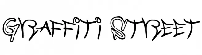
![Graffiti Street تنزيل الخطوط]() تنزيل 122 التنزيلات@WebFont
تنزيل 122 التنزيلات@WebFont -
( Fonts by pheist.net - Stefanie Koerner )
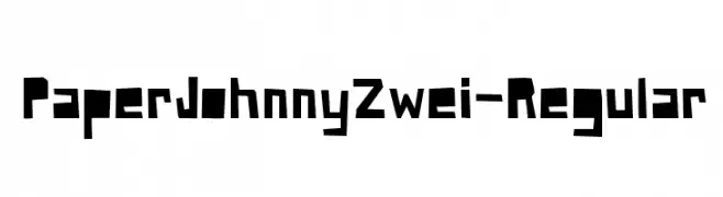
A bold, geometric font with angular, blocky characters.
![PaperJohnnyZwei-Regular تنزيل الخطوط]() تنزيل 122 التنزيلات@WebFont
تنزيل 122 التنزيلات@WebFont -
( Fonts by Manfred Klein. Free for private and charity use. Free for commercial with donation to organizations )
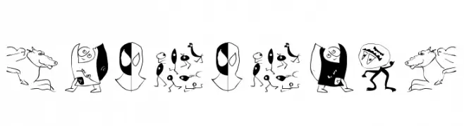
A quirky, illustrative dingbat font featuring abstract cartoon figures.
![DuererUnd تنزيل الخطوط]() تنزيل 122 التنزيلات@WebFont
تنزيل 122 التنزيلات@WebFont -
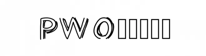
![PWOpened تنزيل الخطوط]() تنزيل 122 التنزيلات@WebFont
تنزيل 122 التنزيلات@WebFont -
( Fonts by CannotIntoSpaceFonts - KineticPlasma Fonts - Personal-use only. For commercial use please contact owner. )
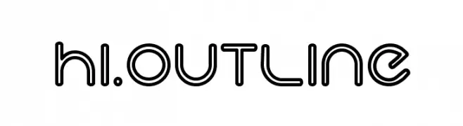
A modern, outline-style font with rounded edges and a tubular appearance.
![Hi. Outline تنزيل الخطوط]() تنزيل 122 التنزيلات@WebFont
تنزيل 122 التنزيلات@WebFont -
( Fonts by Peter Rempel - www.prfonts.com )
A decorative font inspired by Viking and ancient runic symbols with a mystical, hand-drawn style.
![PR Viking Alternates تنزيل الخطوط]() تنزيل 122 التنزيلات@WebFont
تنزيل 122 التنزيلات@WebFont -
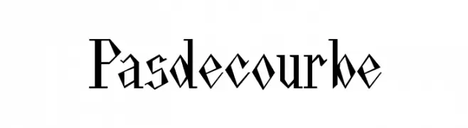
( Fonts by Diogene - Claude Pelletier )
A bold, angular font with a modern, geometric style.
![Pasdecourbe تنزيل الخطوط]() تنزيل 122 التنزيلات@WebFont
تنزيل 122 التنزيلات@WebFont -
![WaterFire تنزيل الخطوط]() تنزيل 122 التنزيلات@WebFont
تنزيل 122 التنزيلات@WebFont -
( Fonts by Kevin Richey - Personal-use only. For commercial use please contact owner. )
A decorative font with geometric and artistic elements, blending modern and vintage styles.
![Charlie تنزيل الخطوط]() تنزيل 122 التنزيلات@WebFont
تنزيل 122 التنزيلات@WebFont -
( Gaelleing )
A playful, decorative font with bold outlines and diagonal line patterns inside each character.
![PLAQUEZIP تنزيل الخطوط]() تنزيل 122 التنزيلات@WebFont
تنزيل 122 التنزيلات@WebFont -
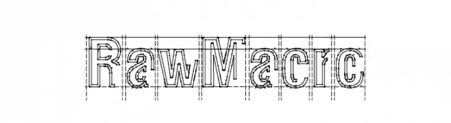
( pOPdOG fONTS - Dimitris Kolyris - popdog_fonts.tripod.com/ )
A bold, geometric font with a technical, architectural style.
![Raw Macro تنزيل الخطوط]() تنزيل 122 التنزيلات@WebFont
تنزيل 122 التنزيلات@WebFont -
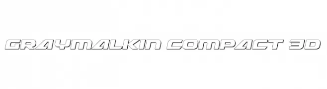
( Fonts by Daniel Zadorozny - www.iconian.com )
A bold, 3D-effect font with a futuristic and geometric design.
![Graymalkin Compact 3D تنزيل الخطوط]() تنزيل 122 التنزيلات@WebFont
تنزيل 122 التنزيلات@WebFont


ما هي أبرز الخطوط الآن؟
تحظى GABRIELLE-Light, Abc Regular, Charge Vector, Mister Twisted Leaning and GamingDice بشعبية لخطوطها النظيفة وتطبيقاتها الواسعة — من الهوية البصرية إلى الصفحات المقصودة والملصقات.
أي الخطوط تُستخدم كثيرًا في الشعارات؟
تُعد السان سيريف الهندسية (مثل Poppins وعائلات على نمط Gotham) خيارًا شائعًا لعلامات نظيفة قابلة للتوسع. ولإضفاء طابع ودي، تبقى السكريبت واليدوية خيارًا كلاسيكيًا. اجمع عنوانًا بارزًا مع خط نصي محايد لتحقيق التوازن والتميّز.
كم مرة يتم تحديث قائمة أعلى الخطوط؟
نحدّثها بانتظام استنادًا إلى التنزيلات والنشاط الفعلي. عُد إليها كثيرًا لاكتشاف النجوم الصاعدة مبكرًا.
💡 نصيحة: أضف هذه الصفحة إلى العلامات — تتغير الاتجاهات بسرعة وقد تُلهم خطوط اليوم الرائجة إعادة العلامة غدًا.