مرحبًا بك في قسم أعلى الخطوط — حيث تلتقي الشعبية بالجودة. هذه هي الخطوط الأكثر تنزيلًا واستخدامًا هذا العام من قبل مجتمعنا. إذا كنت بحاجة إلى اختيار موثوق للشعارات أو الويب أو وسائل التواصل، فابدأ من هنا.
يتميز كل خط رائج بتوازن جيد وقابلية قراءة وتعدد استخدامات. ستجد سان سيريف حديثة، وسكريبتات أنيقة، وسيريف كلاسيكية، وخطوط عرض minimal مختارة بعناية.
-
 تنزيل 128 التنزيلات@WebFont
 -
( Fonts by nariswari_creative - Taufik Dwi Purnomo - Personal-use only. For commercial use please contact owner. )
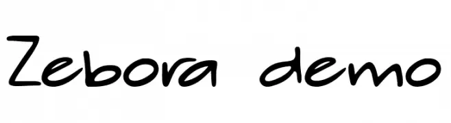
A playful, casual handwritten font with smooth curves and a natural feel.
![Zebora demo تنزيل الخطوط]() تنزيل 128 التنزيلات@WebFont
تنزيل 128 التنزيلات@WebFont -
( Fonts by Subectype & Orenari - Rangga Subekti & Ari - Personal-use only. For commercial use please contact owner. )
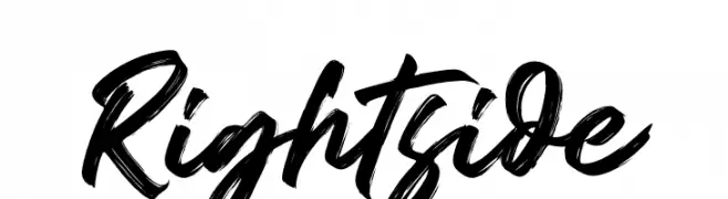
A bold, brush-style font with dynamic and expressive strokes.
![Rightside تنزيل الخطوط]() تنزيل 128 التنزيلات@WebFont
تنزيل 128 التنزيلات@WebFont -
( Fonts by MaknaStudio - Yudis Tira - Personal-use only. For commercial use please contact owner. )
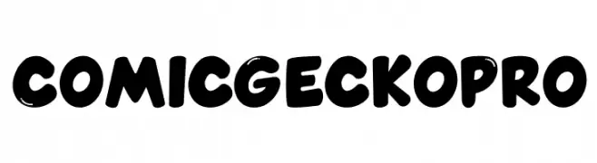
A bold, playful font with rounded, cartoonish characters.
![Comic Gecko Pro تنزيل الخطوط]() تنزيل 128 التنزيلات@WebFont
تنزيل 128 التنزيلات@WebFont -
![Clumsy Matilda Demo تنزيل الخطوط]() تنزيل 128 التنزيلات@WebFont
تنزيل 128 التنزيلات@WebFont -
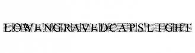
![LowEngravedCapsLight تنزيل الخطوط]() تنزيل 128 التنزيلات@WebFont
تنزيل 128 التنزيلات@WebFont -
( Fonts by Chris Vile - fontmonger.com - Personal-use only. For commercial use please contact owner. )
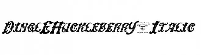
A bold, decorative, and distressed italic font with a vintage flair.
![DinglEHuckleberrY-Italic تنزيل الخطوط]() تنزيل 128 التنزيلات@WebFont
تنزيل 128 التنزيلات@WebFont -
( Fonts by Manfred Klein. Free for private and charity use. Free for commercial with donation to organizations )
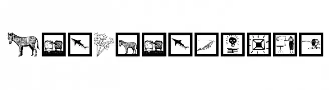
A pictogram dingbat font with hand-drawn illustrations and landmarks.
![ArtParticles تنزيل الخطوط]() تنزيل 128 التنزيلات@WebFont
تنزيل 128 التنزيلات@WebFont -
( Fonts by Mans Greback - www.mansgreback.com - Personal-use only. For commercial use please contact owner. )
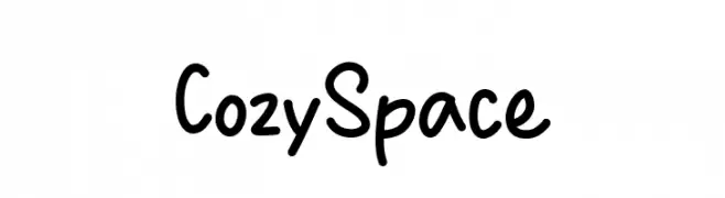
A playful, handwritten font with rounded, irregular characters.
![Cozy Space تنزيل الخطوط]() تنزيل 128 التنزيلات@WebFont
تنزيل 128 التنزيلات@WebFont -
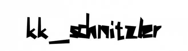
![kk_schnitzler تنزيل الخطوط]() تنزيل 128 التنزيلات@WebFont
تنزيل 128 التنزيلات@WebFont -
( Fonts by StringLabs Creative Studio )
Elegant cursive script font.
![Tindak Fundi تنزيل الخطوط]() تنزيل 128 التنزيلات@WebFont
تنزيل 128 التنزيلات@WebFont -
( Fonts by Joseph Dawson )
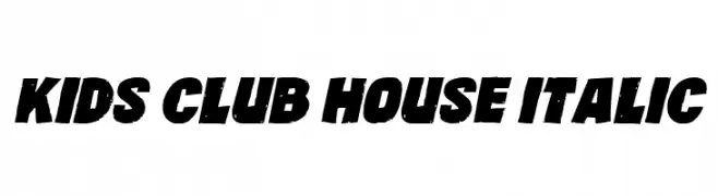
A bold, italicized font with a distressed, playful style.
![Kids Club House Italic تنزيل الخطوط]() تنزيل 128 التنزيلات@WebFont
تنزيل 128 التنزيلات@WebFont -
( Fonts by a Max Infeld - XEROGRAPHER FONTS - xerographer.blogspot.com . Personal-use only. For commercial use please contact owner. )
An intricate and artistic font with swirling, elongated strokes and decorative flourishes.
![AnotherParty تنزيل الخطوط]() تنزيل 128 التنزيلات@WebFont
تنزيل 128 التنزيلات@WebFont -
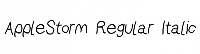
![AppleStorm Regular Italic تنزيل الخطوط]() تنزيل 128 التنزيلات@WebFont
تنزيل 128 التنزيلات@WebFont -
( Fonts by Daniel Zadorozny - www.iconian.com - Free for personal use )
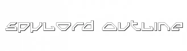
A futuristic, geometric outline font with sharp angles and straight lines.
![Spylord Outline تنزيل الخطوط]() تنزيل 128 التنزيلات@WebFont
تنزيل 128 التنزيلات@WebFont -
( Fonts by Daniel Zadorozny - www.iconian.com - Free for personal use )
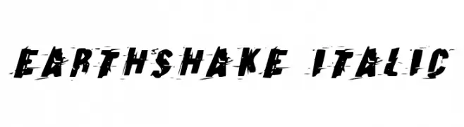
A bold, italicized font with a distressed, grunge aesthetic.
![Earthshake Italic تنزيل الخطوط]() تنزيل 128 التنزيلات@WebFont
تنزيل 128 التنزيلات@WebFont -
( Fonts by Manfred Klein. Free for private and charity use. Free for commercial with donation to organizations )
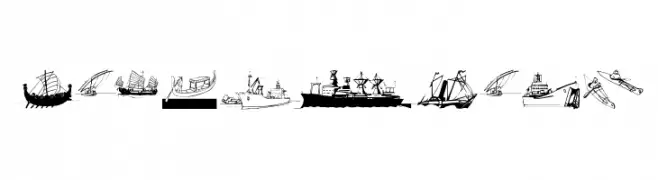
A display font composed of ship and boat illustrations as characters.
![MarineBats تنزيل الخطوط]() تنزيل 128 التنزيلات@WebFont
تنزيل 128 التنزيلات@WebFont -
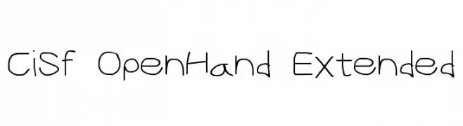
![CiSf OpenHand Extended تنزيل الخطوط]() تنزيل 128 التنزيلات@WebFont
تنزيل 128 التنزيلات@WebFont -
( Chequered Ink - chequered.ink/ )
A bold, geometric font with a 3D effect and strong visual impact.
![Hippopotamus Apocalypse تنزيل الخطوط]() تنزيل 128 التنزيلات@WebFont
تنزيل 128 التنزيلات@WebFont -
( Fonts by DumadiStyle )
A bold, handwritten font with a playful and casual style.
![Hipster Hatch تنزيل الخطوط]() تنزيل 128 التنزيلات@WebFont
تنزيل 128 التنزيلات@WebFont -
( Fonts by Qbotype )
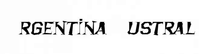
A bold, edgy font with sharp, angular edges and a distressed look.
![Argentina Austral تنزيل الخطوط]() تنزيل 128 التنزيلات@WebFont
تنزيل 128 التنزيلات@WebFont -
( kimberlygeswein.com )
A whimsical and decorative font with playful swirls and curls.
![Janda Swirlygirl تنزيل الخطوط]() تنزيل 128 التنزيلات@WebFont
تنزيل 128 التنزيلات@WebFont -
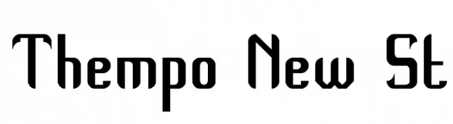
![Thempo New St تنزيل الخطوط]() تنزيل 128 التنزيلات@WebFont
تنزيل 128 التنزيلات@WebFont -
( Free for a personal use. For a commercial use please visit www.kevinandamanda.com )
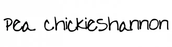
A playful, handwritten font with a casual and friendly vibe.
![Pea ChickieShannon تنزيل الخطوط]() تنزيل 128 التنزيلات@WebFont
تنزيل 128 التنزيلات@WebFont -
( Fonts by Vladimir Nikolic )
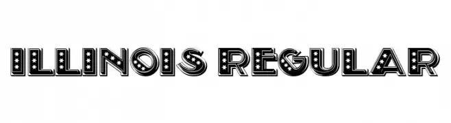
A bold, decorative font with stars and stripes, ideal for standout designs.
![Illinois Regular تنزيل الخطوط]() تنزيل 128 التنزيلات@WebFont
تنزيل 128 التنزيلات@WebFont -
( Fonts by Burhan Afif - hanscostudio.com - Personal-use only. For commercial use please contact owner. )
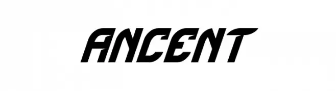
A bold, italicized font with a dynamic, modern style.
![Ancent تنزيل الخطوط]() تنزيل 128 التنزيلات@WebFont
تنزيل 128 التنزيلات@WebFont -
( Fonts by Fontherapy - Siti Anisa - Personal-use only. For commercial use please contact owner. )
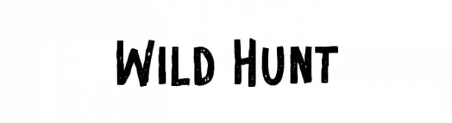
A bold, hand-drawn font with a rugged, adventurous style and distressed texture.
![Wild Hunt تنزيل الخطوط]() تنزيل 128 التنزيلات@WebFont
تنزيل 128 التنزيلات@WebFont -
( Fonts by Manfred Klein. Free for private and charity use. Free for commercial with donation to organizations )
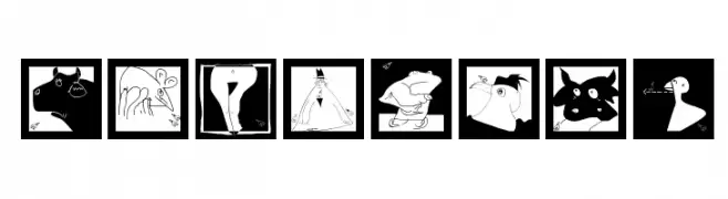
Playful, illustrated font with animal-themed characters in bold black-and-white.
![MouseArt تنزيل الخطوط]() تنزيل 128 التنزيلات@WebFont
تنزيل 128 التنزيلات@WebFont -
( Fonts by Manfred Klein. Free for private and charity use. Free for commercial with donation to organizations )
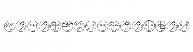
A playful and creative font with each character designed as a unique face within a circle.
![LogoFacesToolbox تنزيل الخطوط]() تنزيل 128 التنزيلات@WebFont
تنزيل 128 التنزيلات@WebFont -
![Raundi Regular تنزيل الخطوط]() تنزيل 128 التنزيلات@WebFont
تنزيل 128 التنزيلات@WebFont -
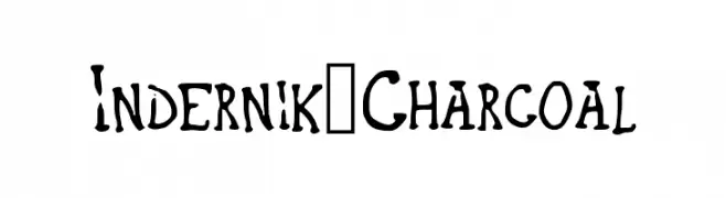
( www.indernik.com )
A bold, hand-drawn font with a charcoal sketch style.
![Indernik_Charcoal تنزيل الخطوط]() تنزيل 128 التنزيلات@WebFont
تنزيل 128 التنزيلات@WebFont -
( Fonts by Alex Tomlinson - Skyhaven Fonts - shfonts.com )
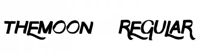
A bold, expressive font with dynamic curves and sharp edges.
![TheMoon-Regular تنزيل الخطوط]() تنزيل 128 التنزيلات@WebFont
تنزيل 128 التنزيلات@WebFont -
![Written In My Heart Shadow تنزيل الخطوط]() تنزيل 128 التنزيلات@WebFont
تنزيل 128 التنزيلات@WebFont -
( Fonts by Woodcutter Manero - www.woodcutter.es - Personal-use only. For commercial use please contact owner. )
A bold, distressed font with a hand-drawn, energetic style.
![Pain Shop تنزيل الخطوط]() تنزيل 128 التنزيلات@WebFont
تنزيل 128 التنزيلات@WebFont -
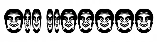
( Fonts by bob istheowl http://luc.devroye.org/bobistheowl.html )
A graphic, face-based decorative font with strong visual impact.
![ObeyBalloon تنزيل الخطوط]() تنزيل 128 التنزيلات@WebFont
تنزيل 128 التنزيلات@WebFont


ما هي أبرز الخطوط الآن؟
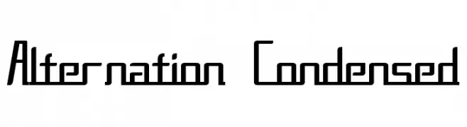
تحظى Alternation Condensed, Zebora demo, Rightside, Comic Gecko Pro and Clumsy Matilda Demo بشعبية لخطوطها النظيفة وتطبيقاتها الواسعة — من الهوية البصرية إلى الصفحات المقصودة والملصقات.
أي الخطوط تُستخدم كثيرًا في الشعارات؟
تُعد السان سيريف الهندسية (مثل Poppins وعائلات على نمط Gotham) خيارًا شائعًا لعلامات نظيفة قابلة للتوسع. ولإضفاء طابع ودي، تبقى السكريبت واليدوية خيارًا كلاسيكيًا. اجمع عنوانًا بارزًا مع خط نصي محايد لتحقيق التوازن والتميّز.
كم مرة يتم تحديث قائمة أعلى الخطوط؟
نحدّثها بانتظام استنادًا إلى التنزيلات والنشاط الفعلي. عُد إليها كثيرًا لاكتشاف النجوم الصاعدة مبكرًا.
💡 نصيحة: أضف هذه الصفحة إلى العلامات — تتغير الاتجاهات بسرعة وقد تُلهم خطوط اليوم الرائجة إعادة العلامة غدًا.