مرحبًا بك في قسم أعلى الخطوط — حيث تلتقي الشعبية بالجودة. هذه هي الخطوط الأكثر تنزيلًا واستخدامًا هذا العام من قبل مجتمعنا. إذا كنت بحاجة إلى اختيار موثوق للشعارات أو الويب أو وسائل التواصل، فابدأ من هنا.
يتميز كل خط رائج بتوازن جيد وقابلية قراءة وتعدد استخدامات. ستجد سان سيريف حديثة، وسكريبتات أنيقة، وسيريف كلاسيكية، وخطوط عرض minimal مختارة بعناية.
-
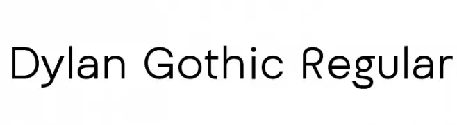
( Simon Dunford )
A modern, geometric sans-serif font with clean lines and uniform stroke width.
 تنزيل 679 التنزيلات@WebFont
 -
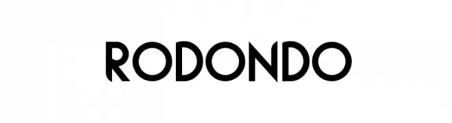
( Olly Wood - cargocollective.com/ollywood )
A bold, geometric font with sharp angles and a modern style.
![Rodondo تنزيل الخطوط]() تنزيل 679 التنزيلات@WebFont
تنزيل 679 التنزيلات@WebFont -
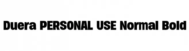
( Måns Grebäck - www.mansgreback.com )
A bold, modern font with a strong and uniform appearance.
![Duera PERSONAL USE Normal Bold تنزيل الخطوط]() تنزيل 679 التنزيلات@WebFont
تنزيل 679 التنزيلات@WebFont -
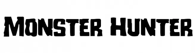
( Iconian Fonts - Daniel Zadorozny - www.iconian.com )
A bold, rugged font with jagged edges and a primal, adventurous style.
![Monster Hunter تنزيل الخطوط]() تنزيل 679 التنزيلات@WebFont
تنزيل 679 التنزيلات@WebFont -
( Fonts by Måns Grebäck )
A bold, flowing script font with elegant curves and connected letters.
![Emiral Script PERSONAL USE تنزيل الخطوط]() تنزيل 679 التنزيلات@WebFont
تنزيل 679 التنزيلات@WebFont -
-
( Fonts by Misti`s Fonts - mistifonts.com - Personal-use only. For commercial use please contact owner. )
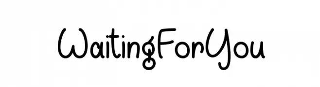
A playful, hand-drawn font with rounded edges and a whimsical style.
![WaitingForYou تنزيل الخطوط]() تنزيل 679 التنزيلات@WebFont
تنزيل 679 التنزيلات@WebFont -
( Fonts by a David Fens. Personal-use only. For commercial use please contact owner. )
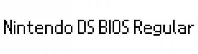
A pixelated, monospaced font with a retro video game aesthetic.
![Nintendo DS BIOS Regular تنزيل الخطوط]() تنزيل 679 التنزيلات@WebFont
تنزيل 679 التنزيلات@WebFont -
( Fonts by a Hayd. Personal-use only. For commercial use please contact owner. )
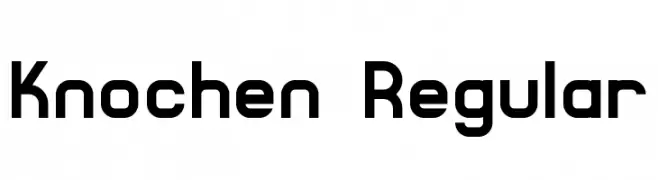
A bold, geometric font with a modern and structured design.
![Knochen Regular تنزيل الخطوط]() تنزيل 679 التنزيلات@WebFont
تنزيل 679 التنزيلات@WebFont -
( Fonts by Daniel Zadorozny - www.iconian.com - Free for personal use )
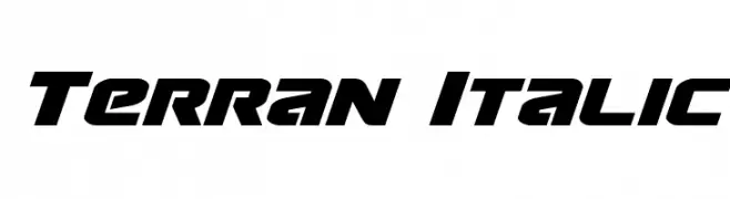
A bold, italic font with a futuristic and dynamic style.
![Terran Italic تنزيل الخطوط]() تنزيل 679 التنزيلات@WebFont
تنزيل 679 التنزيلات@WebFont -
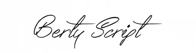
( www.tattoowoo.com )
A flowing, cursive script font with elegant, connected letters and dramatic flourishes.
![Berty Script تنزيل الخطوط]() تنزيل 679 التنزيلات@WebFont
تنزيل 679 التنزيلات@WebFont

ما هي أبرز الخطوط الآن؟
تحظى Dylan Gothic Regular, Rodondo, Duera PERSONAL USE Normal Bold, Monster Hunter and Emiral Script PERSONAL USE بشعبية لخطوطها النظيفة وتطبيقاتها الواسعة — من الهوية البصرية إلى الصفحات المقصودة والملصقات.
أي الخطوط تُستخدم كثيرًا في الشعارات؟
تُعد السان سيريف الهندسية (مثل Poppins وعائلات على نمط Gotham) خيارًا شائعًا لعلامات نظيفة قابلة للتوسع. ولإضفاء طابع ودي، تبقى السكريبت واليدوية خيارًا كلاسيكيًا. اجمع عنوانًا بارزًا مع خط نصي محايد لتحقيق التوازن والتميّز.
كم مرة يتم تحديث قائمة أعلى الخطوط؟
نحدّثها بانتظام استنادًا إلى التنزيلات والنشاط الفعلي. عُد إليها كثيرًا لاكتشاف النجوم الصاعدة مبكرًا.
💡 نصيحة: أضف هذه الصفحة إلى العلامات — تتغير الاتجاهات بسرعة وقد تُلهم خطوط اليوم الرائجة إعادة العلامة غدًا.