مرحبًا بك في قسم أعلى الخطوط — حيث تلتقي الشعبية بالجودة. هذه هي الخطوط الأكثر تنزيلًا واستخدامًا هذا العام من قبل مجتمعنا. إذا كنت بحاجة إلى اختيار موثوق للشعارات أو الويب أو وسائل التواصل، فابدأ من هنا.
يتميز كل خط رائج بتوازن جيد وقابلية قراءة وتعدد استخدامات. ستجد سان سيريف حديثة، وسكريبتات أنيقة، وسيريف كلاسيكية، وخطوط عرض minimal مختارة بعناية.
-
 تنزيل 682 التنزيلات@WebFont
 -
![Byom Light تنزيل الخطوط]() تنزيل 682 التنزيلات@WebFont
تنزيل 682 التنزيلات@WebFont -
( Fonts by Castcraft Software - opti.netii.net - check the website before use )
A classic serif font with elegant curves and balanced strokes, ideal for formal use.
![OPTIHollandseMediumAgency تنزيل الخطوط]() تنزيل 682 التنزيلات@WebFont
تنزيل 682 التنزيلات@WebFont -
( Fonts by Andrew McCluskey - nalgames.com. Personal-use only. For commercial use please contact owner. )
A bold, geometric font with sharp angles and a futuristic look.
![Tolerant Regular تنزيل الخطوط]() تنزيل 682 التنزيلات@WebFont
تنزيل 682 التنزيلات@WebFont -
( Fonts by Daniel Zadorozny - www.iconian.com )
A playful, bold font with rounded edges and a friendly appearance.
![In-House Edition Regular تنزيل الخطوط]() تنزيل 682 التنزيلات@WebFont
تنزيل 682 التنزيلات@WebFont -
-
( Copyright 2010, 2012 Adobe Systems Incorporated (http://www.adobe.com/), with Reserved Font Name 'Source'. All Rights Reserved. Source is a trademark of Adobe Systems Incorporated in the United States and/or other countries. )
A modern, monospaced font with thin strokes and uniform spacing, ideal for coding.
![Source Code Pro ExtraLight تنزيل الخطوط]() تنزيل 682 التنزيلات@WebFont
تنزيل 682 التنزيلات@WebFont -
( www.circografico.com.ar )
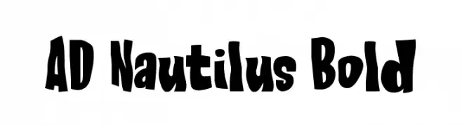
A bold, playful font with a whimsical, hand-drawn style.
![AD Nautilus Bold تنزيل الخطوط]() تنزيل 682 التنزيلات@WebFont
تنزيل 682 التنزيلات@WebFont -
( Fonts by www.dcoxy.com )
A playful, hand-drawn font with a whimsical and friendly style.
![Cheese Cake تنزيل الخطوط]() تنزيل 682 التنزيلات@WebFont
تنزيل 682 التنزيلات@WebFont -
( Fonts by www.aka-acid.com )
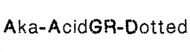
A modern, dotted font with a playful and decorative style.
![Aka-AcidGR-Dotted تنزيل الخطوط]() تنزيل 682 التنزيلات@WebFont
تنزيل 682 التنزيلات@WebFont -
( Fonts by www.kimberlygeswein.com - Kimberly Geswein )
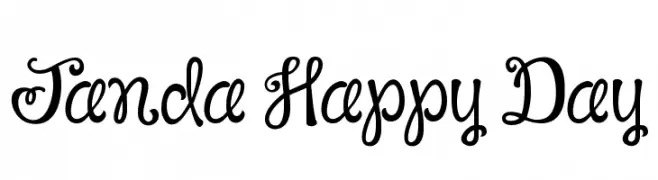
A playful, handwritten font with rounded, flowing characters and a cheerful vibe.
![Janda Happy Day تنزيل الخطوط]() تنزيل 682 التنزيلات@WebFont
تنزيل 682 التنزيلات@WebFont


ما هي أبرز الخطوط الآن؟
تحظى Please Don't Take My Man, Byom Light, OPTIHollandseMediumAgency, Tolerant Regular and In-House Edition Regular بشعبية لخطوطها النظيفة وتطبيقاتها الواسعة — من الهوية البصرية إلى الصفحات المقصودة والملصقات.
أي الخطوط تُستخدم كثيرًا في الشعارات؟
تُعد السان سيريف الهندسية (مثل Poppins وعائلات على نمط Gotham) خيارًا شائعًا لعلامات نظيفة قابلة للتوسع. ولإضفاء طابع ودي، تبقى السكريبت واليدوية خيارًا كلاسيكيًا. اجمع عنوانًا بارزًا مع خط نصي محايد لتحقيق التوازن والتميّز.
كم مرة يتم تحديث قائمة أعلى الخطوط؟
نحدّثها بانتظام استنادًا إلى التنزيلات والنشاط الفعلي. عُد إليها كثيرًا لاكتشاف النجوم الصاعدة مبكرًا.
💡 نصيحة: أضف هذه الصفحة إلى العلامات — تتغير الاتجاهات بسرعة وقد تُلهم خطوط اليوم الرائجة إعادة العلامة غدًا.