مرحبًا بك في قسم أعلى الخطوط — حيث تلتقي الشعبية بالجودة. هذه هي الخطوط الأكثر تنزيلًا واستخدامًا هذا العام من قبل مجتمعنا. إذا كنت بحاجة إلى اختيار موثوق للشعارات أو الويب أو وسائل التواصل، فابدأ من هنا.
يتميز كل خط رائج بتوازن جيد وقابلية قراءة وتعدد استخدامات. ستجد سان سيريف حديثة، وسكريبتات أنيقة، وسيريف كلاسيكية، وخطوط عرض minimal مختارة بعناية.
-
 تنزيل 152 التنزيلات@WebFont
 -
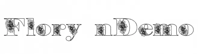
![Floryan Demo تنزيل الخطوط]() تنزيل 152 التنزيلات@WebFont
تنزيل 152 التنزيلات@WebFont -
( Fonts by Letterena Studios )
Elegant handwritten script font.
![Antariskalia Signature تنزيل الخطوط]() تنزيل 152 التنزيلات@WebFont
تنزيل 152 التنزيلات@WebFont -
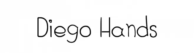
( Fonts by Diego Navarro )
A playful, handwritten font with a casual and friendly appearance.
![Diego Hands تنزيل الخطوط]() تنزيل 152 التنزيلات@WebFont
تنزيل 152 التنزيلات@WebFont -
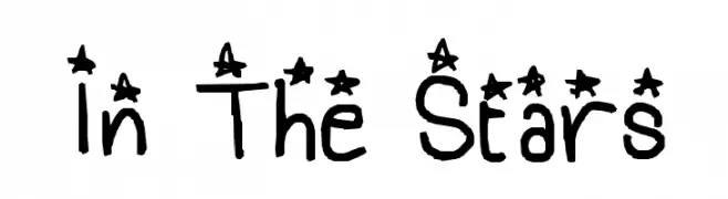
![In The Stars تنزيل الخطوط]() تنزيل 152 التنزيلات@WebFont
تنزيل 152 التنزيلات@WebFont -
( Fonts by Vladimir Nikolic )
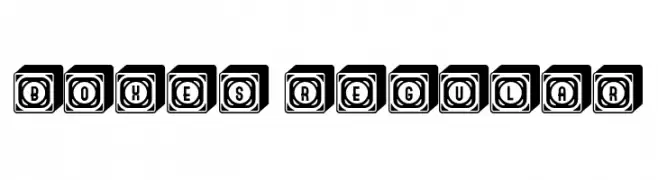
A bold, three-dimensional font with characters encased in shadowed boxes.
![Boxes Regular تنزيل الخطوط]() تنزيل 152 التنزيلات@WebFont
تنزيل 152 التنزيلات@WebFont -
( Fonts by Luke Owens - Personal-use only. For commercial use please contact owner. )
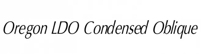
A sleek, condensed, and oblique font with a modern, dynamic style.
![Oregon LDO Condensed Oblique تنزيل الخطوط]() تنزيل 152 التنزيلات@WebFont
تنزيل 152 التنزيلات@WebFont -
( Fonts by www.kimberlygeswein.com - Kimberly Geswein )
A playful, handwritten font with a casual and dynamic style.
![KG It Aint Rocket Science تنزيل الخطوط]() تنزيل 152 التنزيلات@WebFont
تنزيل 152 التنزيلات@WebFont -
![Charger Sport SemiBold Narrow Oblique تنزيل الخطوط]() تنزيل 152 التنزيلات@WebFont
تنزيل 152 التنزيلات@WebFont -
( Fonts by Apostrophic Lab )
A wide, geometric font with a modern, digital aesthetic.
![So Wide تنزيل الخطوط]() تنزيل 152 التنزيلات@WebFont
تنزيل 152 التنزيلات@WebFont -
( Fonts by www.kimberlygeswein.com - Kimberly Geswein )
A futuristic, narrow font with angular lines and a sci-fi theme.
![KG Attack of the Robots تنزيل الخطوط]() تنزيل 152 التنزيلات@WebFont
تنزيل 152 التنزيلات@WebFont -
( Please check the owner website: http://www.billie.grosse.is-a-geek.com )
A modern, outline-style font with smooth, continuous lines and a geometric structure.
![Rupe Outline Medium تنزيل الخطوط]() تنزيل 152 التنزيلات@WebFont
تنزيل 152 التنزيلات@WebFont -
( Fonts by Fanastudio - Personal-use only. For commercial use please contact owner. )
A sophisticated and flowing script font with elegant cursive letterforms.
![Nattalia تنزيل الخطوط]() تنزيل 152 التنزيلات@WebFont
تنزيل 152 التنزيلات@WebFont -
( Fonts by Daniel Zadorozny - www.iconian.com )
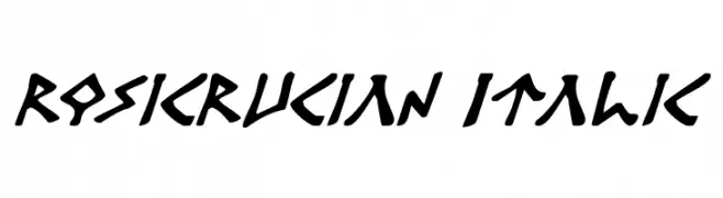
A bold, italic font with sharp angles and geometric forms.
![Rosicrucian Italic تنزيل الخطوط]() تنزيل 152 التنزيلات@WebFont
تنزيل 152 التنزيلات@WebFont -
( Juan Casco - www.juancasco.net )
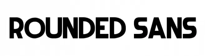
A modern, rounded sans-serif font with bold, clean lines.
![Rounded Sans تنزيل الخطوط]() تنزيل 152 التنزيلات@WebFont
تنزيل 152 التنزيلات@WebFont -
( Fonts by Niskala Huruf )
Playful handwritten script font.
![Backstay Regular تنزيل الخطوط]() تنزيل 152 التنزيلات@WebFont
تنزيل 152 التنزيلات@WebFont -
( Fonts by Iqbal Habibi - Personal-use only. For commercial use please contact owner. )
A dynamic and flowing script font with smooth, cursive strokes.
![Westhouse تنزيل الخطوط]() تنزيل 152 التنزيلات@WebFont
تنزيل 152 التنزيلات@WebFont -
![GrungeTastik تنزيل الخطوط]() تنزيل 152 التنزيلات@WebFont
تنزيل 152 التنزيلات@WebFont -
( Copyright © 2017 IBM Corp. with Reserved Font Name "Plex" )
A modern, thin, and condensed sans-serif font with excellent legibility.
![IBM Plex Sans Condensed Thin تنزيل الخطوط]() تنزيل 152 التنزيلات@WebFont
تنزيل 152 التنزيلات@WebFont -
![Fort Brewith Regular تنزيل الخطوط]() تنزيل 152 التنزيلات@WebFont
تنزيل 152 التنزيلات@WebFont -
( Iconian Fonts - Daniel Zadorozny - www.iconian.com )
A bold, italicized font with a futuristic and dynamic style.
![Jeebra Italic تنزيل الخطوط]() تنزيل 152 التنزيلات@WebFont
تنزيل 152 التنزيلات@WebFont -
( Fonts by www.fontpanda.com. Personal-use only. For commercial use please contact owner. )
A playful, handwritten font with dynamic and fluid strokes.
![wrtty تنزيل الخطوط]() تنزيل 152 التنزيلات@WebFont
تنزيل 152 التنزيلات@WebFont -
( Fonts by www.junkohanhero.com )
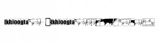
Decorative font with cow illustrations.
![IKHIOOGLAcow تنزيل الخطوط]() تنزيل 152 التنزيلات@WebFont
تنزيل 152 التنزيلات@WebFont -
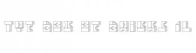
![TPF Box of Bricks 1L تنزيل الخطوط]() تنزيل 152 التنزيلات@WebFont
تنزيل 152 التنزيلات@WebFont -
( Fonts by Alifinart Studio - Personal-use only. For commercial use please contact owner. )
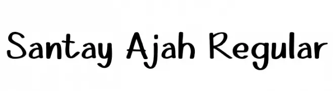
A playful, handwritten font with smooth curves and a casual style.
![Santay Ajah Regular تنزيل الخطوط]() تنزيل 152 التنزيلات@WebFont
تنزيل 152 التنزيلات@WebFont -
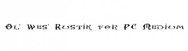
![Ol' Wes' Rustik for PC Medium تنزيل الخطوط]() تنزيل 152 التنزيلات@WebFont
تنزيل 152 التنزيلات@WebFont -
( Fonts by Dieter Steffmann )
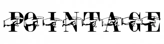
A bold serif font with barbed wire detailing for a rugged, edgy look.
![Pointage تنزيل الخطوط]() تنزيل 152 التنزيلات@WebFont
تنزيل 152 التنزيلات@WebFont -
![OKCOK تنزيل الخطوط]() تنزيل 152 التنزيلات@WebFont
تنزيل 152 التنزيلات@WebFont -
( Fonts by a Quick Brown Fox Fonts - quickbrownfoxfonts.com. Personal-use only. For commercial use please contact owner. )
A bold, hand-drawn font with an expressive and dynamic style.
![John's 1000 Hurts [Demo] تنزيل الخطوط]() تنزيل 152 التنزيلات@WebFont
تنزيل 152 التنزيلات@WebFont -
![Silvent تنزيل الخطوط]() تنزيل 152 التنزيلات@WebFont
تنزيل 152 التنزيلات@WebFont -
( Fonts by Daniel Zadorozny - www.iconian.com - Free for personal use )
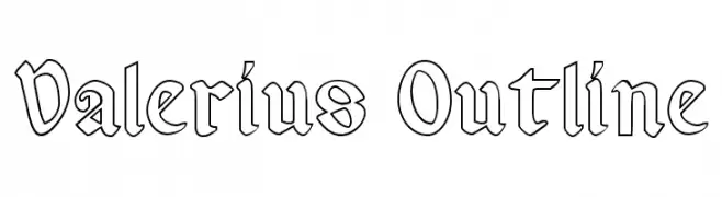
An outlined, angular blackletter-style font with sharp serifs and geometric forms.
![Valerius Outline تنزيل الخطوط]() تنزيل 152 التنزيلات@WebFont
تنزيل 152 التنزيلات@WebFont -
( Family Font Mart - www.h2o.or.jp/~orihikao/ )
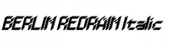
A bold, italic font with a zigzag pattern, offering a dynamic and modern look.
![BERLIN REDRAIN Italic تنزيل الخطوط]() تنزيل 152 التنزيلات@WebFont
تنزيل 152 التنزيلات@WebFont -
![Wagon Sans Two Italic تنزيل الخطوط]() تنزيل 152 التنزيلات@WebFont
تنزيل 152 التنزيلات@WebFont -
( Iconian Fonts - Daniel Zadorozny - www.iconian.com )
A futuristic, expanded italic font with a sleek and dynamic style.
![Radio Space Expanded Italic تنزيل الخطوط]() تنزيل 152 التنزيلات@WebFont
تنزيل 152 التنزيلات@WebFont -
( Fonts by Alit Design )
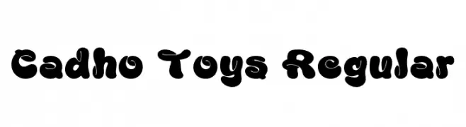
A bold, playful font with rounded, bubble-like characters.
![Cadho Toys Regular تنزيل الخطوط]() تنزيل 152 التنزيلات@WebFont
تنزيل 152 التنزيلات@WebFont


![John's 1000 Hurts [Demo] تنزيل الخطوط](https://d144mzi0q5mijx.cloudfront.net/img/J/O/Johns-1000-Hurts-Demo.webp)

ما هي أبرز الخطوط الآن؟
تحظى KR Scrappin Animals, Floryan Demo, Antariskalia Signature, Diego Hands and In The Stars بشعبية لخطوطها النظيفة وتطبيقاتها الواسعة — من الهوية البصرية إلى الصفحات المقصودة والملصقات.
أي الخطوط تُستخدم كثيرًا في الشعارات؟
تُعد السان سيريف الهندسية (مثل Poppins وعائلات على نمط Gotham) خيارًا شائعًا لعلامات نظيفة قابلة للتوسع. ولإضفاء طابع ودي، تبقى السكريبت واليدوية خيارًا كلاسيكيًا. اجمع عنوانًا بارزًا مع خط نصي محايد لتحقيق التوازن والتميّز.
كم مرة يتم تحديث قائمة أعلى الخطوط؟
نحدّثها بانتظام استنادًا إلى التنزيلات والنشاط الفعلي. عُد إليها كثيرًا لاكتشاف النجوم الصاعدة مبكرًا.
💡 نصيحة: أضف هذه الصفحة إلى العلامات — تتغير الاتجاهات بسرعة وقد تُلهم خطوط اليوم الرائجة إعادة العلامة غدًا.