مرحبًا بك في قسم أعلى الخطوط — حيث تلتقي الشعبية بالجودة. هذه هي الخطوط الأكثر تنزيلًا واستخدامًا هذا العام من قبل مجتمعنا. إذا كنت بحاجة إلى اختيار موثوق للشعارات أو الويب أو وسائل التواصل، فابدأ من هنا.
يتميز كل خط رائج بتوازن جيد وقابلية قراءة وتعدد استخدامات. ستجد سان سيريف حديثة، وسكريبتات أنيقة، وسيريف كلاسيكية، وخطوط عرض minimal مختارة بعناية.
-
 تنزيل 154 التنزيلات@WebFont
 -
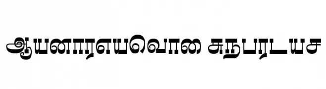
![Madhuvanthi Regular تنزيل الخطوط]() تنزيل 154 التنزيلات@WebFont
تنزيل 154 التنزيلات@WebFont -
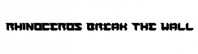
![RHINOCEROS Break THE Wall تنزيل الخطوط]() تنزيل 154 التنزيلات@WebFont
تنزيل 154 التنزيلات@WebFont -
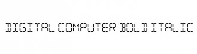
![Digital Computer Bold Italic تنزيل الخطوط]() تنزيل 154 التنزيلات@WebFont
تنزيل 154 التنزيلات@WebFont -
![BackwardsPixelized Regular تنزيل الخطوط]() تنزيل 154 التنزيلات@WebFont
تنزيل 154 التنزيلات@WebFont -
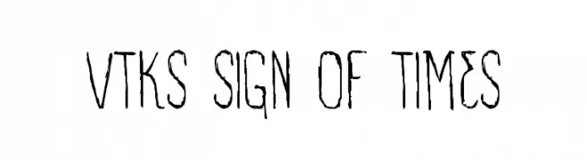
( Fonts by Douglas Vitkauskas - www.vtksdesign.com. Personal-use only. For commercial use please contact owner. )
A distressed, hand-drawn font with a vintage and rustic appeal.
![VTKS SIGN OF TIMES تنزيل الخطوط]() تنزيل 154 التنزيلات@WebFont
تنزيل 154 التنزيلات@WebFont -
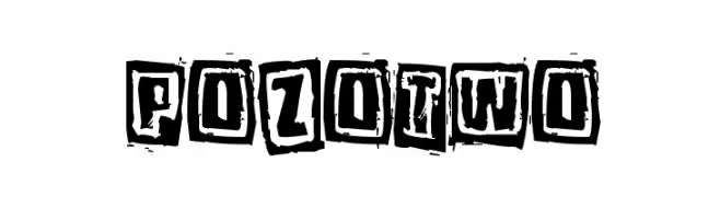
( Fonts by www.junkohanhero.com )
A bold, distressed font with a rugged, stamp-like appearance.
![Pozotwo تنزيل الخطوط]() تنزيل 154 التنزيلات@WebFont
تنزيل 154 التنزيلات@WebFont -
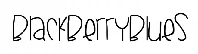
( Fonts by Des Gomez )
A playful, handwritten font with a whimsical and doodle-like style.
![BlackberryBlues تنزيل الخطوط]() تنزيل 154 التنزيلات@WebFont
تنزيل 154 التنزيلات@WebFont -
( Fonts by Udegbunam Tbj )
A bold, brush-style font with a lively, handcrafted appearance.
![Barbecue Chicken Regular تنزيل الخطوط]() تنزيل 154 التنزيلات@WebFont
تنزيل 154 التنزيلات@WebFont -
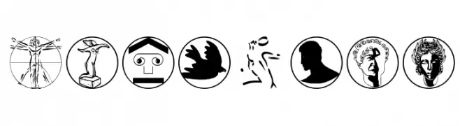
( Fonts by Manfred Klein. Free for private and charity use. Free for commercial with donation to organizations )
A fine arts-themed decorative dingbat font with detailed art-related icons.
![FineArts تنزيل الخطوط]() تنزيل 154 التنزيلات@WebFont
تنزيل 154 التنزيلات@WebFont -
( Fonts by Iconian Fonts )
A bold, playful 3D font with jagged outlines and a gothic flair.
![Count Suckula 3D تنزيل الخطوط]() تنزيل 154 التنزيلات@WebFont
تنزيل 154 التنزيلات@WebFont -
( Fonts by Manuel Viergutz - Typo Graphic Design - www.typographicdesign.de )
A grid-patterned, geometric font with a modern, digital aesthetic.
![back to heavy coat fat ground_line-h Regular تنزيل الخطوط]() تنزيل 154 التنزيلات@WebFont
تنزيل 154 التنزيلات@WebFont -
![Short Stack تنزيل الخطوط]() تنزيل 154 التنزيلات@WebFont
تنزيل 154 التنزيلات@WebFont -
( Fonts by Bumbayo Font Fabrik - bumbayo.blogspot.com )
A bold, grunge-inspired font with a distressed, edgy appearance.
![MiguelSangotischGrungeze تنزيل الخطوط]() تنزيل 154 التنزيلات@WebFont
تنزيل 154 التنزيلات@WebFont -
( Iconian Fonts - Daniel Zadorozny - www.iconian.com )
A bold, rugged font with distressed edges and a dynamic, handcrafted feel.
![Howlin' Mad Staggered تنزيل الخطوط]() تنزيل 154 التنزيلات@WebFont
تنزيل 154 التنزيلات@WebFont -
( SDFonts. http://www.angelfire.com/scifi2/sdfonts/index.html )
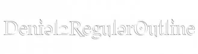
An elegant outline serif font with precise lines and classic styling.
![Denial2RegularOutline تنزيل الخطوط]() تنزيل 154 التنزيلات@WebFont
تنزيل 154 التنزيلات@WebFont -
( Fonts by Darrell Flood )
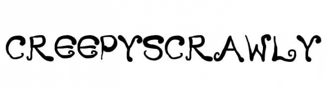
A whimsical and eerie font with playful, hand-drawn characters.
![Creepy Scrawly تنزيل الخطوط]() تنزيل 154 التنزيلات@WebFont
تنزيل 154 التنزيلات@WebFont -
![Sanity Italic تنزيل الخطوط]() تنزيل 154 التنزيلات@WebFont
تنزيل 154 التنزيلات@WebFont -
![FastenYourSeatBelt Textured تنزيل الخطوط]() تنزيل 154 التنزيلات@WebFont
تنزيل 154 التنزيلات@WebFont -
( Fonts by Creavibes Design - Personal-use only. For commercial use please contact owner. )
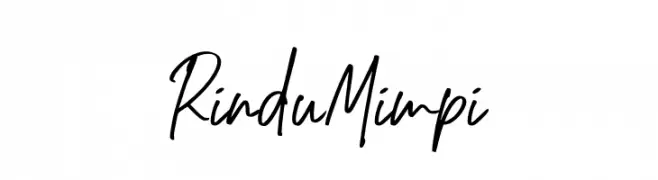
A lively and expressive handwritten font with dynamic strokes and playful characters.
![Rindu Mimpi تنزيل الخطوط]() تنزيل 154 التنزيلات@WebFont
تنزيل 154 التنزيلات@WebFont -
( Fonts by Manfred Klein. Free for private and charity use. Free for commercial with donation to organizations )
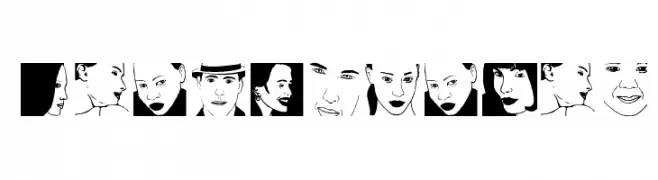
A display font composed of illustrated human faces for each character.
![BeautyFaces تنزيل الخطوط]() تنزيل 154 التنزيلات@WebFont
تنزيل 154 التنزيلات@WebFont -
( Fonts by Manfred Klein. Free for private and charity use. Free for commercial with donation to organizations )
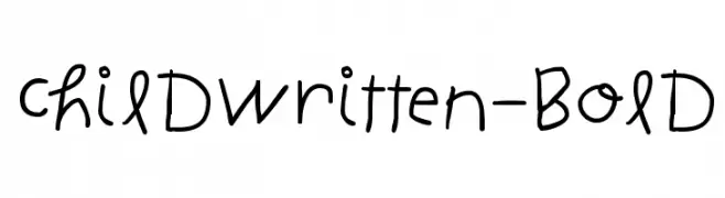
A playful, handwritten-style font with a childlike, whimsical appearance.
![ChildWritten-Bold تنزيل الخطوط]() تنزيل 154 التنزيلات@WebFont
تنزيل 154 التنزيلات@WebFont -
( NewMoleFont )
A pixelated, monospaced font with a retro digital style.
![SGK050 تنزيل الخطوط]() تنزيل 154 التنزيلات@WebFont
تنزيل 154 التنزيلات@WebFont -
( Fonts by JSH creates )
A bold, brush-textured font with a rough, hand-painted style.
![Thug Land تنزيل الخطوط]() تنزيل 154 التنزيلات@WebFont
تنزيل 154 التنزيلات@WebFont -
( Fonts by a Max Infeld - XEROGRAPHER FONTS - xerographer.blogspot.com . Personal-use only. For commercial use please contact owner. )
A bold, hand-drawn style font with dynamic, jagged strokes.
![ExpensiveSolutions تنزيل الخطوط]() تنزيل 154 التنزيلات@WebFont
تنزيل 154 التنزيلات@WebFont -
( iMM - Gianka Petracco - www.instagram.com/immcreativity/ )
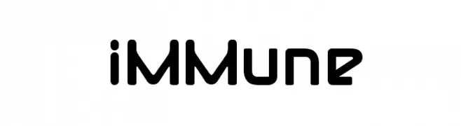
A bold, futuristic font with geometric shapes and sharp angles.
![iMMune تنزيل الخطوط]() تنزيل 154 التنزيلات@WebFont
تنزيل 154 التنزيلات@WebFont -
( Fonts by Vladimir Nikolic )
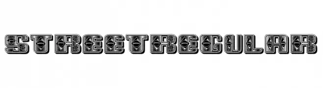
A bold, decorative font with intricate geometric patterns and a street art style.
![Street Regular تنزيل الخطوط]() تنزيل 154 التنزيلات@WebFont
تنزيل 154 التنزيلات@WebFont -
( Fonts by Daniel Zadorozny - www.iconian.com )
A bold, extra-condensed font with geometric shapes and minimal stroke contrast.
![Quickening Extra-Condensed تنزيل الخطوط]() تنزيل 154 التنزيلات@WebFont
تنزيل 154 التنزيلات@WebFont -
![GROSSFADERS CH01 تنزيل الخطوط]() تنزيل 154 التنزيلات@WebFont
تنزيل 154 التنزيلات@WebFont -
( Fonts by www.blambot.com )
A bold, italic, and futuristic font with angular, geometric characters.
![AntigravBB-Italic تنزيل الخطوط]() تنزيل 154 التنزيلات@WebFont
تنزيل 154 التنزيلات@WebFont -
( Fonts by Dan P. Lyons - Personal-use only. For commercial use please contact owner. )
A clean, modern monospace typeface ideal for coding and technical documents.
![POE Monospace تنزيل الخطوط]() تنزيل 154 التنزيلات@WebFont
تنزيل 154 التنزيلات@WebFont -
( Fonts by Abas Creative - Farhan Ramadhika - Personal-use only. For commercial use please contact owner. )
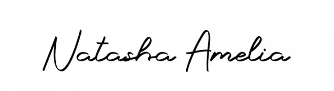
A fluid, cursive font with an elegant handwritten style.
![Natasha Amelia تنزيل الخطوط]() تنزيل 154 التنزيلات@WebFont
تنزيل 154 التنزيلات@WebFont -
( Fonts by Typologic - Fadiel Muhammad - Personal-use only. For commercial use please contact owner. )
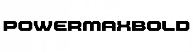
A bold, geometric font with a strong, industrial design and angular edges.
![Powermax Bold تنزيل الخطوط]() تنزيل 154 التنزيلات@WebFont
تنزيل 154 التنزيلات@WebFont -
![DLDesigns6 تنزيل الخطوط]() تنزيل 154 التنزيلات@WebFont
تنزيل 154 التنزيلات@WebFont -
( Fonts by Timur Type )
A fluid and elegant handwritten font with thin, graceful strokes.
![Saint Timothy تنزيل الخطوط]() تنزيل 154 التنزيلات@WebFont
تنزيل 154 التنزيلات@WebFont


ما هي أبرز الخطوط الآن؟
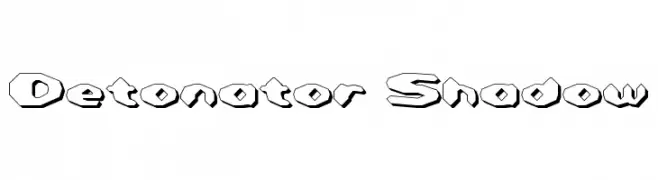
تحظى Detonator Shadow, Madhuvanthi Regular, RHINOCEROS Break THE Wall, Digital Computer Bold Italic and BackwardsPixelized Regular بشعبية لخطوطها النظيفة وتطبيقاتها الواسعة — من الهوية البصرية إلى الصفحات المقصودة والملصقات.
أي الخطوط تُستخدم كثيرًا في الشعارات؟
تُعد السان سيريف الهندسية (مثل Poppins وعائلات على نمط Gotham) خيارًا شائعًا لعلامات نظيفة قابلة للتوسع. ولإضفاء طابع ودي، تبقى السكريبت واليدوية خيارًا كلاسيكيًا. اجمع عنوانًا بارزًا مع خط نصي محايد لتحقيق التوازن والتميّز.
كم مرة يتم تحديث قائمة أعلى الخطوط؟
نحدّثها بانتظام استنادًا إلى التنزيلات والنشاط الفعلي. عُد إليها كثيرًا لاكتشاف النجوم الصاعدة مبكرًا.
💡 نصيحة: أضف هذه الصفحة إلى العلامات — تتغير الاتجاهات بسرعة وقد تُلهم خطوط اليوم الرائجة إعادة العلامة غدًا.