مرحبًا بك في قسم أعلى الخطوط — حيث تلتقي الشعبية بالجودة. هذه هي الخطوط الأكثر تنزيلًا واستخدامًا هذا العام من قبل مجتمعنا. إذا كنت بحاجة إلى اختيار موثوق للشعارات أو الويب أو وسائل التواصل، فابدأ من هنا.
يتميز كل خط رائج بتوازن جيد وقابلية قراءة وتعدد استخدامات. ستجد سان سيريف حديثة، وسكريبتات أنيقة، وسيريف كلاسيكية، وخطوط عرض minimal مختارة بعناية.
-
( Fonts by Pixel Sagas )
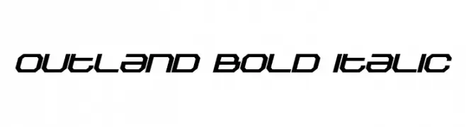
A bold, italic, futuristic font with sharp, angular design.
 تنزيل 158 التنزيلات@WebFont
 -
![Squaropen Italic تنزيل الخطوط]() تنزيل 158 التنزيلات@WebFont
تنزيل 158 التنزيلات@WebFont -
![Nowherebound تنزيل الخطوط]() تنزيل 158 التنزيلات@WebFont
تنزيل 158 التنزيلات@WebFont -
( Fonts by David Espinosa [Type Sailor] - www.facebook.com/typesailor - Personal-use only. For commercial use please contact owner. )
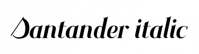
An elegant italic font with sharp serifs and dynamic letterforms.
![Santander italic تنزيل الخطوط]() تنزيل 158 التنزيلات@WebFont
تنزيل 158 التنزيلات@WebFont -
( Fonts by Neale Davidson - www.pixelsagas.com )
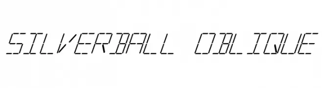
A futuristic, segmented font with an oblique slant and digital appearance.
![Silverball Oblique تنزيل الخطوط]() تنزيل 158 التنزيلات@WebFont
تنزيل 158 التنزيلات@WebFont -
( Fonts by Woodcutter Manero - http://www.woodcutter.es - Personal-use only. For commercial use please contact owner. )
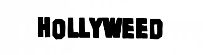
A bold, blocky font with a playful, rebellious edge and hand-cut appearance.
![Hollyweed تنزيل الخطوط]() تنزيل 158 التنزيلات@WebFont
تنزيل 158 التنزيلات@WebFont -
( Fonts by Thomas Ledin - tomledin.com )
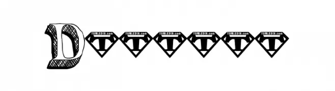
A bold, textured, three-dimensional font with a playful, hand-drawn style.
![Dullard تنزيل الخطوط]() تنزيل 158 التنزيلات@WebFont
تنزيل 158 التنزيلات@WebFont -
( Fonts by Daniel Zadorozny - www.iconian.com )
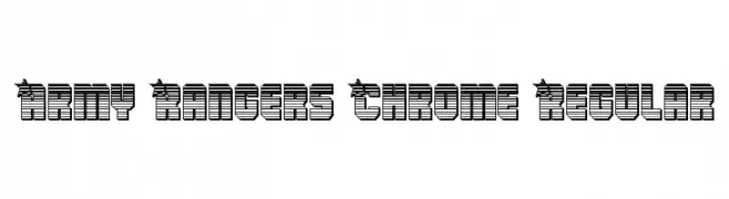
A bold, three-dimensional font with a chrome-like, industrial appearance.
![Army Rangers Chrome Regular تنزيل الخطوط]() تنزيل 158 التنزيلات@WebFont
تنزيل 158 التنزيلات@WebFont -
( Fonts by Kelvin Ma - letterpunch.blogspot.com - Personal-use only. For commercial use please contact owner. )
A whimsical, handwritten font with playful loops and heart embellishments.
![Pineapples Don't Have Sleeves تنزيل الخطوط]() تنزيل 158 التنزيلات@WebFont
تنزيل 158 التنزيلات@WebFont -
( Fonts by www.haroldsfonts.com )
A bold, silhouette-style font with a modern and artistic flair.
![ProfilerDEMO تنزيل الخطوط]() تنزيل 158 التنزيلات@WebFont
تنزيل 158 التنزيلات@WebFont -
![Cuddles Regular تنزيل الخطوط]() تنزيل 158 التنزيلات@WebFont
تنزيل 158 التنزيلات@WebFont -
![Charger Sport SemiBold Extended تنزيل الخطوط]() تنزيل 158 التنزيلات@WebFont
تنزيل 158 التنزيلات@WebFont -
![QuaelGothicHollowLefty تنزيل الخطوط]() تنزيل 158 التنزيلات@WebFont
تنزيل 158 التنزيلات@WebFont -
( William Jeovah de Medeiros - www.william.com.br )
A bold, rugged font with thick strokes and a hand-crafted appearance.
![CalangoRevi تنزيل الخطوط]() تنزيل 158 التنزيلات@WebFont
تنزيل 158 التنزيلات@WebFont -
( Fonts by BLKBK - https://blkbk.ink - Personal-use only. For commercial use please contact owner. تجاري خط )
A bold, brush-style font with dynamic, hand-painted aesthetics.
![Ultra Fresh تنزيل الخطوط]() تنزيل 158 التنزيلات
تنزيل 158 التنزيلات -
( Fonts by Kotak Kuning Studio )
A bold, handwritten-style font with rounded, playful characters.
![Fruity Stories تنزيل الخطوط]() تنزيل 158 التنزيلات@WebFont
تنزيل 158 التنزيلات@WebFont -
( Fonts by Google - Personal-use only. For commercial use please contact owner. )
A modern, italicized font with a sleek and professional appearance.
![Franko Medium Italic تنزيل الخطوط]() تنزيل 158 التنزيلات@WebFont
تنزيل 158 التنزيلات@WebFont -
( Fonts by sronstudio - Yusron Billah - Personal-use only. For commercial use please contact owner. )
A playful, bold handwritten font with rounded edges and a whimsical style.
![Spring Plum تنزيل الخطوط]() تنزيل 158 التنزيلات@WebFont
تنزيل 158 التنزيلات@WebFont -
![Luchitas تنزيل الخطوط]() تنزيل 158 التنزيلات@WebFont
تنزيل 158 التنزيلات@WebFont -
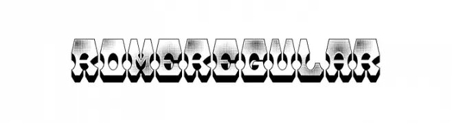
( Fonts by Vladimir Nikolic - www.creativefabrica.com/designer/vladimirnikolic/ - Personal-use only. For commercial use please contact owner. )
A bold, 3D geometric font with halftone texture and shadow effects.
![Rome Regular تنزيل الخطوط]() تنزيل 158 التنزيلات@WebFont
تنزيل 158 التنزيلات@WebFont -
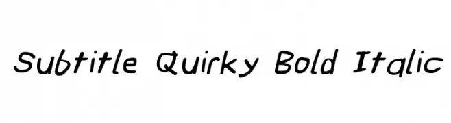
![Subtitle Quirky Bold Italic تنزيل الخطوط]() تنزيل 158 التنزيلات@WebFont
تنزيل 158 التنزيلات@WebFont -
![Icons Social Media 2 تنزيل الخطوط]() تنزيل 158 التنزيلات@WebFont
تنزيل 158 التنزيلات@WebFont -
( گالری فانت فارسی پژوهش آريانا - only compatible with Farsi and Arabic )
A traditional and elegant script with flowing curves and intricate details.
![Naskh Type II تنزيل الخطوط]() تنزيل 158 التنزيلات@WebFont
تنزيل 158 التنزيلات@WebFont -
![MSMM Titling 2018 تنزيل الخطوط]() تنزيل 158 التنزيلات@WebFont
تنزيل 158 التنزيلات@WebFont -
( Fonts by imagex )
A bold, geometric, and futuristic outlined font.
![Astral Delight Upright تنزيل الخطوط]() تنزيل 158 التنزيلات@WebFont
تنزيل 158 التنزيلات@WebFont -
( Frogii`s Fonts )
A playful, blocky font with each character enclosed in a square.
![AlphaBaby تنزيل الخطوط]() تنزيل 158 التنزيلات@WebFont
تنزيل 158 التنزيلات@WebFont -
( Fonts by Apostrophic Lab )
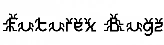
A decorative and futuristic font with abstract, bold letterforms.
![Futurex Bugz تنزيل الخطوط]() تنزيل 158 التنزيلات@WebFont
تنزيل 158 التنزيلات@WebFont -
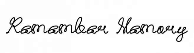
![Remember Memory تنزيل الخطوط]() تنزيل 158 التنزيلات@WebFont
تنزيل 158 التنزيلات@WebFont -
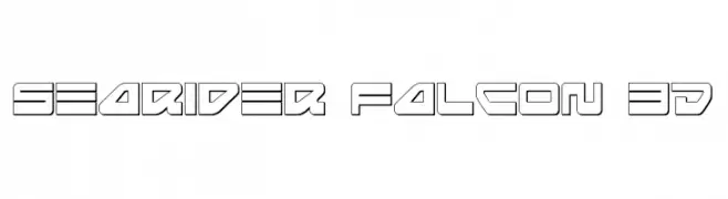
( Fonts by Daniel Zadorozny - www.iconian.com - Free for personal use )
A bold, futuristic font with a 3D outline effect and geometric design.
![Searider Falcon 3D تنزيل الخطوط]() تنزيل 158 التنزيلات@WebFont
تنزيل 158 التنزيلات@WebFont -
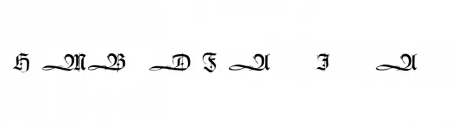
( Fonts by Dieter Steffmann )
An ornate Blackletter font with bold, angular lines and elaborate flourishes.
![HumboldtFrakturInitialen تنزيل الخطوط]() تنزيل 158 التنزيلات@WebFont
تنزيل 158 التنزيلات@WebFont -
( Fonts by www.haroldsfonts.com )
A nautical-themed symbol set inspired by maritime flags, featuring bold geometric designs.
![Maritime Flags Red تنزيل الخطوط]() تنزيل 158 التنزيلات@WebFont
تنزيل 158 التنزيلات@WebFont -
( Fonts by Jen Jones )
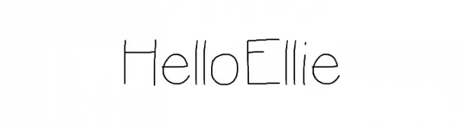
A playful, handwritten font with a casual and whimsical style.
![HelloEllie تنزيل الخطوط]() تنزيل 158 التنزيلات@WebFont
تنزيل 158 التنزيلات@WebFont -
( Fonts by Adrian Candela )
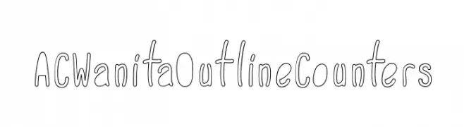
A playful, outline-style font with a hand-drawn, whimsical feel.
![ACWanitaOutlineCounters تنزيل الخطوط]() تنزيل 158 التنزيلات@WebFont
تنزيل 158 التنزيلات@WebFont -
( Fonts by Manfred Klein. Free for private and charity use. Free for commercial with donation to organizations )
Abstract geometric glyphs with clean lines and symmetrical designs.
![GeometricGlyphs تنزيل الخطوط]() تنزيل 158 التنزيلات@WebFont
تنزيل 158 التنزيلات@WebFont -
( Fonts by Ali Hamidi - Personal-use only. For commercial use please contact owner. )
A bold, flowing script font with elegant curves and dynamic style.
![Fearlessly تنزيل الخطوط]() تنزيل 158 التنزيلات@WebFont
تنزيل 158 التنزيلات@WebFont


ما هي أبرز الخطوط الآن؟
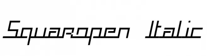
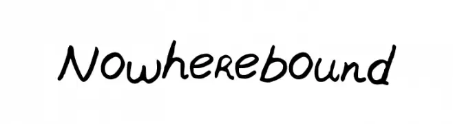
تحظى Outland Bold Italic, Squaropen Italic, Nowherebound, Santander italic and Silverball Oblique بشعبية لخطوطها النظيفة وتطبيقاتها الواسعة — من الهوية البصرية إلى الصفحات المقصودة والملصقات.
أي الخطوط تُستخدم كثيرًا في الشعارات؟
تُعد السان سيريف الهندسية (مثل Poppins وعائلات على نمط Gotham) خيارًا شائعًا لعلامات نظيفة قابلة للتوسع. ولإضفاء طابع ودي، تبقى السكريبت واليدوية خيارًا كلاسيكيًا. اجمع عنوانًا بارزًا مع خط نصي محايد لتحقيق التوازن والتميّز.
كم مرة يتم تحديث قائمة أعلى الخطوط؟
نحدّثها بانتظام استنادًا إلى التنزيلات والنشاط الفعلي. عُد إليها كثيرًا لاكتشاف النجوم الصاعدة مبكرًا.
💡 نصيحة: أضف هذه الصفحة إلى العلامات — تتغير الاتجاهات بسرعة وقد تُلهم خطوط اليوم الرائجة إعادة العلامة غدًا.