مرحبًا بك في قسم أعلى الخطوط — حيث تلتقي الشعبية بالجودة. هذه هي الخطوط الأكثر تنزيلًا واستخدامًا هذا العام من قبل مجتمعنا. إذا كنت بحاجة إلى اختيار موثوق للشعارات أو الويب أو وسائل التواصل، فابدأ من هنا.
يتميز كل خط رائج بتوازن جيد وقابلية قراءة وتعدد استخدامات. ستجد سان سيريف حديثة، وسكريبتات أنيقة، وسيريف كلاسيكية، وخطوط عرض minimal مختارة بعناية.
-
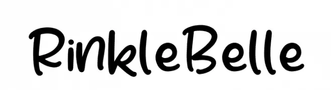
( Fonts by Perspectype Studio - Letterena.com - Personal-use only. For commercial use please contact owner. )
A playful, handwritten font with smooth, rounded edges and a casual style.
 تنزيل 808 التنزيلات@WebFont
 -
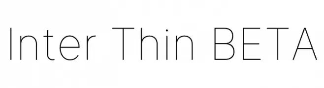
( Fonts by The Inter Project Authors - This Font Software is licensed under the SIL Open Font License. )
A modern, thin sans-serif font with clean lines and a minimalist aesthetic.
![Inter Thin BETA تنزيل الخطوط]() تنزيل 808 التنزيلات@WebFont
تنزيل 808 التنزيلات@WebFont -
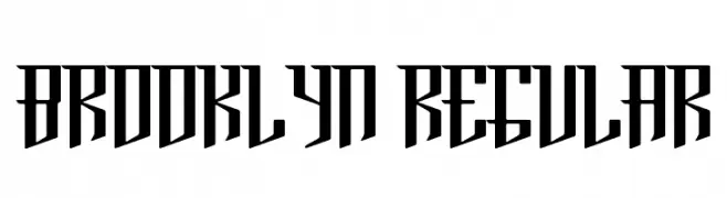
( Fonts by Paul Reis - Personal-use only. For commercial use please contact owner. )
A bold, angular font with a modern, geometric style.
![Brooklyn Regular تنزيل الخطوط]() تنزيل 808 التنزيلات@WebFont
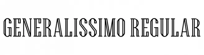
تنزيل 808 التنزيلات@WebFont -
![Generalissimo Regular تنزيل الخطوط]() تنزيل 808 التنزيلات@WebFont
تنزيل 808 التنزيلات@WebFont -
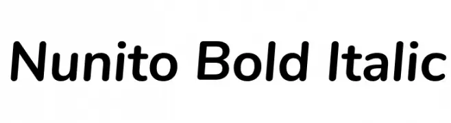
( Copyright 2014 The Nunito Project Authors (contact@sansoxygen.com) )
A bold, italic, modern sans-serif font with smooth curves and medium contrast.
![Nunito Bold Italic تنزيل الخطوط]() تنزيل 808 التنزيلات@WebFont
تنزيل 808 التنزيلات@WebFont -
-
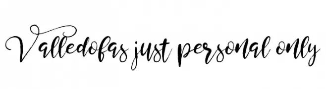
( Fonts by Alit Suarnegara )
A decorative script font with elegant swashes and flowing letterforms.
![Valledofas just personal only تنزيل الخطوط]() تنزيل 808 التنزيلات@WebFont
تنزيل 808 التنزيلات@WebFont -
( Fonts by Phitradesign )
A casual, handwritten font with smooth, fluid strokes and a playful appearance.
![phitradesign INK تنزيل الخطوط]() تنزيل 808 التنزيلات@WebFont
تنزيل 808 التنزيلات@WebFont -
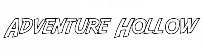
( Fonts by a Neale Davidson - www.pixelsagas.com. Personal-use only. For commercial use please contact owner. )
A bold, hollow font with a dynamic and adventurous style.
![Adventure Hollow تنزيل الخطوط]() تنزيل 808 التنزيلات@WebFont
تنزيل 808 التنزيلات@WebFont -
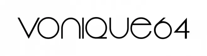
( Fonts by Sharkshock Productions----www.sharkshock.com. Personal-use only. For commercial use please contact owner. )
A sleek, modern font with geometric influences and sharp angles.
![Vonique64 تنزيل الخطوط]() تنزيل 808 التنزيلات@WebFont
تنزيل 808 التنزيلات@WebFont -
![FHAModernizedIdealClassicNC تنزيل الخطوط]() تنزيل 808 التنزيلات@WebFont
تنزيل 808 التنزيلات@WebFont

ما هي أبرز الخطوط الآن؟
تحظى Rinkle Belle, Inter Thin BETA, Brooklyn Regular, Generalissimo Regular and Nunito Bold Italic بشعبية لخطوطها النظيفة وتطبيقاتها الواسعة — من الهوية البصرية إلى الصفحات المقصودة والملصقات.
أي الخطوط تُستخدم كثيرًا في الشعارات؟
تُعد السان سيريف الهندسية (مثل Poppins وعائلات على نمط Gotham) خيارًا شائعًا لعلامات نظيفة قابلة للتوسع. ولإضفاء طابع ودي، تبقى السكريبت واليدوية خيارًا كلاسيكيًا. اجمع عنوانًا بارزًا مع خط نصي محايد لتحقيق التوازن والتميّز.
كم مرة يتم تحديث قائمة أعلى الخطوط؟
نحدّثها بانتظام استنادًا إلى التنزيلات والنشاط الفعلي. عُد إليها كثيرًا لاكتشاف النجوم الصاعدة مبكرًا.
💡 نصيحة: أضف هذه الصفحة إلى العلامات — تتغير الاتجاهات بسرعة وقد تُلهم خطوط اليوم الرائجة إعادة العلامة غدًا.