مرحبًا بك في قسم أعلى الخطوط — حيث تلتقي الشعبية بالجودة. هذه هي الخطوط الأكثر تنزيلًا واستخدامًا هذا العام من قبل مجتمعنا. إذا كنت بحاجة إلى اختيار موثوق للشعارات أو الويب أو وسائل التواصل، فابدأ من هنا.
يتميز كل خط رائج بتوازن جيد وقابلية قراءة وتعدد استخدامات. ستجد سان سيريف حديثة، وسكريبتات أنيقة، وسيريف كلاسيكية، وخطوط عرض minimal مختارة بعناية.
-
( Lettersiro Studio - Muhammad Sirojuddin - creativemarket.com/Lettersiro )
A bold, flowing script font with elegant, connected strokes.
 تنزيل 828 التنزيلات@WebFont
 -
( Andrey Kochetov - www.inglobal.ru )
A bold, rounded font with smooth curves and a modern, approachable style.
![inglobal Bold تنزيل الخطوط]() تنزيل 828 التنزيلات@WebFont
تنزيل 828 التنزيلات@WebFont -
( Fonts by www.studiotypo.com - Personal-use only. For commercial use please contact owner. )
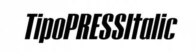
A bold, italic font with tight spacing and high contrast, ideal for dynamic designs.
![Tipo PRESS Italic تنزيل الخطوط]() تنزيل 828 التنزيلات@WebFont
تنزيل 828 التنزيلات@WebFont -
( Fonts by a Viktor Hammarberg - www.viktorh.com. Personal-use only. For commercial use please contact owner. )
A bold, condensed font with a modern and strong appearance.
![The Medic Regular تنزيل الخطوط]() تنزيل 828 التنزيلات@WebFont
تنزيل 828 التنزيلات@WebFont -
( Fonts by Daniel Zadorozny - www.iconian.com - Free for personal use )
A modern, italicized font with a sleek and dynamic design.
![Concielian Italic تنزيل الخطوط]() تنزيل 828 التنزيلات@WebFont
تنزيل 828 التنزيلات@WebFont -
-
( Fonts by Daniel Zadorozny - www.iconian.com - Free for personal use )
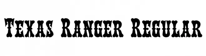
A bold, vintage font with decorative serifs and a Wild West flair.
![Texas Ranger Regular تنزيل الخطوط]() تنزيل 828 التنزيلات@WebFont
تنزيل 828 التنزيلات@WebFont -
![Sztylet Bold Oblique تنزيل الخطوط]() تنزيل 828 التنزيلات@WebFont
تنزيل 828 التنزيلات@WebFont -
( Fonts by Castcraft Software - opti.netii.net - check the website before use )
An elegant, Art Deco-inspired font with geometric shapes and clean lines.
![OPTIDelphian تنزيل الخطوط]() تنزيل 828 التنزيلات@WebFont
تنزيل 828 التنزيلات@WebFont -
![Qarmic sans free تنزيل الخطوط]() تنزيل 828 التنزيلات@WebFont
تنزيل 828 التنزيلات@WebFont -
( Fonts by Style-7 - www.styleseven.com - Personal-use only. For commercial use please contact owner. )
A pixelated, retro-style font inspired by early digital graphics.
![Computer Pixel-7 تنزيل الخطوط]() تنزيل 828 التنزيلات@WebFont
تنزيل 828 التنزيلات@WebFont


ما هي أبرز الخطوط الآن؟
تحظى Mentega, inglobal Bold, Tipo PRESS Italic, The Medic Regular and Concielian Italic بشعبية لخطوطها النظيفة وتطبيقاتها الواسعة — من الهوية البصرية إلى الصفحات المقصودة والملصقات.
أي الخطوط تُستخدم كثيرًا في الشعارات؟
تُعد السان سيريف الهندسية (مثل Poppins وعائلات على نمط Gotham) خيارًا شائعًا لعلامات نظيفة قابلة للتوسع. ولإضفاء طابع ودي، تبقى السكريبت واليدوية خيارًا كلاسيكيًا. اجمع عنوانًا بارزًا مع خط نصي محايد لتحقيق التوازن والتميّز.
كم مرة يتم تحديث قائمة أعلى الخطوط؟
نحدّثها بانتظام استنادًا إلى التنزيلات والنشاط الفعلي. عُد إليها كثيرًا لاكتشاف النجوم الصاعدة مبكرًا.
💡 نصيحة: أضف هذه الصفحة إلى العلامات — تتغير الاتجاهات بسرعة وقد تُلهم خطوط اليوم الرائجة إعادة العلامة غدًا.