مرحبًا بك في قسم أعلى الخطوط — حيث تلتقي الشعبية بالجودة. هذه هي الخطوط الأكثر تنزيلًا واستخدامًا هذا العام من قبل مجتمعنا. إذا كنت بحاجة إلى اختيار موثوق للشعارات أو الويب أو وسائل التواصل، فابدأ من هنا.
يتميز كل خط رائج بتوازن جيد وقابلية قراءة وتعدد استخدامات. ستجد سان سيريف حديثة، وسكريبتات أنيقة، وسيريف كلاسيكية، وخطوط عرض minimal مختارة بعناية.
-
( - www.facebook.com/luqmantechno )
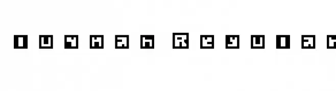
A bold, pixelated font with a retro digital aesthetic.
 تنزيل 844 التنزيلات@WebFont
 -
( Fonts by www.vicfieger.com )
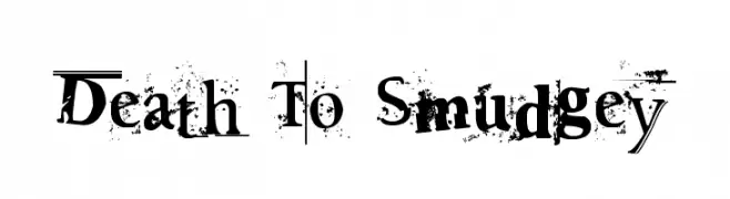
A distressed, grungy font with a bold, chaotic style.
![Death To Smudgey تنزيل الخطوط]() تنزيل 844 التنزيلات@WebFont
تنزيل 844 التنزيلات@WebFont -
( Fonts by www.typodermicfonts.com - Ray Larabie )
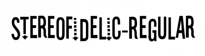
A bold, condensed, and modern geometric font with high legibility.
![Stereofidelic-Regular تنزيل الخطوط]() تنزيل 844 التنزيلات@WebFont
تنزيل 844 التنزيلات@WebFont -
( Fonts by Manfred Klein. Free for private and charity use. Free for commercial with donation to organizations )
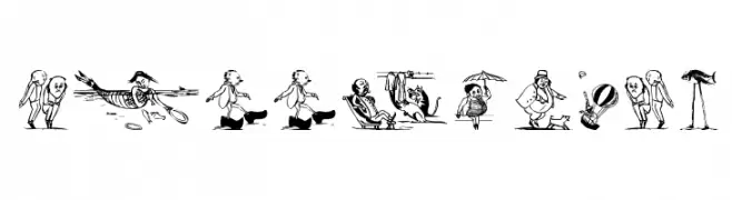
Surreal, illustrated display font with narrative scenes for each character.
![SurrealisM تنزيل الخطوط]() تنزيل 844 التنزيلات@WebFont
تنزيل 844 التنزيلات@WebFont -
( Fonts by Steve Ferrera )
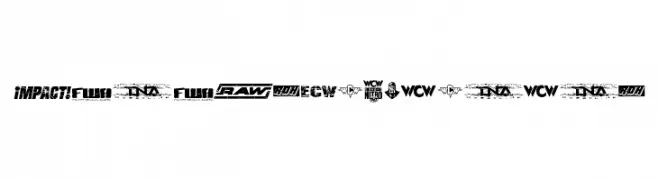
Bold, condensed, slanted sans-serif with high energy and impact.
![Pro Wrestling Logos تنزيل الخطوط]() تنزيل 844 التنزيلات@WebFont
تنزيل 844 التنزيلات@WebFont -
-
( Fonts by Tup Wanders - www.tupwanders.nl )
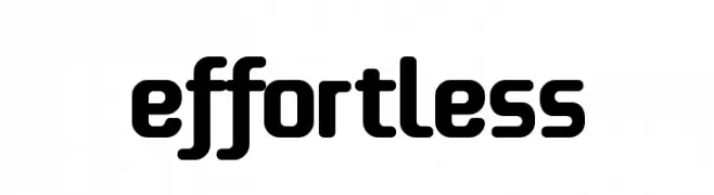
A bold, rounded font with smooth curves and uniform strokes.
![effortless تنزيل الخطوط]() تنزيل 844 التنزيلات@WebFont
تنزيل 844 التنزيلات@WebFont -
( K-Type Freebies (Free for Personal Use Only) FROM http://www.k-type.com )
A bold, geometric font with a futuristic and angular design.
![Kato تنزيل الخطوط]() تنزيل 844 التنزيلات@WebFont
تنزيل 844 التنزيلات@WebFont -
( Please check the owner website: http://www.billie.grosse.is-a-geek.com )
A bold, decorative font with abstract and artistic letterforms.
![Rupe Heavy تنزيل الخطوط]() تنزيل 844 التنزيلات@WebFont
تنزيل 844 التنزيلات@WebFont -
( Fonts by Kat`s Fun Fonts - Personal-use only. For commercial use please contact owner. )
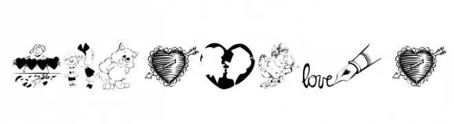
A decorative font with romantic and whimsical illustrations replacing characters.
![KR Be Mine تنزيل الخطوط]() تنزيل 844 التنزيلات@WebFont
تنزيل 844 التنزيلات@WebFont -
( Paul Lloyd Fonts )
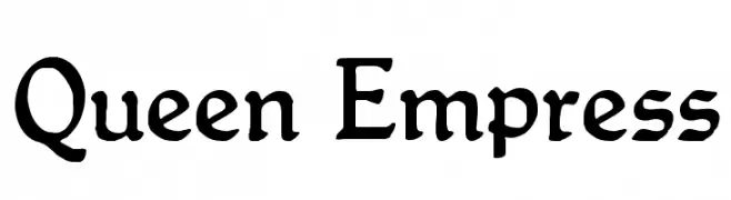
A classic serif font with elegant, vintage-inspired design.
![Queen Empress تنزيل الخطوط]() تنزيل 844 التنزيلات
تنزيل 844 التنزيلات

ما هي أبرز الخطوط الآن؟
تحظى luqman Regular, Death To Smudgey, Stereofidelic-Regular, SurrealisM and Pro Wrestling Logos بشعبية لخطوطها النظيفة وتطبيقاتها الواسعة — من الهوية البصرية إلى الصفحات المقصودة والملصقات.
أي الخطوط تُستخدم كثيرًا في الشعارات؟
تُعد السان سيريف الهندسية (مثل Poppins وعائلات على نمط Gotham) خيارًا شائعًا لعلامات نظيفة قابلة للتوسع. ولإضفاء طابع ودي، تبقى السكريبت واليدوية خيارًا كلاسيكيًا. اجمع عنوانًا بارزًا مع خط نصي محايد لتحقيق التوازن والتميّز.
كم مرة يتم تحديث قائمة أعلى الخطوط؟
نحدّثها بانتظام استنادًا إلى التنزيلات والنشاط الفعلي. عُد إليها كثيرًا لاكتشاف النجوم الصاعدة مبكرًا.
💡 نصيحة: أضف هذه الصفحة إلى العلامات — تتغير الاتجاهات بسرعة وقد تُلهم خطوط اليوم الرائجة إعادة العلامة غدًا.