مرحبًا بك في قسم أعلى الخطوط — حيث تلتقي الشعبية بالجودة. هذه هي الخطوط الأكثر تنزيلًا واستخدامًا هذا العام من قبل مجتمعنا. إذا كنت بحاجة إلى اختيار موثوق للشعارات أو الويب أو وسائل التواصل، فابدأ من هنا.
يتميز كل خط رائج بتوازن جيد وقابلية قراءة وتعدد استخدامات. ستجد سان سيريف حديثة، وسكريبتات أنيقة، وسيريف كلاسيكية، وخطوط عرض minimal مختارة بعناية.
-
( Fonts by Daniel Werneck )
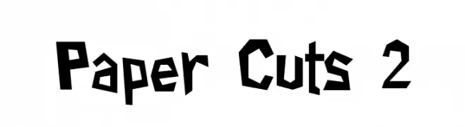
A bold, angular font with a playful, paper-cutout style.
 تنزيل 847 التنزيلات@WebFont
 -
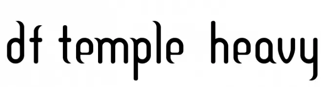
![DF Temple Heavy تنزيل الخطوط]() تنزيل 847 التنزيلات@WebFont
تنزيل 847 التنزيلات@WebFont -
( Fonts by Daniel Zadorozny - www.iconian.com )
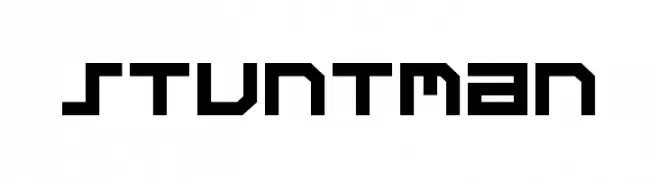
A bold, geometric font with a futuristic and digital aesthetic.
![Stuntman تنزيل الخطوط]() تنزيل 847 التنزيلات@WebFont
تنزيل 847 التنزيلات@WebFont -
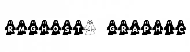
![rmghost4 graphic تنزيل الخطوط]() تنزيل 847 التنزيلات@WebFont
تنزيل 847 التنزيلات@WebFont -
( Fonts by Divide By Zero! - fonts.tom7.com )
A playful, eclectic font with a collage-like, mismatched style.
![Ransom تنزيل الخطوط]() تنزيل 847 التنزيلات@WebFont
تنزيل 847 التنزيلات@WebFont -
-
( Fonts by Jacob Fisher - www.pizzadude.dk )
A bold, geometric font with a 3D effect, ideal for retro-themed projects.
![Flashback version 3 تنزيل الخطوط]() تنزيل 847 التنزيلات@WebFont
تنزيل 847 التنزيلات@WebFont -
( Fonts by Jacob Fisher - www.pizzadude.dk )
A bold, playful font with chunky, rounded letters and a whimsical style.
![Vitamin تنزيل الخطوط]() تنزيل 847 التنزيلات@WebFont
تنزيل 847 التنزيلات@WebFont -
( Fonts by StringLabs )
A playful, bold, and handwritten-style font with a whimsical touch.
![Sunday Display تنزيل الخطوط]() تنزيل 846 التنزيلات@WebFont
تنزيل 846 التنزيلات@WebFont -
خط بواسطة defharo. For commercial use please contact the owner.
( Fastup Regular and Small Caps is available in two weights (Regular and Bold), geometric design fonts, with a rounded finish on the vertices that provides warmth, with short ascenders and descenders offers a more compact set of letters, the 22° inclination )
A bold, slanted font with thick strokes and a dynamic, energetic style.
![Fastup SC Regular تنزيل الخطوط]() تنزيل 846 التنزيلات@WebFont
تنزيل 846 التنزيلات@WebFont -
( Fonts by Fira Sans original fonts by bBox Type GmbH, Carrois Corporate GbR, & Edenspiekermann AG / Changes by Cristiano Sobral - Personal-use only. For commercial use please contact owner. )
A modern sans-serif font with a clean and balanced design.
![Trujillo Medium تنزيل الخطوط]() تنزيل 846 التنزيلات@WebFont
تنزيل 846 التنزيلات@WebFont


ما هي أبرز الخطوط الآن؟
تحظى Paper Cuts 2, DF Temple Heavy, Stuntman, rmghost4 graphic and Ransom بشعبية لخطوطها النظيفة وتطبيقاتها الواسعة — من الهوية البصرية إلى الصفحات المقصودة والملصقات.
أي الخطوط تُستخدم كثيرًا في الشعارات؟
تُعد السان سيريف الهندسية (مثل Poppins وعائلات على نمط Gotham) خيارًا شائعًا لعلامات نظيفة قابلة للتوسع. ولإضفاء طابع ودي، تبقى السكريبت واليدوية خيارًا كلاسيكيًا. اجمع عنوانًا بارزًا مع خط نصي محايد لتحقيق التوازن والتميّز.
كم مرة يتم تحديث قائمة أعلى الخطوط؟
نحدّثها بانتظام استنادًا إلى التنزيلات والنشاط الفعلي. عُد إليها كثيرًا لاكتشاف النجوم الصاعدة مبكرًا.
💡 نصيحة: أضف هذه الصفحة إلى العلامات — تتغير الاتجاهات بسرعة وقد تُلهم خطوط اليوم الرائجة إعادة العلامة غدًا.