مرحبًا بك في قسم أعلى الخطوط — حيث تلتقي الشعبية بالجودة. هذه هي الخطوط الأكثر تنزيلًا واستخدامًا هذا العام من قبل مجتمعنا. إذا كنت بحاجة إلى اختيار موثوق للشعارات أو الويب أو وسائل التواصل، فابدأ من هنا.
يتميز كل خط رائج بتوازن جيد وقابلية قراءة وتعدد استخدامات. ستجد سان سيريف حديثة، وسكريبتات أنيقة، وسيريف كلاسيكية، وخطوط عرض minimal مختارة بعناية.
-
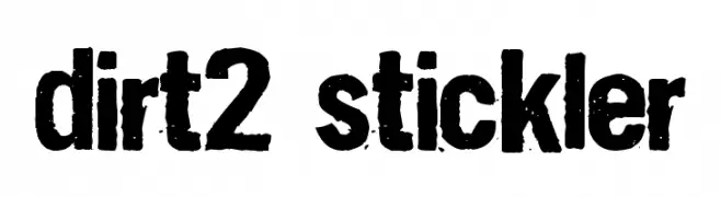
( Fonts by Andrew Hart - dirt2.com )
A bold, distressed font with a rugged, textured appearance.
 تنزيل 852 التنزيلات@WebFont
 -
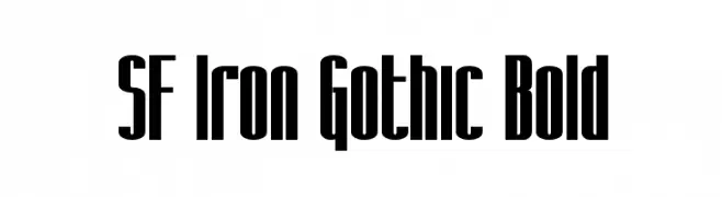
( Fonts by www.fugit-tempus.de )
A bold, Gothic-inspired font with tall, narrow characters and strong vertical emphasis.
![SF Iron Gothic Bold تنزيل الخطوط]() تنزيل 852 التنزيلات@WebFont
تنزيل 852 التنزيلات@WebFont -
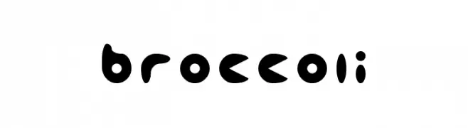
![broccoli تنزيل الخطوط]() تنزيل 852 التنزيلات@WebFont
تنزيل 852 التنزيلات@WebFont -
( Fonts by dcoxy )
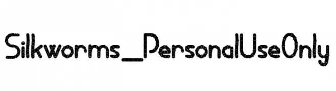
A decorative font with a segmented, silkworm-like design.
![Silkworms_PersonalUseOnly تنزيل الخطوط]() تنزيل 851 التنزيلات@WebFont
تنزيل 851 التنزيلات@WebFont -
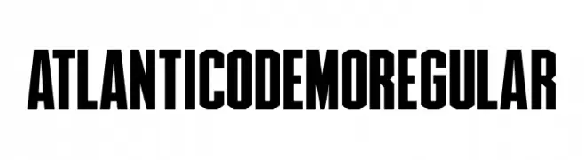
( Fonts by Indieground Design - Personal-use only. For commercial use please contact owner. )
Bold, geometric font with uniform width and angular edges.
![AtlanticoDemoRegular تنزيل الخطوط]() تنزيل 851 التنزيلات@WebFont
تنزيل 851 التنزيلات@WebFont -
-
( Fonts by YOFonts - Yasuhiro Yamaoka - yoworks.com - Personal-use only. For commercial use please contact owner. )
A modern, sleek font with elongated, narrow characters and clean lines.
![Nord تنزيل الخطوط]() تنزيل 851 التنزيلات@WebFont
تنزيل 851 التنزيلات@WebFont -
( Fonts by Christian Robertson, Adam Twardoch, & Cristiano Sobral - Personal-use only. For commercial use please contact owner. )
A bold, modern sans-serif font with clean lines and balanced spacing.
![Bert Sans Bold تنزيل الخطوط]() تنزيل 851 التنزيلات@WebFont
تنزيل 851 التنزيلات@WebFont -
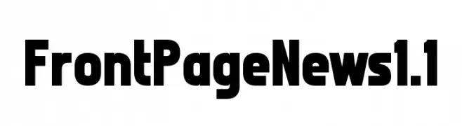
( Chequered Ink - chequered.ink/ )
A bold, modern font with strong, uniform strokes and high legibility.
![Front Page News 1.1 تنزيل الخطوط]() تنزيل 851 التنزيلات@WebFont
تنزيل 851 التنزيلات@WebFont -
( JOEBOB graphics - Joe vanderHam - www.joebob.nl )
A lively, handwritten font with smooth, flowing strokes and a dynamic style.
![Manus Smooth_TRIAL تنزيل الخطوط]() تنزيل 851 التنزيلات@WebFont
تنزيل 851 التنزيلات@WebFont -
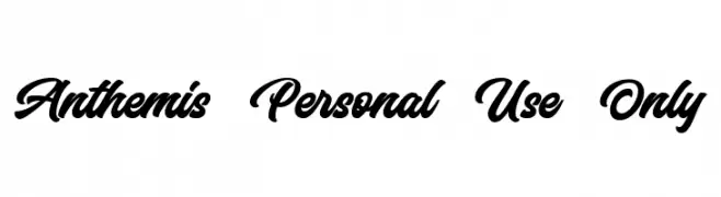
( Bangkit Tri Setiadi - creativemarket.com/bangkit.tri.setiadi )
A bold, flowing script font with elegant, cursive letterforms.
![Anthemis Personal Use Only تنزيل الخطوط]() تنزيل 851 التنزيلات@WebFont
تنزيل 851 التنزيلات@WebFont


ما هي أبرز الخطوط الآن؟
تحظى Dirt2 Stickler, SF Iron Gothic Bold, broccoli, Silkworms_PersonalUseOnly and AtlanticoDemoRegular بشعبية لخطوطها النظيفة وتطبيقاتها الواسعة — من الهوية البصرية إلى الصفحات المقصودة والملصقات.
أي الخطوط تُستخدم كثيرًا في الشعارات؟
تُعد السان سيريف الهندسية (مثل Poppins وعائلات على نمط Gotham) خيارًا شائعًا لعلامات نظيفة قابلة للتوسع. ولإضفاء طابع ودي، تبقى السكريبت واليدوية خيارًا كلاسيكيًا. اجمع عنوانًا بارزًا مع خط نصي محايد لتحقيق التوازن والتميّز.
كم مرة يتم تحديث قائمة أعلى الخطوط؟
نحدّثها بانتظام استنادًا إلى التنزيلات والنشاط الفعلي. عُد إليها كثيرًا لاكتشاف النجوم الصاعدة مبكرًا.
💡 نصيحة: أضف هذه الصفحة إلى العلامات — تتغير الاتجاهات بسرعة وقد تُلهم خطوط اليوم الرائجة إعادة العلامة غدًا.