مرحبًا بك في قسم أعلى الخطوط — حيث تلتقي الشعبية بالجودة. هذه هي الخطوط الأكثر تنزيلًا واستخدامًا هذا العام من قبل مجتمعنا. إذا كنت بحاجة إلى اختيار موثوق للشعارات أو الويب أو وسائل التواصل، فابدأ من هنا.
يتميز كل خط رائج بتوازن جيد وقابلية قراءة وتعدد استخدامات. ستجد سان سيريف حديثة، وسكريبتات أنيقة، وسيريف كلاسيكية، وخطوط عرض minimal مختارة بعناية.
-
( Copyright (c) 2012, Pablo Impallari (www.impallari.com|impallari@gmail.com) )
A playful and friendly font with rounded, slightly condensed letterforms and thin strokes.
 تنزيل 946 التنزيلات@WebFont
 -
( Copyright (c) 2011 by Sorkin Type Co (www.sorkintype.com) )
A bold slab serif font with strong, block-like serifs and excellent readability.
![Wellfleet تنزيل الخطوط]() تنزيل 946 التنزيلات@WebFont
تنزيل 946 التنزيلات@WebFont -
( Fonts by Mans Greback - www.mawns.com )
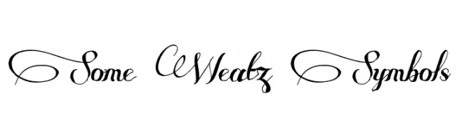
An elegant and ornate script font with flowing, decorative letterforms.
![Some Weatz Symbols تنزيل الخطوط]() تنزيل 946 التنزيلات@WebFont
تنزيل 946 التنزيلات@WebFont -
( K-Type Freebies (Free for Personal Use Only) FROM http://www.k-type.com )
A modern, clean sans-serif font with geometric letterforms and consistent stroke widths.
![Excite تنزيل الخطوط]() تنزيل 946 التنزيلات@WebFont
تنزيل 946 التنزيلات@WebFont -
( Fonts by Manfred Klein. Free for private and charity use. Free for commercial with donation to organizations )
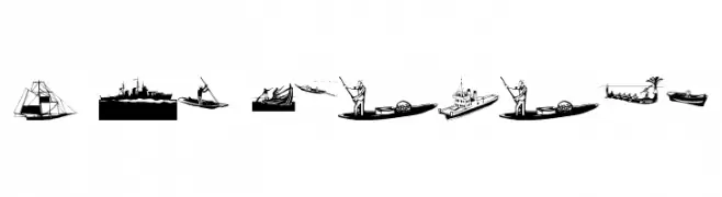
Illustrative maritime-themed display font with boat and ship drawings.
![I Am Sailing تنزيل الخطوط]() تنزيل 946 التنزيلات@WebFont
تنزيل 946 التنزيلات@WebFont -
-
( Fonts by www.pia-frauss.de )
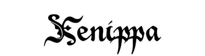
A decorative blackletter font with intricate swashes and a bold, gothic style.
![Xenippa تنزيل الخطوط]() تنزيل 946 التنزيلات@WebFont
تنزيل 946 التنزيلات@WebFont -
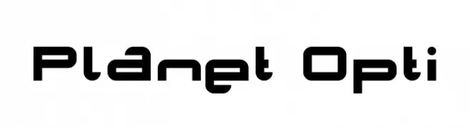
( Fonts by www.planet.dk )
A futuristic, geometric font with bold, uniform strokes and a modern aesthetic.
![Planet Opti تنزيل الخطوط]() تنزيل 946 التنزيلات@WebFont
تنزيل 946 التنزيلات@WebFont -
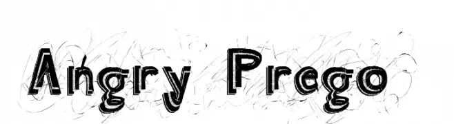
![Angry Prego تنزيل الخطوط]() تنزيل 946 التنزيلات@WebFont
تنزيل 946 التنزيلات@WebFont -
( Fonts by Altsys Metamorphosis )
A bold, Celtic-inspired font with angular strokes and artistic flair.
![CelticHand تنزيل الخطوط]() تنزيل 946 التنزيلات@WebFont
تنزيل 946 التنزيلات@WebFont -
( Fonts by Jacob Fisher - www.pizzadude.dk )
A bold, cartoonish font with thick outlines and a playful style.
![JustAnotherFont تنزيل الخطوط]() تنزيل 946 التنزيلات@WebFont
تنزيل 946 التنزيلات@WebFont


ما هي أبرز الخطوط الآن؟
تحظى LifeSavers-Regular, Wellfleet, Some Weatz Symbols, Excite and I Am Sailing بشعبية لخطوطها النظيفة وتطبيقاتها الواسعة — من الهوية البصرية إلى الصفحات المقصودة والملصقات.
أي الخطوط تُستخدم كثيرًا في الشعارات؟
تُعد السان سيريف الهندسية (مثل Poppins وعائلات على نمط Gotham) خيارًا شائعًا لعلامات نظيفة قابلة للتوسع. ولإضفاء طابع ودي، تبقى السكريبت واليدوية خيارًا كلاسيكيًا. اجمع عنوانًا بارزًا مع خط نصي محايد لتحقيق التوازن والتميّز.
كم مرة يتم تحديث قائمة أعلى الخطوط؟
نحدّثها بانتظام استنادًا إلى التنزيلات والنشاط الفعلي. عُد إليها كثيرًا لاكتشاف النجوم الصاعدة مبكرًا.
💡 نصيحة: أضف هذه الصفحة إلى العلامات — تتغير الاتجاهات بسرعة وقد تُلهم خطوط اليوم الرائجة إعادة العلامة غدًا.