مرحبًا بك في قسم أعلى الخطوط — حيث تلتقي الشعبية بالجودة. هذه هي الخطوط الأكثر تنزيلًا واستخدامًا هذا العام من قبل مجتمعنا. إذا كنت بحاجة إلى اختيار موثوق للشعارات أو الويب أو وسائل التواصل، فابدأ من هنا.
يتميز كل خط رائج بتوازن جيد وقابلية قراءة وتعدد استخدامات. ستجد سان سيريف حديثة، وسكريبتات أنيقة، وسيريف كلاسيكية، وخطوط عرض minimal مختارة بعناية.
-
 تنزيل 967 التنزيلات@WebFont
 -
( Fonts by a Max Infeld - XEROGRAPHER FONTS - xerographer.blogspot.com . Personal-use only. For commercial use please contact owner. )
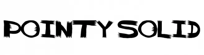
A bold, jagged font with sharp edges and a dynamic, aggressive style.
![pointy solid تنزيل الخطوط]() تنزيل 967 التنزيلات@WebFont
تنزيل 967 التنزيلات@WebFont -
( Fonts by Paul Lloyd )
A playful and whimsical font with unique, irregular letterforms.
![Casua تنزيل الخطوط]() تنزيل 967 التنزيلات@WebFont
تنزيل 967 التنزيلات@WebFont -
( Fonts by uatype.faithweb.com - UnAuthorized Type )
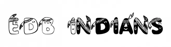
A decorative font with feather-like elements and bold outlines, ideal for creative projects.
![EDB Indians تنزيل الخطوط]() تنزيل 967 التنزيلات@WebFont
تنزيل 967 التنزيلات@WebFont -
( Fonts by Graham Meade - GemFonts )
A bold, three-dimensional font with a striped, layered design.
![Early Tickertape تنزيل الخطوط]() تنزيل 967 التنزيلات@WebFont
تنزيل 967 التنزيلات@WebFont -
-
( Fonts by wep - Wahyu Eka Prasetya - Personal-use only. For commercial use please contact owner. )
A modern, rounded font with a clean and approachable style.
![Benmono Liane تنزيل الخطوط]() تنزيل 966 التنزيلات@WebFont
تنزيل 966 التنزيلات@WebFont -
( Fonts by Febri_Creative - Febrianto Yuwono - Personal-use only. For commercial use please contact owner. )
A dynamic and flowing script font with elegant cursive letterforms.
![Amaliani تنزيل الخطوط]() تنزيل 966 التنزيلات@WebFont
تنزيل 966 التنزيلات@WebFont -
( Fonts by Behnam - Personal-use only. For commercial use please contact owner. )
A bold, classic serif font with strong strokes and elegant curves.
![XB Tabriz Bold تنزيل الخطوط]() تنزيل 966 التنزيلات@WebFont
تنزيل 966 التنزيلات@WebFont -
( Noto is a trademark of Google Inc. Noto fonts are open source. All Noto fonts are published under the SIL Open Font License, Version 1.1 )
A refined serif typeface with elegant, thin strokes and excellent readability.
![Noto Serif Light تنزيل الخطوط]() تنزيل 966 التنزيلات@WebFont
تنزيل 966 التنزيلات@WebFont -
( Studio Typo - www.studiotypo.com )
A modern, geometric font with rounded edges and balanced spacing.
![Typo Hoop Light Demo تنزيل الخطوط]() تنزيل 966 التنزيلات@WebFont
تنزيل 966 التنزيلات@WebFont


ما هي أبرز الخطوط الآن؟
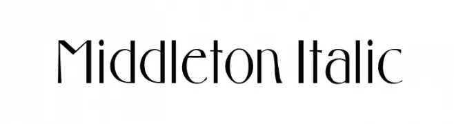
تحظى Middleton Italic, pointy solid, Casua, EDB Indians and Early Tickertape بشعبية لخطوطها النظيفة وتطبيقاتها الواسعة — من الهوية البصرية إلى الصفحات المقصودة والملصقات.
أي الخطوط تُستخدم كثيرًا في الشعارات؟
تُعد السان سيريف الهندسية (مثل Poppins وعائلات على نمط Gotham) خيارًا شائعًا لعلامات نظيفة قابلة للتوسع. ولإضفاء طابع ودي، تبقى السكريبت واليدوية خيارًا كلاسيكيًا. اجمع عنوانًا بارزًا مع خط نصي محايد لتحقيق التوازن والتميّز.
كم مرة يتم تحديث قائمة أعلى الخطوط؟
نحدّثها بانتظام استنادًا إلى التنزيلات والنشاط الفعلي. عُد إليها كثيرًا لاكتشاف النجوم الصاعدة مبكرًا.
💡 نصيحة: أضف هذه الصفحة إلى العلامات — تتغير الاتجاهات بسرعة وقد تُلهم خطوط اليوم الرائجة إعادة العلامة غدًا.