مرحبًا بك في قسم أعلى الخطوط — حيث تلتقي الشعبية بالجودة. هذه هي الخطوط الأكثر تنزيلًا واستخدامًا هذا العام من قبل مجتمعنا. إذا كنت بحاجة إلى اختيار موثوق للشعارات أو الويب أو وسائل التواصل، فابدأ من هنا.
يتميز كل خط رائج بتوازن جيد وقابلية قراءة وتعدد استخدامات. ستجد سان سيريف حديثة، وسكريبتات أنيقة، وسيريف كلاسيكية، وخطوط عرض minimal مختارة بعناية.
-
( Fonts by HPLHS Prop Fonts - Andrew H. Leman http://www.cthulhulives.org/toybox/propdocs/propfonts.html )
A classic serif font with a vintage, hand-crafted appearance.
 تنزيل 989 التنزيلات@WebFont
 -
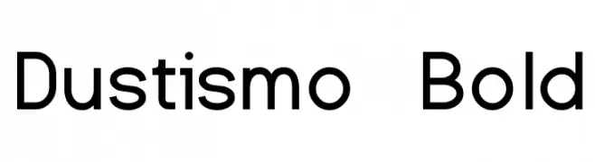
( Fonts by Dustin Norlander - www.cheapskatefonts.com )
A bold, modern sans-serif font with clean lines and balanced proportions.
![Dustismo Bold تنزيل الخطوط]() تنزيل 989 التنزيلات@WebFont
تنزيل 989 التنزيلات@WebFont -
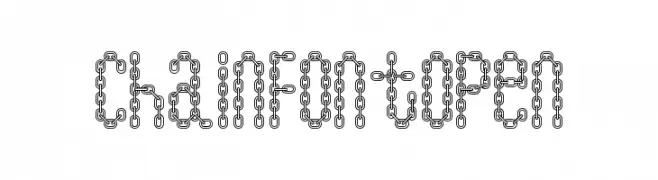
( Fonts by Daniel Gauthier )
A decorative font with characters designed as chain links, offering a bold and industrial look.
![ChainFontOpen تنزيل الخطوط]() تنزيل 989 التنزيلات@WebFont
تنزيل 989 التنزيلات@WebFont -
![Benevento!]() تنزيل 989 التنزيلات@WebFont
تنزيل 989 التنزيلات@WebFont -
( Fonts by Digital Graphics Labs - www.digitalgraphiclabs.com )
A bold, strong font with thick strokes and rounded edges.
![Incite تنزيل الخطوط]() تنزيل 989 التنزيلات@WebFont
تنزيل 989 التنزيلات@WebFont -
-
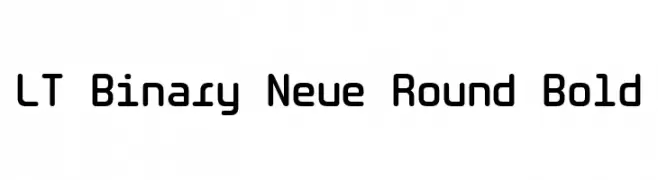
( Fonts by LyonsType )
A bold, rounded, and modern font with smooth curves and consistent stroke thickness.
![LT Binary Neue Round Bold تنزيل الخطوط]() تنزيل 988 التنزيلات@WebFont
تنزيل 988 التنزيلات@WebFont -
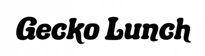
( Fonts by Fenny Wiryani - Personal-use only. For commercial use please contact owner. )
A bold, playful font with rounded edges and a slightly condensed style.
![Gecko Lunch تنزيل الخطوط]() تنزيل 988 التنزيلات@WebFont
تنزيل 988 التنزيلات@WebFont -
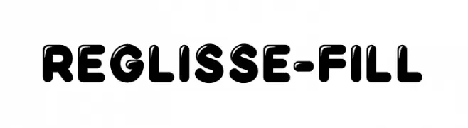
( Fonts by Youssef Habchi - youssef-habchi.com - Personal-use only. For commercial use please contact owner. )
A bold, playful font with rounded edges and a filled appearance, perfect for fun designs.
![Reglisse-Fill تنزيل الخطوط]() تنزيل 988 التنزيلات@WebFont
تنزيل 988 التنزيلات@WebFont -
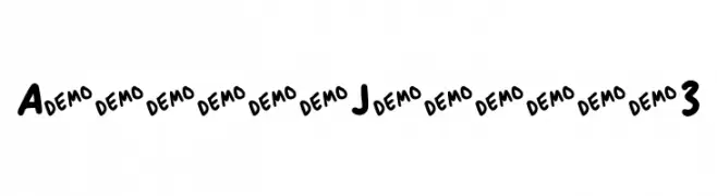
![Anitype Journal 3 تنزيل الخطوط]() تنزيل 988 التنزيلات@WebFont
تنزيل 988 التنزيلات@WebFont -
( Fonts by CannotIntoSpaceFonts - KineticPlasma Fonts - Personal-use only. For commercial use please contact owner. )
A bold, extended font with a mechanical and industrial aesthetic.
![Mechanical Bold Extended تنزيل الخطوط]() تنزيل 988 التنزيلات@WebFont
تنزيل 988 التنزيلات@WebFont


ما هي أبرز الخطوط الآن؟
تحظى OldstyleHPLHS-Regular, Dustismo Bold, ChainFontOpen, Benevento!" and Incite بشعبية لخطوطها النظيفة وتطبيقاتها الواسعة — من الهوية البصرية إلى الصفحات المقصودة والملصقات.
أي الخطوط تُستخدم كثيرًا في الشعارات؟
تُعد السان سيريف الهندسية (مثل Poppins وعائلات على نمط Gotham) خيارًا شائعًا لعلامات نظيفة قابلة للتوسع. ولإضفاء طابع ودي، تبقى السكريبت واليدوية خيارًا كلاسيكيًا. اجمع عنوانًا بارزًا مع خط نصي محايد لتحقيق التوازن والتميّز.
كم مرة يتم تحديث قائمة أعلى الخطوط؟
نحدّثها بانتظام استنادًا إلى التنزيلات والنشاط الفعلي. عُد إليها كثيرًا لاكتشاف النجوم الصاعدة مبكرًا.
💡 نصيحة: أضف هذه الصفحة إلى العلامات — تتغير الاتجاهات بسرعة وقد تُلهم خطوط اليوم الرائجة إعادة العلامة غدًا.