مرحبًا بك في قسم أعلى الخطوط — حيث تلتقي الشعبية بالجودة. هذه هي الخطوط الأكثر تنزيلًا واستخدامًا هذا العام من قبل مجتمعنا. إذا كنت بحاجة إلى اختيار موثوق للشعارات أو الويب أو وسائل التواصل، فابدأ من هنا.
يتميز كل خط رائج بتوازن جيد وقابلية قراءة وتعدد استخدامات. ستجد سان سيريف حديثة، وسكريبتات أنيقة، وسيريف كلاسيكية، وخطوط عرض minimal مختارة بعناية.
-
( Fonts by Christopher Hansen )
A bold, hand-drawn font with dynamic, irregular strokes for a rebellious look.
 تنزيل 1026 التنزيلات@WebFont
 -
( Fonts by Jacob Fisher - www.pizzadude.dk )
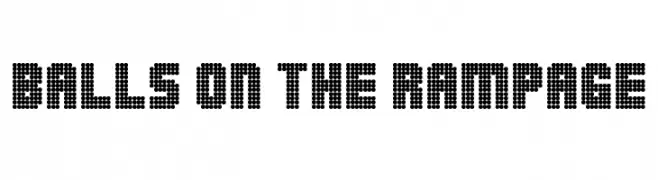
A bold, dotted font with a pixelated, digital appearance.
![Balls on the rampage تنزيل الخطوط]() تنزيل 1026 التنزيلات@WebFont
تنزيل 1026 التنزيلات@WebFont -
( Copyright 2019 The Bevietnam Project Authors (https://github.com/bettergui/beVietnam) )
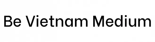
A modern, geometric sans-serif typeface with balanced proportions and clear readability.
![Be Vietnam Medium تنزيل الخطوط]() تنزيل 1025 التنزيلات@WebFont
تنزيل 1025 التنزيلات@WebFont -
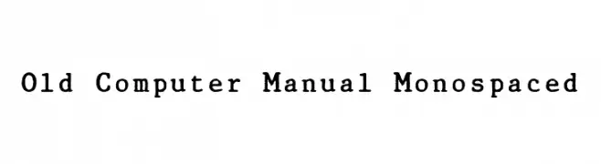
![Old Computer Manual Monospaced تنزيل الخطوط]() تنزيل 1025 التنزيلات@WebFont
تنزيل 1025 التنزيلات@WebFont -
( Zetafonts - www.zetafonts.com )
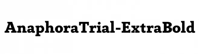
A bold and robust font with strong, thick strokes for a confident and authoritative look.
![AnaphoraTrial-ExtraBold تنزيل الخطوط]() تنزيل 1025 التنزيلات@WebFont
تنزيل 1025 التنزيلات@WebFont -
-
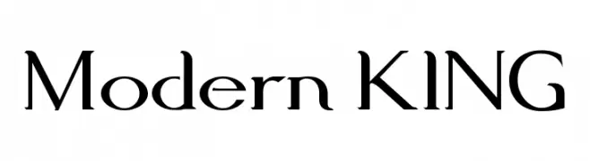
( Fonts by Rawad Saghir - www.behance.net/rawadsaghir - Personal-use only. For commercial use please contact owner. )
A sophisticated serif font with high contrast and elegant styling.
![Modern KING تنزيل الخطوط]() تنزيل 1025 التنزيلات@WebFont
تنزيل 1025 التنزيلات@WebFont -
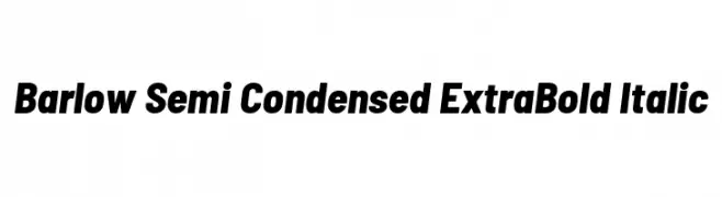
( Copyright 2017 The Barlow Project Authors (https://github.com/jpt/barlow) )
A modern, semi-condensed, extra bold italic typeface with clean lines and dynamic style.
![Barlow Semi Condensed ExtraBold Italic تنزيل الخطوط]() تنزيل 1025 التنزيلات@WebFont
تنزيل 1025 التنزيلات@WebFont -
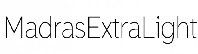
( Fonts by a www.fontfabric.com. Personal-use only. For commercial use please contact owner. )
A modern, extra light sans-serif font with clean lines and uniform spacing.
![MadrasExtraLight تنزيل الخطوط]() تنزيل 1025 التنزيلات@WebFont
تنزيل 1025 التنزيلات@WebFont -
( Fonts by a Max Infeld - XEROGRAPHER FONTS - xerographer.blogspot.com . Personal-use only. For commercial use please contact owner. )
A bold, rounded font with a playful, retro 1990s aesthetic.
![AlternativeNineties تنزيل الخطوط]() تنزيل 1025 التنزيلات@WebFont
تنزيل 1025 التنزيلات@WebFont -
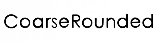
![CoarseRounded تنزيل الخطوط]() تنزيل 1025 التنزيلات@WebFont
تنزيل 1025 التنزيلات@WebFont

ما هي أبرز الخطوط الآن؟
تحظى Raiderz, Balls on the rampage, Be Vietnam Medium, Old Computer Manual Monospaced and AnaphoraTrial-ExtraBold بشعبية لخطوطها النظيفة وتطبيقاتها الواسعة — من الهوية البصرية إلى الصفحات المقصودة والملصقات.
أي الخطوط تُستخدم كثيرًا في الشعارات؟
تُعد السان سيريف الهندسية (مثل Poppins وعائلات على نمط Gotham) خيارًا شائعًا لعلامات نظيفة قابلة للتوسع. ولإضفاء طابع ودي، تبقى السكريبت واليدوية خيارًا كلاسيكيًا. اجمع عنوانًا بارزًا مع خط نصي محايد لتحقيق التوازن والتميّز.
كم مرة يتم تحديث قائمة أعلى الخطوط؟
نحدّثها بانتظام استنادًا إلى التنزيلات والنشاط الفعلي. عُد إليها كثيرًا لاكتشاف النجوم الصاعدة مبكرًا.
💡 نصيحة: أضف هذه الصفحة إلى العلامات — تتغير الاتجاهات بسرعة وقد تُلهم خطوط اليوم الرائجة إعادة العلامة غدًا.