مرحبًا بك في قسم أعلى الخطوط — حيث تلتقي الشعبية بالجودة. هذه هي الخطوط الأكثر تنزيلًا واستخدامًا هذا العام من قبل مجتمعنا. إذا كنت بحاجة إلى اختيار موثوق للشعارات أو الويب أو وسائل التواصل، فابدأ من هنا.
يتميز كل خط رائج بتوازن جيد وقابلية قراءة وتعدد استخدامات. ستجد سان سيريف حديثة، وسكريبتات أنيقة، وسيريف كلاسيكية، وخطوط عرض minimal مختارة بعناية.
-
( گالری فانت فارسی پژوهش آريانا - only compatible with Farsi and Arabic )
A bold, geometric font with sharp angles and a modern aesthetic.
 تنزيل 224 التنزيلات@WebFont
 -
( Fonts by Mikrojihad Inc - www.behance.net/mikrojihad - Personal-use only. For commercial use please contact owner. )
A bold, geometric font with angular shapes and a double-line effect.
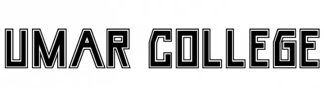
![Umar College تنزيل الخطوط]() تنزيل 224 التنزيلات@WebFont
تنزيل 224 التنزيلات@WebFont -
( Fonts by Haidi Shabrina )
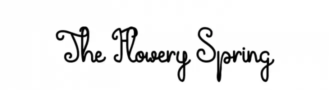
A whimsical script font with looping, interconnected letters and decorative swirls.
![The Flowery Spring تنزيل الخطوط]() تنزيل 224 التنزيلات@WebFont
تنزيل 224 التنزيلات@WebFont -
( Fonts by Daniel Zadorozny - www.iconian.com )
A bold, geometric font with a three-dimensional shadow effect.
![Realpolitik Shadow تنزيل الخطوط]() تنزيل 224 التنزيلات@WebFont
تنزيل 224 التنزيلات@WebFont -
( Fonts by Here Be Monsters )
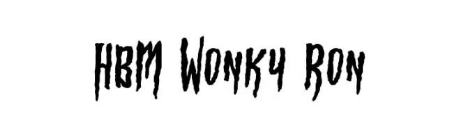
A quirky, hand-drawn font with irregular, jagged strokes.
![HBM Wonky Ron تنزيل الخطوط]() تنزيل 224 التنزيلات@WebFont
تنزيل 224 التنزيلات@WebFont -
( Fonts by www.blambot.com )
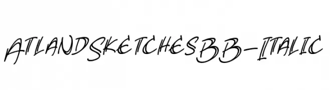
A dynamic, italicized handwritten font with a sketch-like appearance.
![AtlandSketchesBB-Italic تنزيل الخطوط]() تنزيل 224 التنزيلات@WebFont
تنزيل 224 التنزيلات@WebFont -
![font bottons music pro تنزيل الخطوط]() تنزيل 224 التنزيلات@WebFont
تنزيل 224 التنزيلات@WebFont -
( Fonts by Zetafonts - Personal-use only. For commercial use please contact owner. )
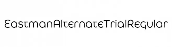
A modern geometric sans-serif font with rounded edges and consistent stroke width.
![Eastman Alternate Trial Regular تنزيل الخطوط]() تنزيل 224 التنزيلات@WebFont
تنزيل 224 التنزيلات@WebFont -
( Fonts by Vladimir Nikolic - www.creativefabrica.com/designer/vladimirnikolic/ - Personal-use only. For commercial use please contact owner. )
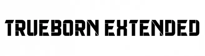
A bold, geometric font with a futuristic and industrial style.
![Trueborn Extended تنزيل الخطوط]() تنزيل 224 التنزيلات@WebFont
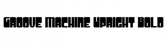
تنزيل 224 التنزيلات@WebFont -
![Groove Machine Upright Bold تنزيل الخطوط]() تنزيل 224 التنزيلات@WebFont
تنزيل 224 التنزيلات@WebFont -
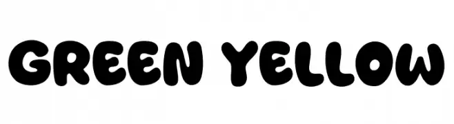
( Fonts by Khurasan )
A bold, rounded, and playful font with a bubbly appearance.
![Green Yellow تنزيل الخطوط]() تنزيل 224 التنزيلات@WebFont
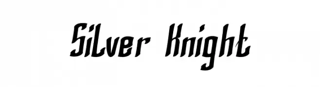
تنزيل 224 التنزيلات@WebFont -
![Silver Knight تنزيل الخطوط]() تنزيل 224 التنزيلات@WebFont
تنزيل 224 التنزيلات@WebFont -
( Fonts by Iconian Fonts )
A bold, 3D italic font with a futuristic and dynamic style.
![Master Breaker 3D Italic تنزيل الخطوط]() تنزيل 224 التنزيلات@WebFont
تنزيل 224 التنزيلات@WebFont -
( Fonts by Manfred Klein - manfred-klein.ina-mar.com )
A hand-drawn, woodcut-style decorative font with circular outlines.
![WoodcuttedCapsFS تنزيل الخطوط]() تنزيل 224 التنزيلات@WebFont
تنزيل 224 التنزيلات@WebFont -
( Fonts by Nicki Throndsen - www.throndsendesigns.com )
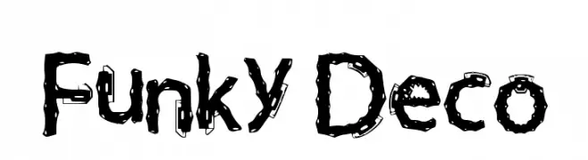
A playful, decorative font with bold, swirling patterns.
![Funky Deco تنزيل الخطوط]() تنزيل 224 التنزيلات@WebFont
تنزيل 224 التنزيلات@WebFont -
( Fonts by Astigmatic One Eye Typographic Institute - Brian J. Bonislawsky - astigmatic.com )
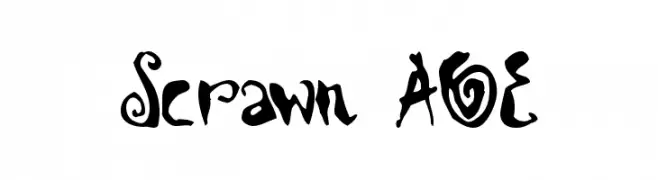
A playful, hand-drawn font with quirky, artistic flourishes.
![Scrawn AOE تنزيل الخطوط]() تنزيل 224 التنزيلات@WebFont
تنزيل 224 التنزيلات@WebFont -
( Fonts by Allouse Studio - Personal-use only. For commercial use please contact owner. )
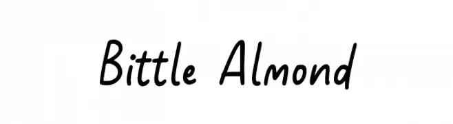
A playful, casual handwritten font with smooth curves and consistent strokes.
![Bittle Almond تنزيل الخطوط]() تنزيل 224 التنزيلات@WebFont
تنزيل 224 التنزيلات@WebFont -
![TokyoSquare تنزيل الخطوط]() تنزيل 224 التنزيلات@WebFont
تنزيل 224 التنزيلات@WebFont -
![SF Florencesans SC Bold Italic تنزيل الخطوط]() تنزيل 224 التنزيلات@WebFont
تنزيل 224 التنزيلات@WebFont -
( Font by Sven Stuber - www.superlooper.de )
A bold, pixelated typeface with a retro digital aesthetic.
![superdigital تنزيل الخطوط]() تنزيل 224 التنزيلات@WebFont
تنزيل 224 التنزيلات@WebFont -
( Fonts by www.norfok.com - Norfok® Incredible Font Design - Thomas W. Otto )
A bold, abstract font with tribal-inspired curves and angles.
![Bullskrit NFI تنزيل الخطوط]() تنزيل 224 التنزيلات@WebFont
تنزيل 224 التنزيلات@WebFont -
( truefonts.blogspot.com )
A bold, decorative font with star motifs integrated into each character.
![Rock X Start tfb تنزيل الخطوط]() تنزيل 224 التنزيلات@WebFont
تنزيل 224 التنزيلات@WebFont -
( Fonts by Geronimo Fonts - Personal-use only. For commercial use please contact owner. )
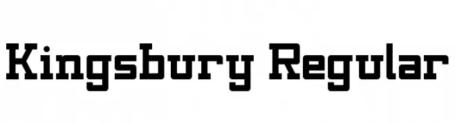
A bold, structured font with geometric shapes and slab serif elements, offering a vintage yet modern appeal.
![Kingsbury Regular تنزيل الخطوط]() تنزيل 224 التنزيلات@WebFont
تنزيل 224 التنزيلات@WebFont -
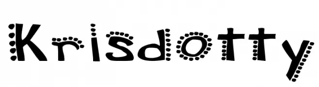
![Krisdotty تنزيل الخطوط]() تنزيل 224 التنزيلات@WebFont
تنزيل 224 التنزيلات@WebFont -
( Fonts by Klaus Johansen - www.listemageren.dK )
A playful, domino-themed font with italicized, outlined characters.
![Domino flad kursiv omrids تنزيل الخطوط]() تنزيل 224 التنزيلات@WebFont
تنزيل 224 التنزيلات@WebFont -
( Fonts by Nathatype )
A bold, hand-drawn font with rugged, organic strokes.
![Biloner تنزيل الخطوط]() تنزيل 224 التنزيلات@WebFont
تنزيل 224 التنزيلات@WebFont -
( Fonts by Apostrophic Lab )
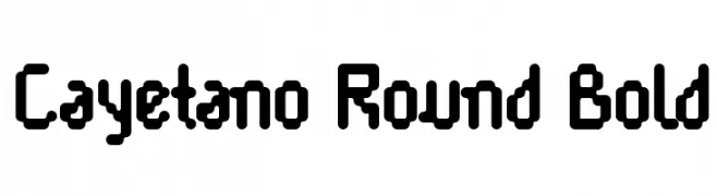
A bold, rounded font with a playful and modern style.
![Cayetano Round Bold تنزيل الخطوط]() تنزيل 224 التنزيلات@WebFont
تنزيل 224 التنزيلات@WebFont -
![Bamum Symbols 1 تنزيل الخطوط]() تنزيل 224 التنزيلات@WebFont
تنزيل 224 التنزيلات@WebFont -
( Riskiansyah Ilyas )
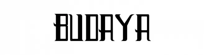
A bold, modern font with Gothic influences and high contrast strokes.
![Budaya تنزيل الخطوط]() تنزيل 224 التنزيلات@WebFont
تنزيل 224 التنزيلات@WebFont -
( Fonts by Dan P. Lyons - Personal-use only. For commercial use please contact owner. )
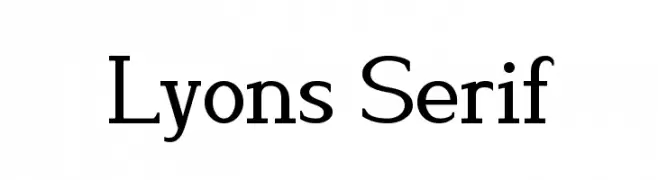
A classic serif typeface with elegant and balanced letterforms.
![Lyons Serif تنزيل الخطوط]() تنزيل 224 التنزيلات@WebFont
تنزيل 224 التنزيلات@WebFont -
( Fonts by www.fontalicious.com )
A bold, playful font with rounded outlines and a cartoonish style.
![Woggle تنزيل الخطوط]() تنزيل 224 التنزيلات@WebFont
تنزيل 224 التنزيلات@WebFont -
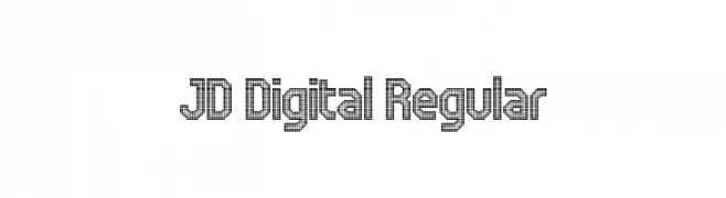
![JD Digital Regular تنزيل الخطوط]() تنزيل 224 التنزيلات@WebFont
تنزيل 224 التنزيلات@WebFont -
( pointlab studio - creativemarket.com/pointlab )
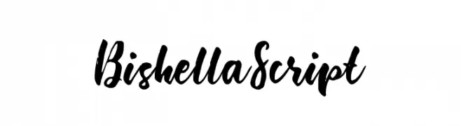
A bold, expressive script font with a hand-painted, brush-like appearance.
![BishellaScript تنزيل الخطوط]() تنزيل 224 التنزيلات@WebFont
تنزيل 224 التنزيلات@WebFont -
( Fonts by Steve Cloutier - www.cloutierfontes.ca )
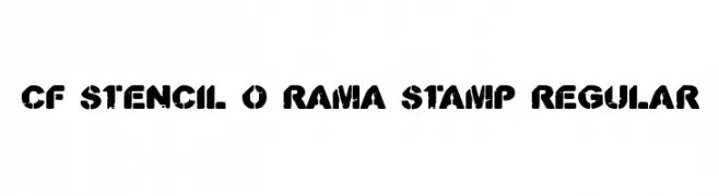
A bold, distressed stencil font with a vintage, industrial feel.
![CF Stencil O Rama Stamp Regular تنزيل الخطوط]() تنزيل 224 التنزيلات@WebFont
تنزيل 224 التنزيلات@WebFont -
( Fonts by Style-7 - www.styleseven.com - Personal-use only. For commercial use please contact owner. )
A pixelated, neon-inspired font with a retro digital aesthetic.
![Neon Pixel-7 تنزيل الخطوط]() تنزيل 223 التنزيلات@WebFont
تنزيل 223 التنزيلات@WebFont


ما هي أبرز الخطوط الآن؟
تحظى Bolbol I, Umar College, The Flowery Spring, Realpolitik Shadow and HBM Wonky Ron بشعبية لخطوطها النظيفة وتطبيقاتها الواسعة — من الهوية البصرية إلى الصفحات المقصودة والملصقات.
أي الخطوط تُستخدم كثيرًا في الشعارات؟
تُعد السان سيريف الهندسية (مثل Poppins وعائلات على نمط Gotham) خيارًا شائعًا لعلامات نظيفة قابلة للتوسع. ولإضفاء طابع ودي، تبقى السكريبت واليدوية خيارًا كلاسيكيًا. اجمع عنوانًا بارزًا مع خط نصي محايد لتحقيق التوازن والتميّز.
كم مرة يتم تحديث قائمة أعلى الخطوط؟
نحدّثها بانتظام استنادًا إلى التنزيلات والنشاط الفعلي. عُد إليها كثيرًا لاكتشاف النجوم الصاعدة مبكرًا.
💡 نصيحة: أضف هذه الصفحة إلى العلامات — تتغير الاتجاهات بسرعة وقد تُلهم خطوط اليوم الرائجة إعادة العلامة غدًا.