مرحبًا بك في قسم أعلى الخطوط — حيث تلتقي الشعبية بالجودة. هذه هي الخطوط الأكثر تنزيلًا واستخدامًا هذا العام من قبل مجتمعنا. إذا كنت بحاجة إلى اختيار موثوق للشعارات أو الويب أو وسائل التواصل، فابدأ من هنا.
يتميز كل خط رائج بتوازن جيد وقابلية قراءة وتعدد استخدامات. ستجد سان سيريف حديثة، وسكريبتات أنيقة، وسيريف كلاسيكية، وخطوط عرض minimal مختارة بعناية.
-
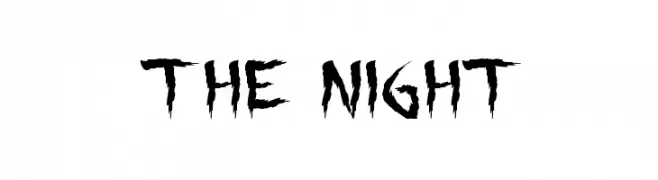
( Fonts by Daniel Zadorozny - www.iconian.com - Free for personal use )
A bold, horror-themed font with jagged, dripping edges.
 تنزيل 226 التنزيلات@WebFont
 -
![RCN تنزيل الخطوط]() تنزيل 226 التنزيلات@WebFont
تنزيل 226 التنزيلات@WebFont -
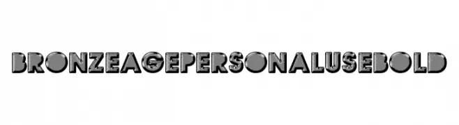
( Fonts by Billy Argel Fonts ® )
A bold, decorative font with a vintage, three-dimensional style.
![BRONZEAGE PERSONAL USE Bold تنزيل الخطوط]() تنزيل 226 التنزيلات@WebFont
تنزيل 226 التنزيلات@WebFont -
( Noto is a trademark of Google Inc. Noto fonts are open source. All Noto fonts are published under the SIL Open Font License, Version 1.1 )
A modern, clean sans-serif font with excellent readability and balanced proportions.
![Noto Sans Bengali SemiBold تنزيل الخطوط]() تنزيل 226 التنزيلات@WebFont
تنزيل 226 التنزيلات@WebFont -
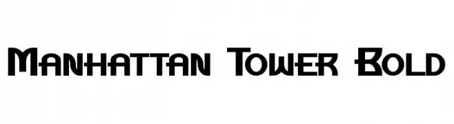
( Fonts by a Neale Davidson - www.pixelsagas.com. Personal-use only. For commercial use please contact owner. )
A bold, geometric font with strong, angular lines and a modern aesthetic.
![Manhattan Tower Bold تنزيل الخطوط]() تنزيل 226 التنزيلات@WebFont
تنزيل 226 التنزيلات@WebFont -
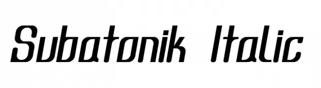
( Fonts by Levi Halmos )
A modern italic font with sleek, elongated characters and a dynamic style.
![Subatonik Italic تنزيل الخطوط]() تنزيل 226 التنزيلات@WebFont
تنزيل 226 التنزيلات@WebFont -
![Jeff Regular تنزيل الخطوط]() تنزيل 226 التنزيلات@WebFont
تنزيل 226 التنزيلات@WebFont -
( Fonts by Muhammad Wahyudin - Personal-use only. For commercial use please contact owner. )
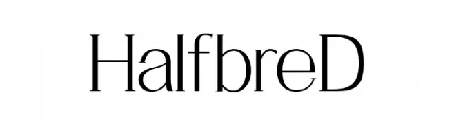
A modern, elegant font with high contrast and clean lines.
![HalfbreD تنزيل الخطوط]() تنزيل 226 التنزيلات@WebFont
تنزيل 226 التنزيلات@WebFont -
( Free for personal use - truefonts.blogspot.com )
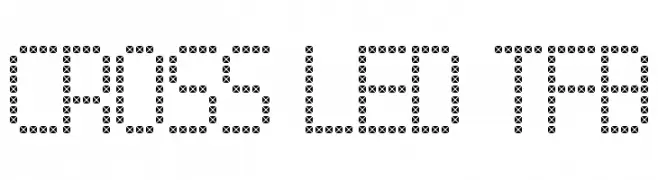
A dot-matrix style font with a digital and modern aesthetic.
![Cross led tfb تنزيل الخطوط]() تنزيل 226 التنزيلات@WebFont
تنزيل 226 التنزيلات@WebFont -
![Distro II Squidgey تنزيل الخطوط]() تنزيل 226 التنزيلات@WebFont
تنزيل 226 التنزيلات@WebFont -
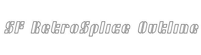
( Fonts by ShyFonts )
A retro-inspired outline font with geometric and angular design elements.
![SF RetroSplice Outline تنزيل الخطوط]() تنزيل 226 التنزيلات@WebFont
تنزيل 226 التنزيلات@WebFont -
( Fonts by Studio Typo )
A modern, light sans-serif font with clean lines and balanced proportions.
![Manti Sans Light Demo تنزيل الخطوط]() تنزيل 226 التنزيلات@WebFont
تنزيل 226 التنزيلات@WebFont -
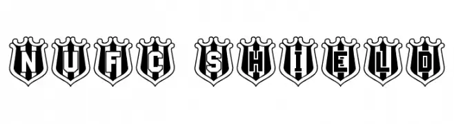
![NUFC Shield تنزيل الخطوط]() تنزيل 226 التنزيلات@WebFont
تنزيل 226 التنزيلات@WebFont -
( Fonts by Sham - Personal-use only. For commercial use please contact owner. )
A playful, rounded font with bold, thick strokes and a cartoonish style.
![Widound تنزيل الخطوط]() تنزيل 226 التنزيلات@WebFont
تنزيل 226 التنزيلات@WebFont -
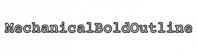
( Fonts by CannotIntoSpaceFonts - KineticPlasma Fonts - Personal-use only. For commercial use please contact owner. )
A bold, outlined mechanical font with a strong, industrial style.
![Mechanical Bold Outline تنزيل الخطوط]() تنزيل 226 التنزيلات@WebFont
تنزيل 226 التنزيلات@WebFont -
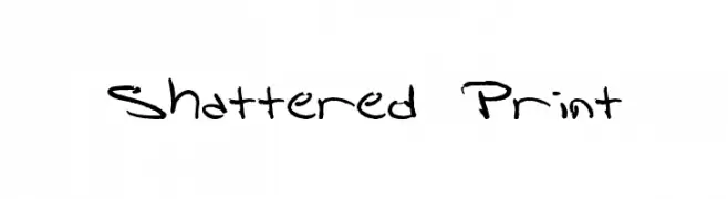
![Shattered Print تنزيل الخطوط]() تنزيل 226 التنزيلات@WebFont
تنزيل 226 التنزيلات@WebFont -
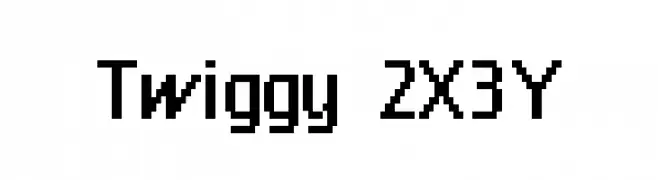
( Fonts by Kreative Korporation - www.kreativekorp.com )
A pixelated, retro-style font with a blocky, geometric design.
![Twiggy 2X3Y تنزيل الخطوط]() تنزيل 226 التنزيلات@WebFont
تنزيل 226 التنزيلات@WebFont -
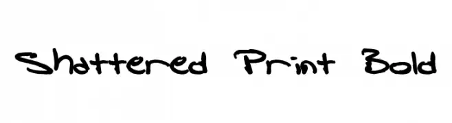
![Shattered Print Bold تنزيل الخطوط]() تنزيل 226 التنزيلات@WebFont
تنزيل 226 التنزيلات@WebFont -
( Fonts by Inermedia Studio )
An elegant, flowing script font with classic and modern elements.
![Backlight تنزيل الخطوط]() تنزيل 226 التنزيلات@WebFont
تنزيل 226 التنزيلات@WebFont -
( Fonts by Leonard Posavec )
A bold, playful, hand-drawn font with a casual and artistic feel.
![KIWANO APPLE تنزيل الخطوط]() تنزيل 226 التنزيلات@WebFont
تنزيل 226 التنزيلات@WebFont -
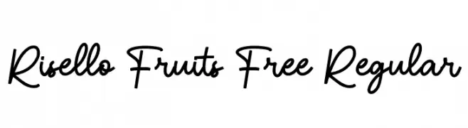
( Fonts by Maulana Creative - Gilang Maulana - Personal-use only. For commercial use please contact owner. )
A playful and elegant script font with flowing, cursive letterforms.
![Risello Fruits Free Regular تنزيل الخطوط]() تنزيل 226 التنزيلات@WebFont
تنزيل 226 التنزيلات@WebFont -
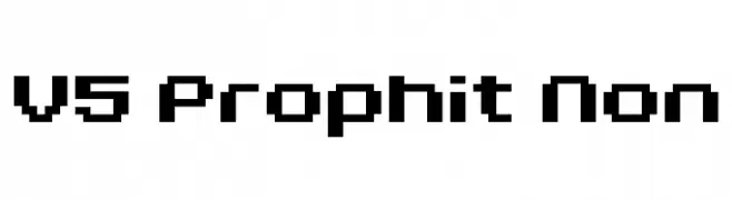
![V5 Prophit Non تنزيل الخطوط]() تنزيل 226 التنزيلات@WebFont
تنزيل 226 التنزيلات@WebFont -
![Love Me Tender تنزيل الخطوط]() تنزيل 226 التنزيلات@WebFont
تنزيل 226 التنزيلات@WebFont -
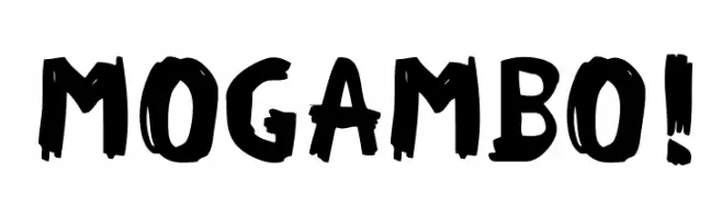
( Fonts by www.woodcutter.es - woodcutter Manero - Personal-use only. For commercial use please contact owner. )
A bold, hand-painted style font with dynamic, irregular strokes.
![MOGAMBO! تنزيل الخطوط]() تنزيل 226 التنزيلات@WebFont
تنزيل 226 التنزيلات@WebFont -
( Qwerks - Joanne Taylor - graphicriver.net/user/joiaco )
A playful, rounded font with a bold and modern design.
![Quiglet تنزيل الخطوط]() تنزيل 226 التنزيلات@WebFont
تنزيل 226 التنزيلات@WebFont -
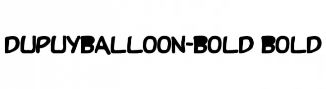
![DupuyBALloon-Bold Bold تنزيل الخطوط]() تنزيل 226 التنزيلات@WebFont
تنزيل 226 التنزيلات@WebFont -
![Clownz تنزيل الخطوط]() تنزيل 226 التنزيلات@WebFont
تنزيل 226 التنزيلات@WebFont -
( Fonts by www.blambot.com )
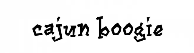
A bold, angular font with a playful, hand-drawn style.
![Cajun Boogie تنزيل الخطوط]() تنزيل 226 التنزيلات@WebFont
تنزيل 226 التنزيلات@WebFont -
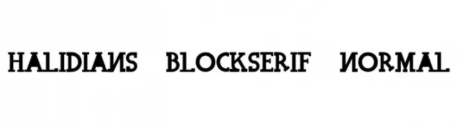
![Halidians Blockserif Normal تنزيل الخطوط]() تنزيل 226 التنزيلات@WebFont
تنزيل 226 التنزيلات@WebFont -
![AppleStorm Extra Bold Blurry Fax تنزيل الخطوط]() تنزيل 226 التنزيلات@WebFont
تنزيل 226 التنزيلات@WebFont -
( Fonts by Iconian Fonts )
A bold, rounded, semi-italic font with a modern and dynamic style.
![1st Enterprises Semi-Italic تنزيل الخطوط]() تنزيل 226 التنزيلات@WebFont
تنزيل 226 التنزيلات@WebFont -
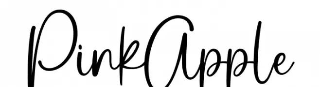
( Fonts by Ramli Setiadi - Personal-use only. For commercial use please contact owner. )
A playful, casual handwritten font with smooth, connected letterforms.
![Pink Apple تنزيل الخطوط]() تنزيل 226 التنزيلات@WebFont
تنزيل 226 التنزيلات@WebFont -
( Fonts by Brixdee - jack-oatley.com - Personal-use only. For commercial use please contact owner. )
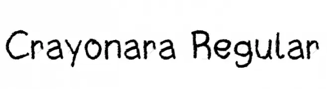
A playful, crayon-like font with a textured, hand-drawn appearance.
![Crayonara Regular تنزيل الخطوط]() تنزيل 226 التنزيلات@WebFont
تنزيل 226 التنزيلات@WebFont -
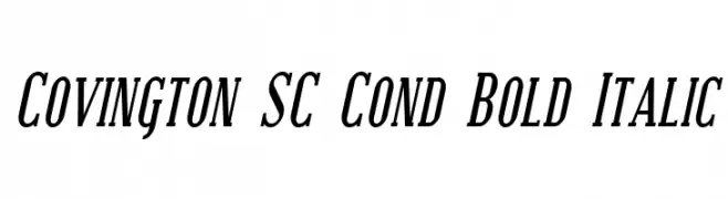
( Fonts by Apostrophic Lab )
A bold, italic, and condensed font with high contrast and tight spacing.
![Covington SC Cond Bold Italic تنزيل الخطوط]() تنزيل 226 التنزيلات@WebFont
تنزيل 226 التنزيلات@WebFont -
![the night تنزيل الخطوط]() تنزيل 226 التنزيلات@WebFont
تنزيل 226 التنزيلات@WebFont


ما هي أبرز الخطوط الآن؟
تحظى Bloodlust Academy Regular, RCN, BRONZEAGE PERSONAL USE Bold, Noto Sans Bengali SemiBold and Manhattan Tower Bold بشعبية لخطوطها النظيفة وتطبيقاتها الواسعة — من الهوية البصرية إلى الصفحات المقصودة والملصقات.
أي الخطوط تُستخدم كثيرًا في الشعارات؟
تُعد السان سيريف الهندسية (مثل Poppins وعائلات على نمط Gotham) خيارًا شائعًا لعلامات نظيفة قابلة للتوسع. ولإضفاء طابع ودي، تبقى السكريبت واليدوية خيارًا كلاسيكيًا. اجمع عنوانًا بارزًا مع خط نصي محايد لتحقيق التوازن والتميّز.
كم مرة يتم تحديث قائمة أعلى الخطوط؟
نحدّثها بانتظام استنادًا إلى التنزيلات والنشاط الفعلي. عُد إليها كثيرًا لاكتشاف النجوم الصاعدة مبكرًا.
💡 نصيحة: أضف هذه الصفحة إلى العلامات — تتغير الاتجاهات بسرعة وقد تُلهم خطوط اليوم الرائجة إعادة العلامة غدًا.