مرحبًا بك في قسم أعلى الخطوط — حيث تلتقي الشعبية بالجودة. هذه هي الخطوط الأكثر تنزيلًا واستخدامًا هذا العام من قبل مجتمعنا. إذا كنت بحاجة إلى اختيار موثوق للشعارات أو الويب أو وسائل التواصل، فابدأ من هنا.
يتميز كل خط رائج بتوازن جيد وقابلية قراءة وتعدد استخدامات. ستجد سان سيريف حديثة، وسكريبتات أنيقة، وسيريف كلاسيكية، وخطوط عرض minimal مختارة بعناية.
-
( Fonts by Khurasan )
A playful, handwritten font with a casual and friendly style.
 تنزيل 1070 التنزيلات@WebFont
 -
( Fonts by EssentialsStudio - Personal-use only. For commercial use please contact owner. )
A playful and elegant script font with a modern twist.
![Jambul تنزيل الخطوط]() تنزيل 1070 التنزيلات@WebFont
تنزيل 1070 التنزيلات@WebFont -
( Fonts by Eknoji Studio - www.eknojistudio.com - Personal-use only. For commercial use please contact owner. )
A bold, playful script font with a handwritten style.
![Cagakara تنزيل الخطوط]() تنزيل 1070 التنزيلات@WebFont
تنزيل 1070 التنزيلات@WebFont -
( Ozan Karakoc - be.net/ozankarakoc )
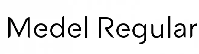
A modern sans-serif font with clean lines and balanced proportions.
![Medel Regular تنزيل الخطوط]() تنزيل 1070 التنزيلات@WebFont
تنزيل 1070 التنزيلات@WebFont -
( Fonts by Chequered Ink )
A playful handwritten font with an informal and friendly style.
![Beautiful Heartbeat تنزيل الخطوط]() تنزيل 1070 التنزيلات@WebFont
تنزيل 1070 التنزيلات@WebFont -
-
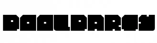
![PoolParty تنزيل الخطوط]() تنزيل 1070 التنزيلات@WebFont
تنزيل 1070 التنزيلات@WebFont -
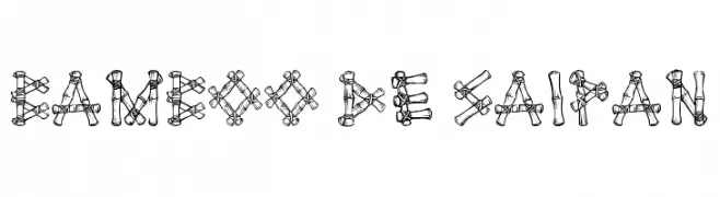
![Bamboo de Saipan تنزيل الخطوط]() تنزيل 1070 التنزيلات@WebFont
تنزيل 1070 التنزيلات@WebFont -
( Fonts by Ingo Zimmermann - www.ingofonts.com )
A modern, italic sans-serif font with a sleek and dynamic style.
![Absolut Pro Medium Italic reduced تنزيل الخطوط]() تنزيل 1070 التنزيلات@WebFont
تنزيل 1070 التنزيلات@WebFont -
( Fonts by www.typodermicfonts.com - Ray Larabie )
A modern, condensed, and italicized font with a sleek and uniform appearance.
![SteelfishRg-Italic تنزيل الخطوط]() تنزيل 1070 التنزيلات@WebFont
تنزيل 1070 التنزيلات@WebFont -
( Copyright (c) 2010, Igino Marini (mail@iginomarini.com) )
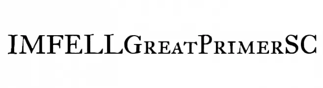
A classic serif font with a historical and elegant design.
![IM FELL Great Primer SC تنزيل الخطوط]() تنزيل 1070 التنزيلات@WebFont
تنزيل 1070 التنزيلات@WebFont


ما هي أبرز الخطوط الآن؟
تحظى Catbrother, Jambul, Cagakara, Medel Regular and Beautiful Heartbeat بشعبية لخطوطها النظيفة وتطبيقاتها الواسعة — من الهوية البصرية إلى الصفحات المقصودة والملصقات.
أي الخطوط تُستخدم كثيرًا في الشعارات؟
تُعد السان سيريف الهندسية (مثل Poppins وعائلات على نمط Gotham) خيارًا شائعًا لعلامات نظيفة قابلة للتوسع. ولإضفاء طابع ودي، تبقى السكريبت واليدوية خيارًا كلاسيكيًا. اجمع عنوانًا بارزًا مع خط نصي محايد لتحقيق التوازن والتميّز.
كم مرة يتم تحديث قائمة أعلى الخطوط؟
نحدّثها بانتظام استنادًا إلى التنزيلات والنشاط الفعلي. عُد إليها كثيرًا لاكتشاف النجوم الصاعدة مبكرًا.
💡 نصيحة: أضف هذه الصفحة إلى العلامات — تتغير الاتجاهات بسرعة وقد تُلهم خطوط اليوم الرائجة إعادة العلامة غدًا.