مرحبًا بك في قسم أعلى الخطوط — حيث تلتقي الشعبية بالجودة. هذه هي الخطوط الأكثر تنزيلًا واستخدامًا هذا العام من قبل مجتمعنا. إذا كنت بحاجة إلى اختيار موثوق للشعارات أو الويب أو وسائل التواصل، فابدأ من هنا.
يتميز كل خط رائج بتوازن جيد وقابلية قراءة وتعدد استخدامات. ستجد سان سيريف حديثة، وسكريبتات أنيقة، وسيريف كلاسيكية، وخطوط عرض minimal مختارة بعناية.
-
( Fonts by DM Studio )
A bold, playful font with a 3D effect and cartoonish style.
 تنزيل 240 التنزيلات@WebFont
 -
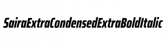
( Fonts by Omnibus Type )
A bold, extra-condensed italic font with a dynamic and modern style.
![Saira ExtraCondensed ExtraBold Italic تنزيل الخطوط]() تنزيل 240 التنزيلات@WebFont
تنزيل 240 التنزيلات@WebFont -
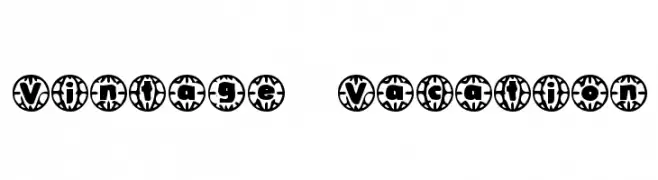
( Fonts by www.fontalicious.com )
A playful, decorative font with a vintage vacation theme and circular borders.
![Vintage Vacation تنزيل الخطوط]() تنزيل 240 التنزيلات@WebFont
تنزيل 240 التنزيلات@WebFont -
![Insomnia [3am] تنزيل الخطوط]() تنزيل 240 التنزيلات@WebFont
تنزيل 240 التنزيلات@WebFont -
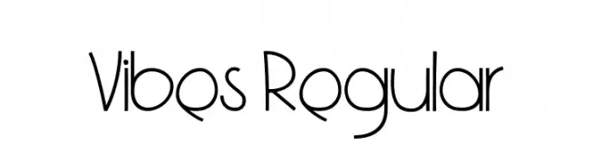
( Copyright 2019 The Vibes Project Authors (https://github.com/bluemix/vibes-typeface) )
A playful, modern font with clean, geometric lines and a whimsical touch.
![Vibes Regular تنزيل الخطوط]() تنزيل 240 التنزيلات@WebFont
تنزيل 240 التنزيلات@WebFont -
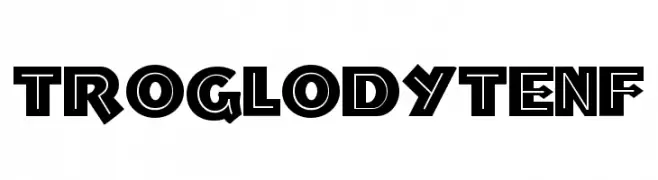
( Fonts by Nick's Fonts )
A bold, geometric font with a modern, edgy style and high contrast.
![TroglodyteNF تنزيل الخطوط]() تنزيل 240 التنزيلات@WebFont
تنزيل 240 التنزيلات@WebFont -
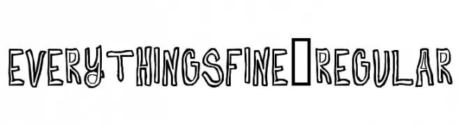
( Fonts by Alex Tomlinson - Skyhaven Fonts - shfonts.com )
A playful, hand-drawn font with bold, sketch-like characters.
![EverythingsFine-Regular تنزيل الخطوط]() تنزيل 240 التنزيلات@WebFont
تنزيل 240 التنزيلات@WebFont -
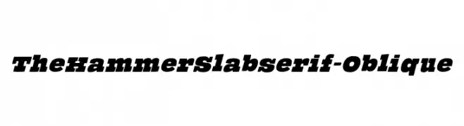
( Fonts by Manfred Klein. Free for private and charity use. Free for commercial with donation to organizations )
A bold, oblique slab serif font with strong, dynamic strokes.
![TheHammerSlabserif-Oblique تنزيل الخطوط]() تنزيل 240 التنزيلات@WebFont
تنزيل 240 التنزيلات@WebFont -
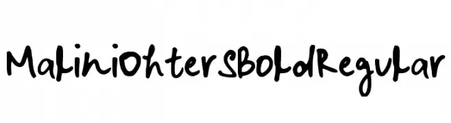
![Malini Ohter S Bold Regular تنزيل الخطوط]() تنزيل 240 التنزيلات@WebFont
تنزيل 240 التنزيلات@WebFont -
![Irnafont_2 تنزيل الخطوط]() تنزيل 240 التنزيلات@WebFont
تنزيل 240 التنزيلات@WebFont -
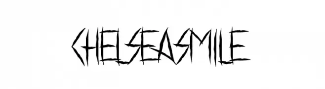
( Fonts by www.chequered.ink - Chequered Ink - Personal-use only. For commercial use please contact owner. )
A jagged, edgy font with sharp, angular lines for a rebellious look.
![Chelsea Smile تنزيل الخطوط]() تنزيل 240 التنزيلات@WebFont
تنزيل 240 التنزيلات@WebFont -
( Fonts by CannotIntoSpaceFonts - KineticPlasma Fonts - Personal-use only. For commercial use please contact owner. )
A fragmented, abstract font with bold, angular shapes.
![Arrow تنزيل الخطوط]() تنزيل 240 التنزيلات@WebFont
تنزيل 240 التنزيلات@WebFont -
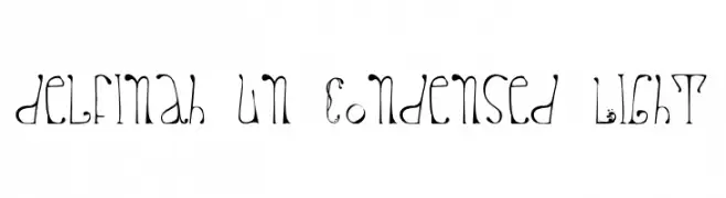
![delfinah un Condensed Light تنزيل الخطوط]() تنزيل 240 التنزيلات@WebFont
تنزيل 240 التنزيلات@WebFont -
![MEN'S COSME تنزيل الخطوط]() تنزيل 240 التنزيلات
تنزيل 240 التنزيلات -
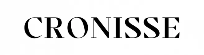
( Fonts by Almarkhatype - Abdul Malik Wisnu - Personal-use only. For commercial use please contact owner. )
A classic serif font with elegant strokes and medium contrast.
![Cronisse تنزيل الخطوط]() تنزيل 240 التنزيلات@WebFont
تنزيل 240 التنزيلات@WebFont -
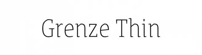
( Copyright 2018 The Grenze Project Authors (https://github.com/Omnibus-Type/Grenze), with Reserved Font Name "Grenze". )
A refined serif font with thin strokes and a classic yet modern aesthetic.
![Grenze Thin تنزيل الخطوط]() تنزيل 240 التنزيلات@WebFont
تنزيل 240 التنزيلات@WebFont -
( Fonts by Daniel Zadorozny - www.iconian.com - Personal-use only. For commercial use please contact owner. )
A bold, geometric font with a futuristic and robust design.
![Mandalore تنزيل الخطوط]() تنزيل 240 التنزيلات@WebFont
تنزيل 240 التنزيلات@WebFont -
![AzoftSans-Italic تنزيل الخطوط]() تنزيل 240 التنزيلات@WebFont
تنزيل 240 التنزيلات@WebFont -
![Thyme تنزيل الخطوط]() تنزيل 240 التنزيلات@WebFont
تنزيل 240 التنزيلات@WebFont -
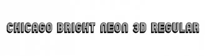
( Vladimir Nikolic - www.coroflot.com/vladimirnikolic )
A bold, 3D neon-style font with layered outlines for a striking effect.
![Chicago Bright Neon 3D Regular تنزيل الخطوط]() تنزيل 240 التنزيلات@WebFont
تنزيل 240 التنزيلات@WebFont -
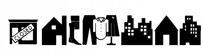
( Fonts by Manfred Klein. Free for private and charity use. Free for commercial with donation to organizations )
Icon-based decorative font with housing and lifestyle motifs.
![Housing تنزيل الخطوط]() تنزيل 240 التنزيلات@WebFont
تنزيل 240 التنزيلات@WebFont -
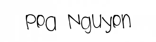
( Free for a personal use. For a commercial use please visit www.kevinandamanda.com )
A playful, handwritten font with a casual and friendly appearance.
![Pea Nguyen تنزيل الخطوط]() تنزيل 240 التنزيلات@WebFont
تنزيل 240 التنزيلات@WebFont -
( Font by Jonathan Harris - www.tattoowoo.com )
A whimsical and decorative font with playful, curly letterforms.
![Pixie Moon تنزيل الخطوط]() تنزيل 240 التنزيلات@WebFont
تنزيل 240 التنزيلات@WebFont -
![BLACKBONSAI1.0Regular تنزيل الخطوط]() تنزيل 240 التنزيلات@WebFont
تنزيل 240 التنزيلات@WebFont -
( Fonts by Grzegorz l - www.glukfonts.pl )
The image does not depict a valid font.
![Foglihten DeH04 تنزيل الخطوط]() تنزيل 240 التنزيلات@WebFont
تنزيل 240 التنزيلات@WebFont -
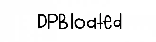
![DPBloated تنزيل الخطوط]() تنزيل 240 التنزيلات@WebFont
تنزيل 240 التنزيلات@WebFont -
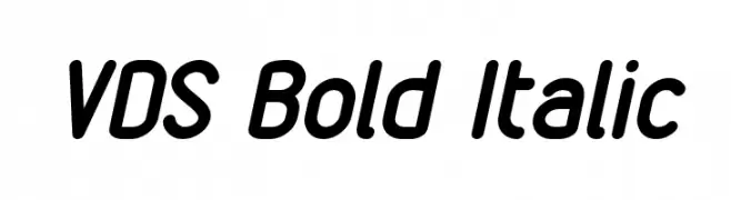
![VDS Bold Italic تنزيل الخطوط]() تنزيل 240 التنزيلات@WebFont
تنزيل 240 التنزيلات@WebFont -
( Fonts by Billy Argel - www.billyargel.com - Personal-use only. For commercial use please contact owner. )
A playful, rounded font with a bold and smooth design, ideal for creative projects.
![YUKAFONTSMILE تنزيل الخطوط]() تنزيل 240 التنزيلات@WebFont
تنزيل 240 التنزيلات@WebFont -
![Kids Stuff تنزيل الخطوط]() تنزيل 240 التنزيلات@WebFont
تنزيل 240 التنزيلات@WebFont -
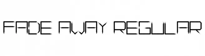
![Fade Away Regular تنزيل الخطوط]() تنزيل 240 التنزيلات@WebFont
تنزيل 240 التنزيلات@WebFont -
![Runar تنزيل الخطوط]() تنزيل 240 التنزيلات@WebFont
تنزيل 240 التنزيلات@WebFont -
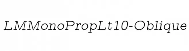
( Fonts by www.gust.org.pl )
A monospaced, oblique font with a modern and technical style.
![LMMonoPropLt10-Oblique تنزيل الخطوط]() تنزيل 240 التنزيلات@WebFont
تنزيل 240 التنزيلات@WebFont -
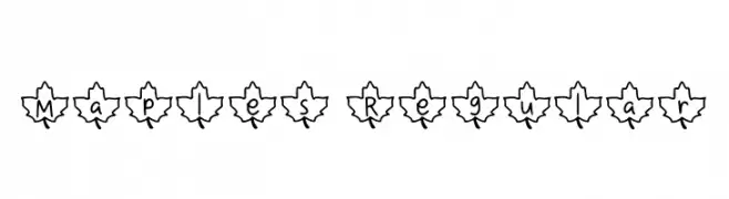
( Fonts by Aisyah )
A decorative font with characters inside maple leaf outlines.
![Maples Regular تنزيل الخطوط]() تنزيل 240 التنزيلات@WebFont
تنزيل 240 التنزيلات@WebFont -
![Bataler تنزيل الخطوط]() تنزيل 240 التنزيلات@WebFont
تنزيل 240 التنزيلات@WebFont -
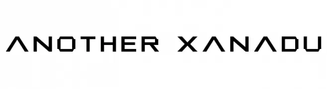
( TwoNineFive - Maximillian Limpo )
A bold, geometric font with a digital, pixelated style.
![Another Xanadu تنزيل الخطوط]() تنزيل 240 التنزيلات@WebFont
تنزيل 240 التنزيلات@WebFont
![Insomnia [3am] تنزيل الخطوط](https://d144mzi0q5mijx.cloudfront.net/img/I/N/Insomnia-3am.webp)


ما هي أبرز الخطوط الآن؟
تحظى School Mania, Saira ExtraCondensed ExtraBold Italic, Vintage Vacation, Insomnia [3am] and Vibes Regular بشعبية لخطوطها النظيفة وتطبيقاتها الواسعة — من الهوية البصرية إلى الصفحات المقصودة والملصقات.
أي الخطوط تُستخدم كثيرًا في الشعارات؟
تُعد السان سيريف الهندسية (مثل Poppins وعائلات على نمط Gotham) خيارًا شائعًا لعلامات نظيفة قابلة للتوسع. ولإضفاء طابع ودي، تبقى السكريبت واليدوية خيارًا كلاسيكيًا. اجمع عنوانًا بارزًا مع خط نصي محايد لتحقيق التوازن والتميّز.
كم مرة يتم تحديث قائمة أعلى الخطوط؟
نحدّثها بانتظام استنادًا إلى التنزيلات والنشاط الفعلي. عُد إليها كثيرًا لاكتشاف النجوم الصاعدة مبكرًا.
💡 نصيحة: أضف هذه الصفحة إلى العلامات — تتغير الاتجاهات بسرعة وقد تُلهم خطوط اليوم الرائجة إعادة العلامة غدًا.