مرحبًا بك في قسم أعلى الخطوط — حيث تلتقي الشعبية بالجودة. هذه هي الخطوط الأكثر تنزيلًا واستخدامًا هذا العام من قبل مجتمعنا. إذا كنت بحاجة إلى اختيار موثوق للشعارات أو الويب أو وسائل التواصل، فابدأ من هنا.
يتميز كل خط رائج بتوازن جيد وقابلية قراءة وتعدد استخدامات. ستجد سان سيريف حديثة، وسكريبتات أنيقة، وسيريف كلاسيكية، وخطوط عرض minimal مختارة بعناية.
-
 تنزيل 284 التنزيلات@WebFont
 -
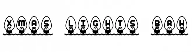
![Xmas Lights BRK تنزيل الخطوط]() تنزيل 284 التنزيلات@WebFont
تنزيل 284 التنزيلات@WebFont -
( Fonts by Koczman Balint - magiquefonts.gportal.hu )
A bold, geometric font with sharp edges and a modern style.
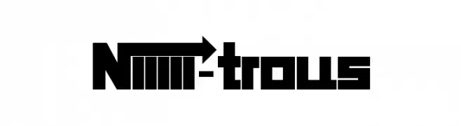
![Niiiii-trous تنزيل الخطوط]() تنزيل 284 التنزيلات@WebFont
تنزيل 284 التنزيلات@WebFont -
( Fonts by Sharkshock - Personal-use only. For commercial use please contact owner. )
A playful, hand-drawn font with tall, narrow letters and a whimsical style.
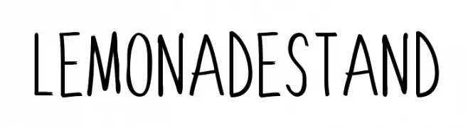
![Lemonade Stand تنزيل الخطوط]() تنزيل 284 التنزيلات@WebFont
تنزيل 284 التنزيلات@WebFont -
( Fonts by Bobistheowl - Personal-use only. For commercial use please contact owner. )
A bold, high-contrast serif font with strong, authoritative strokes.
![CabbagetownBook تنزيل الخطوط]() تنزيل 284 التنزيلات@WebFont
تنزيل 284 التنزيلات@WebFont -
( Fonts by MuraKnockout Media + Design - muraknockout.com. Personal-use only. For commercial use please contact owner. )
A sleek, modern font with thin, geometric lines and a minimalist design.
![Daiichi تنزيل الخطوط]() تنزيل 284 التنزيلات@WebFont
تنزيل 284 التنزيلات@WebFont -
خط بواسطة TGIFStudio. For commercial use please contact the owner.
( Thank you for downloading this font This font is free for PERSONAL USE ONLY! Commercial license for this font can be purchased at: http://bit.ly/2gWZKEk )
An elegant script font with flowing, cursive letterforms and decorative swashes.
![Vignette Script تنزيل الخطوط]() تنزيل 284 التنزيلات@WebFont
تنزيل 284 التنزيلات@WebFont -
( Please check www.otlab.ru before you use this font! )
A rustic, handcrafted font with a vintage flair.
![RusticusStd تنزيل الخطوط]() تنزيل 284 التنزيلات@WebFont
تنزيل 284 التنزيلات@WebFont -
( Fonts by Yasir Ekinci )
An elegant, flowing script font with a hand-drawn appearance.
![VeronaLotte تنزيل الخطوط]() تنزيل 284 التنزيلات@WebFont
تنزيل 284 التنزيلات@WebFont -
( Fonts by Febryl Arully - Personal-use only. For commercial use please contact owner. )
A bold, flowing script font with a modern, playful aesthetic.
![Love تنزيل الخطوط]() تنزيل 284 التنزيلات@WebFont
تنزيل 284 التنزيلات@WebFont -
![Through Struggle تنزيل الخطوط]() تنزيل 284 التنزيلات@WebFont
تنزيل 284 التنزيلات@WebFont -
( Copyright 2016 The Nunito Project Authors (contact@sansoxygen.com) )
A modern, italic sans-serif font with a clean and approachable style.
![Nunito Sans Italic تنزيل الخطوط]() تنزيل 284 التنزيلات@WebFont
تنزيل 284 التنزيلات@WebFont -
( Fonts by Edric Studio - Personal-use only. For commercial use please contact owner. )
A bold, geometric font with a modern and structured design.
![Reyburn Demo Bold تنزيل الخطوط]() تنزيل 284 التنزيلات@WebFont
تنزيل 284 التنزيلات@WebFont -
( Fonts by SDFonts - Ritzy )
Primitive, pictograph-style font with hand-drawn, irregular shapes.
![Finnish Rock Paintings تنزيل الخطوط]() تنزيل 284 التنزيلات@WebFont
تنزيل 284 التنزيلات@WebFont -
![SF Covington SC Exp تنزيل الخطوط]() تنزيل 284 التنزيلات@WebFont
تنزيل 284 التنزيلات@WebFont -
![Kruti Dev 060 Condensed تنزيل الخطوط]() تنزيل 284 التنزيلات@WebFont
تنزيل 284 التنزيلات@WebFont -
( Noto is a trademark of Google Inc. Noto fonts are open source. All Noto fonts are published under the SIL Open Font License, Version 1.1 )
A bold, modern sans-serif font with a clean and geometric design.
![Noto Sans Oriya Bold تنزيل الخطوط]() تنزيل 284 التنزيلات@WebFont
تنزيل 284 التنزيلات@WebFont -
![Pixelicious تنزيل الخطوط]() تنزيل 284 التنزيلات@WebFont
تنزيل 284 التنزيلات@WebFont -
( Fonts by Iconian Fonts )
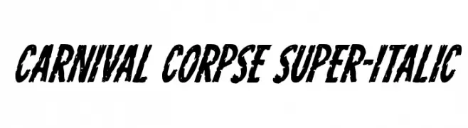
A bold, distressed, and heavily slanted font with a grunge aesthetic.
![Carnival Corpse Super-Italic تنزيل الخطوط]() تنزيل 284 التنزيلات@WebFont
تنزيل 284 التنزيلات@WebFont -
( Fonts by Daniel Zadorozny - www.iconian.com )
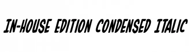
A bold, condensed, and italicized font with a dynamic style.
![In-House Edition Condensed Italic تنزيل الخطوط]() تنزيل 284 التنزيلات@WebFont
تنزيل 284 التنزيلات@WebFont -
( Fonts by Daniel Zadorozny - www.iconian.com )
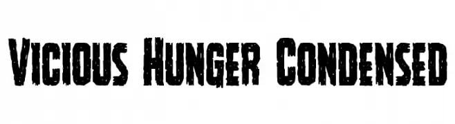
A bold, distressed, and condensed font with a rugged, textured appearance.
![Vicious Hunger Condensed تنزيل الخطوط]() تنزيل 284 التنزيلات@WebFont
تنزيل 284 التنزيلات@WebFont -
![Arggh @$*# Lite تنزيل الخطوط]() تنزيل 284 التنزيلات@WebFont
تنزيل 284 التنزيلات@WebFont -
![Vatican Rough Letters, 8th c. تنزيل الخطوط]() تنزيل 284 التنزيلات@WebFont
تنزيل 284 التنزيلات@WebFont -
( triden works - triden tan - www.tridenworks.com )
A bold, angular font with a futuristic and geometric design.
![Lontara تنزيل الخطوط]() تنزيل 284 التنزيلات@WebFont
تنزيل 284 التنزيلات@WebFont -
( Fonts by David Kerkhoff - www.hanodedphotography.com )
A bold, cursive script font with dynamic, sweeping strokes and a handwritten feel.
![Sweet Steeffie تنزيل الخطوط]() تنزيل 284 التنزيلات@WebFont
تنزيل 284 التنزيلات@WebFont -
( Fonts by Nathan Rutzky )
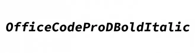
A bold, italicized font with strong strokes and a modern aesthetic.
![Office Code Pro D Bold Italic تنزيل الخطوط]() تنزيل 284 التنزيلات@WebFont
تنزيل 284 التنزيلات@WebFont -
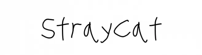
![Stray Cat تنزيل الخطوط]() تنزيل 284 التنزيلات@WebFont
تنزيل 284 التنزيلات@WebFont -
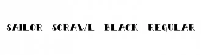
![Sailor Scrawl Black Regular تنزيل الخطوط]() تنزيل 284 التنزيلات@WebFont
تنزيل 284 التنزيلات@WebFont -
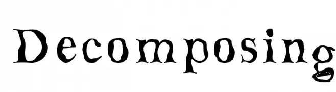
![Decomposing تنزيل الخطوط]() تنزيل 284 التنزيلات
تنزيل 284 التنزيلات -
( Fonts by Manfred Klein. Free for private and charity use. Free for commercial with donation to organizations )
An elegant oblique serif font with high contrast and sharp serifs.
![GiambattistaDueMille-Oblique تنزيل الخطوط]() تنزيل 284 التنزيلات@WebFont
تنزيل 284 التنزيلات@WebFont -
( SDFonts. http://www.angelfire.com/scifi2/sdfonts/index.html )
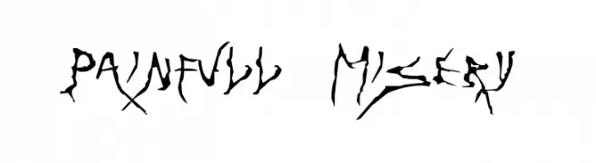
A chaotic, distressed font with jagged edges and a raw, untamed appearance.
![Painfull Misery تنزيل الخطوط]() تنزيل 284 التنزيلات@WebFont
تنزيل 284 التنزيلات@WebFont -
( Fonts by Font People - Personal-use only. For commercial use please contact owner. )
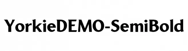
A bold, modern font with clean lines and a professional appearance.
![YorkieDEMO-SemiBold تنزيل الخطوط]() تنزيل 284 التنزيلات@WebFont
تنزيل 284 التنزيلات@WebFont -
![VALENTINEHEARTS تنزيل الخطوط]() تنزيل 284 التنزيلات@WebFont
تنزيل 284 التنزيلات@WebFont -
( Fonts by Manfred Klein. Free for private and charity use. Free for commercial with donation to organizations )
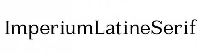
A classic serif font with elegant, well-proportioned characters.
![ImperiumLatineSerif تنزيل الخطوط]() تنزيل 284 التنزيلات@WebFont
تنزيل 284 التنزيلات@WebFont -
( Fonts by Des Gomez )
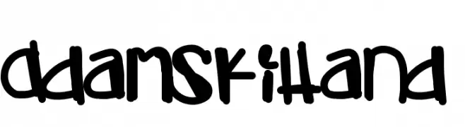
A bold, playful handwritten font with a whimsical and artistic style.
![AdamskiHand تنزيل الخطوط]() تنزيل 284 التنزيلات@WebFont
تنزيل 284 التنزيلات@WebFont


ما هي أبرز الخطوط الآن؟
تحظى fenotype dings # people 0.5, Xmas Lights BRK, Niiiii-trous, Lemonade Stand and CabbagetownBook بشعبية لخطوطها النظيفة وتطبيقاتها الواسعة — من الهوية البصرية إلى الصفحات المقصودة والملصقات.
أي الخطوط تُستخدم كثيرًا في الشعارات؟
تُعد السان سيريف الهندسية (مثل Poppins وعائلات على نمط Gotham) خيارًا شائعًا لعلامات نظيفة قابلة للتوسع. ولإضفاء طابع ودي، تبقى السكريبت واليدوية خيارًا كلاسيكيًا. اجمع عنوانًا بارزًا مع خط نصي محايد لتحقيق التوازن والتميّز.
كم مرة يتم تحديث قائمة أعلى الخطوط؟
نحدّثها بانتظام استنادًا إلى التنزيلات والنشاط الفعلي. عُد إليها كثيرًا لاكتشاف النجوم الصاعدة مبكرًا.
💡 نصيحة: أضف هذه الصفحة إلى العلامات — تتغير الاتجاهات بسرعة وقد تُلهم خطوط اليوم الرائجة إعادة العلامة غدًا.