مرحبًا بك في قسم أعلى الخطوط — حيث تلتقي الشعبية بالجودة. هذه هي الخطوط الأكثر تنزيلًا واستخدامًا هذا العام من قبل مجتمعنا. إذا كنت بحاجة إلى اختيار موثوق للشعارات أو الويب أو وسائل التواصل، فابدأ من هنا.
يتميز كل خط رائج بتوازن جيد وقابلية قراءة وتعدد استخدامات. ستجد سان سيريف حديثة، وسكريبتات أنيقة، وسيريف كلاسيكية، وخطوط عرض minimal مختارة بعناية.
-
 تنزيل 1423 التنزيلات@WebFont
 -
( Fonts by Masato Shimojima - Personal-use only. For commercial use please contact owner. )
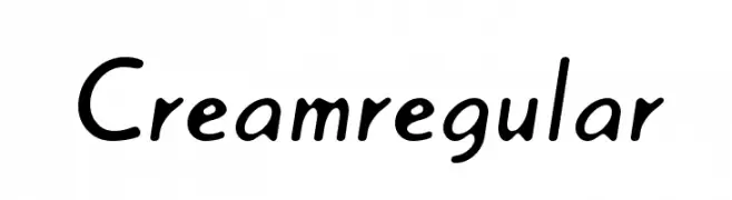
A playful, handwritten-style font with rounded characters.
![Creamregular تنزيل الخطوط]() تنزيل 1423 التنزيلات@WebFont
تنزيل 1423 التنزيلات@WebFont -
( Fonts by Perspectype Studio - Letterena.com - Personal-use only. For commercial use please contact owner. )
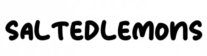
A playful, bold font with rounded, thick strokes and a hand-drawn feel.
![SALTED LEMONS تنزيل الخطوط]() تنزيل 1422 التنزيلات@WebFont
تنزيل 1422 التنزيلات@WebFont -
( Fonts by wepfont - Wahyu Eka Prasetya - Personal-use only. For commercial use please contact owner. )
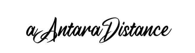
An elegant, flowing script font with smooth, cursive strokes.
![a Antara Distance تنزيل الخطوط]() تنزيل 1422 التنزيلات@WebFont
تنزيل 1422 التنزيلات@WebFont -
( Fonts by Naomi D - Personal-use only. For commercial use please contact owner. )
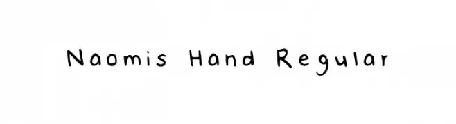
A playful, handwritten-style font with an organic and casual feel.
![Naomis Hand Regular تنزيل الخطوط]() تنزيل 1422 التنزيلات@WebFont
تنزيل 1422 التنزيلات@WebFont -
-
( Fonts by Joonas Tielinen - Personal-use only. For commercial use please contact owner. )
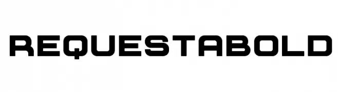
A bold, geometric font with a modern and assertive style.
![Requesta Bold تنزيل الخطوط]() تنزيل 1422 التنزيلات@WebFont
تنزيل 1422 التنزيلات@WebFont -
( Fonts by Saji Johnny Kundukulam - Personal-use only. For commercial use please contact owner. )
A bold, modern sans-serif font with clean, geometric lines.
![REVOLUTION تنزيل الخطوط]() تنزيل 1422 التنزيلات@WebFont
تنزيل 1422 التنزيلات@WebFont -
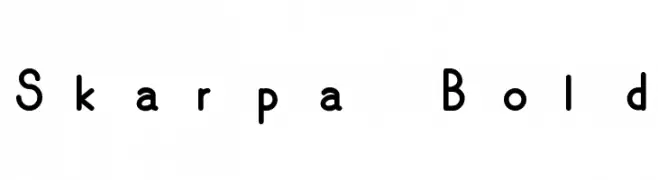
![Skarpa Bold تنزيل الخطوط]() تنزيل 1422 التنزيلات@WebFont
تنزيل 1422 التنزيلات@WebFont -
( Fonts by www.feorag.com )
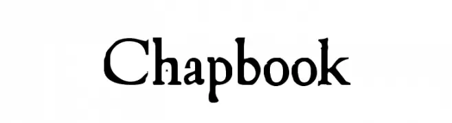
A vintage, handcrafted font with bold, irregular strokes and playful numerals.
![Chapbook تنزيل الخطوط]() تنزيل 1422 التنزيلات@WebFont
تنزيل 1422 التنزيلات@WebFont -
( Fonts by Manfred Klein. Free for private and charity use. Free for commercial with donation to organizations )
A modern, medium-weight sans-serif font with a tall x-height and clean lines.
![MKSansserifMediumTallX تنزيل الخطوط]() تنزيل 1422 التنزيلات@WebFont
تنزيل 1422 التنزيلات@WebFont

ما هي أبرز الخطوط الآن؟
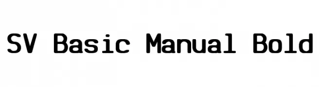
تحظى SV Basic Manual Bold, Creamregular, SALTED LEMONS, a Antara Distance and Naomis Hand Regular بشعبية لخطوطها النظيفة وتطبيقاتها الواسعة — من الهوية البصرية إلى الصفحات المقصودة والملصقات.
أي الخطوط تُستخدم كثيرًا في الشعارات؟
تُعد السان سيريف الهندسية (مثل Poppins وعائلات على نمط Gotham) خيارًا شائعًا لعلامات نظيفة قابلة للتوسع. ولإضفاء طابع ودي، تبقى السكريبت واليدوية خيارًا كلاسيكيًا. اجمع عنوانًا بارزًا مع خط نصي محايد لتحقيق التوازن والتميّز.
كم مرة يتم تحديث قائمة أعلى الخطوط؟
نحدّثها بانتظام استنادًا إلى التنزيلات والنشاط الفعلي. عُد إليها كثيرًا لاكتشاف النجوم الصاعدة مبكرًا.
💡 نصيحة: أضف هذه الصفحة إلى العلامات — تتغير الاتجاهات بسرعة وقد تُلهم خطوط اليوم الرائجة إعادة العلامة غدًا.