مرحبًا بك في قسم أعلى الخطوط — حيث تلتقي الشعبية بالجودة. هذه هي الخطوط الأكثر تنزيلًا واستخدامًا هذا العام من قبل مجتمعنا. إذا كنت بحاجة إلى اختيار موثوق للشعارات أو الويب أو وسائل التواصل، فابدأ من هنا.
يتميز كل خط رائج بتوازن جيد وقابلية قراءة وتعدد استخدامات. ستجد سان سيريف حديثة، وسكريبتات أنيقة، وسيريف كلاسيكية، وخطوط عرض minimal مختارة بعناية.
-
( Fonts by Apostrophic Lab )
A modern, geometric font with consistent line weight and minimalist design.
 تنزيل 325 التنزيلات@WebFont
 -
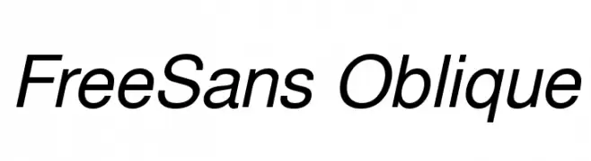
( Fonts by GNU )
A modern sans-serif font with an oblique slant and medium contrast.
![FreeSans Oblique تنزيل الخطوط]() تنزيل 325 التنزيلات@WebFont
تنزيل 325 التنزيلات@WebFont -
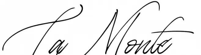
( Fonts by Letteralle Studios )
Elegant cursive script with a handwritten feel.
![La Monte تنزيل الخطوط]() تنزيل 325 التنزيلات@WebFont
تنزيل 325 التنزيلات@WebFont -
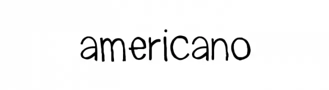
( LALATO FONTS )
A playful, handwritten font with a casual and informal style.
![americano تنزيل الخطوط]() تنزيل 325 التنزيلات@WebFont
تنزيل 325 التنزيلات@WebFont -
( Thor Christopher Arisland - www.tcarisland.com )
A bold, geometric font with decorative elements and a double-layered effect.
![Giovanni تنزيل الخطوط]() تنزيل 325 التنزيلات@WebFont
تنزيل 325 التنزيلات@WebFont -
( Fonts by Syaf Rizal - www.creativefabrica.com/ref/53/ - Personal-use only. For commercial use please contact owner. )
A dynamic and expressive handwritten font with fluid, cursive strokes.
![Antam تنزيل الخطوط]() تنزيل 325 التنزيلات@WebFont
تنزيل 325 التنزيلات@WebFont -
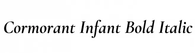
( Copyright (c) 2015, Christian Thalmann and the Cormorant Project Authors (github.com/CatharsisFonts/Cormorant) )
A bold, italic serif font with classic elegance and strong visibility.
![Cormorant Infant Bold Italic تنزيل الخطوط]() تنزيل 325 التنزيلات@WebFont
تنزيل 325 التنزيلات@WebFont -
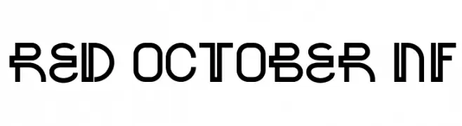
( Fonts by Nick Curtis - www.nicksfonts.com )
A bold, geometric font with a modern, industrial style.
![Red October NF تنزيل الخطوط]() تنزيل 325 التنزيلات@WebFont
تنزيل 325 التنزيلات@WebFont -
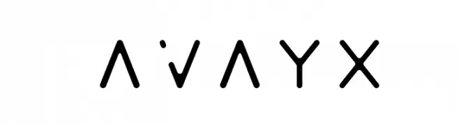
( MathewRoswell )
A modern, geometric font with clean lines and circular cutouts.
![Avayx تنزيل الخطوط]() تنزيل 325 التنزيلات@WebFont
تنزيل 325 التنزيلات@WebFont -
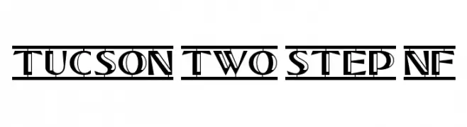
( Fonts by Nick Curtis - www.nicksfonts.com )
A bold, decorative font with geometric elements and high contrast strokes.
![Tucson Two Step NF تنزيل الخطوط]() تنزيل 325 التنزيلات@WebFont
تنزيل 325 التنزيلات@WebFont -
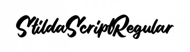
( Fonts by StringLabs - stringlabscreative.com - Personal-use only. For commercial use please contact owner. )
A bold, flowing script font with a natural handwriting style.
![Stilda Script Regular تنزيل الخطوط]() تنزيل 325 التنزيلات@WebFont
تنزيل 325 التنزيلات@WebFont -
( Iconian Fonts - Daniel Zadorozny - www.iconian.com )
A bold, italicized font with a futuristic, angular design.
![Drone Tracker Bold Italic تنزيل الخطوط]() تنزيل 325 التنزيلات@WebFont
تنزيل 325 التنزيلات@WebFont -
![365Letters تنزيل الخطوط]() تنزيل 325 التنزيلات@WebFont
تنزيل 325 التنزيلات@WebFont -
![graffonti.atomic.bomb تنزيل الخطوط]() تنزيل 325 التنزيلات@WebFont
تنزيل 325 التنزيلات@WebFont -
( Fonts by Murozakul Akhsan - Personal-use only. For commercial use please contact owner. )
A graceful and flowing script font with elegant, cursive letterforms.
![Kemabluk تنزيل الخطوط]() تنزيل 325 التنزيلات@WebFont
تنزيل 325 التنزيلات@WebFont -
( Fonts by The Scriptorium - Dave Nalle )
Ornamental medieval tile-inspired decorative font.
![Medieval Tiles I تنزيل الخطوط]() تنزيل 325 التنزيلات@WebFont
تنزيل 325 التنزيلات@WebFont -
![Unicum تنزيل الخطوط]() تنزيل 325 التنزيلات@WebFont
تنزيل 325 التنزيلات@WebFont -
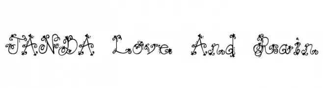
( Fonts by www.kimberlygeswein.com - Kimberly Geswein )
An ornate, decorative font with intricate swirls and floral embellishments.
![JANDA Love And Rain تنزيل الخطوط]() تنزيل 325 التنزيلات@WebFont
تنزيل 325 التنزيلات@WebFont -
( Fonts by Daniel Zadorozny - www.iconian.com - Free for personal use )
A sleek, modern italic font with uniform strokes and rounded edges.
![Federal Service Light Italic تنزيل الخطوط]() تنزيل 325 التنزيلات@WebFont
تنزيل 325 التنزيلات@WebFont -
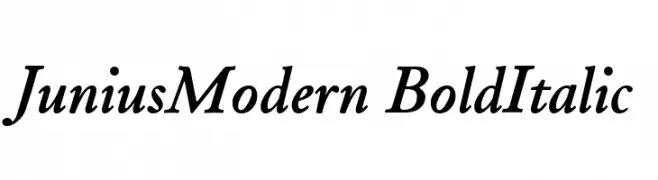
( Peter S. Baker - faculty.virginia.edu/oldenglish/ )
A bold, italicized font with elegant, flowing letterforms and a modern yet classic appeal.
![JuniusModern BoldItalic تنزيل الخطوط]() تنزيل 325 التنزيلات@WebFont
تنزيل 325 التنزيلات@WebFont -
( Fonts by Dieter Steffmann )
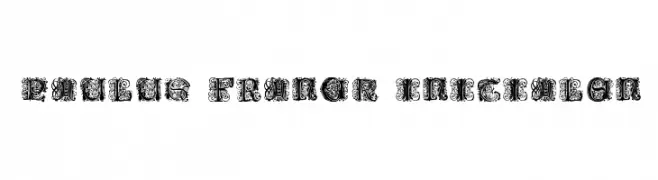
An ornate, decorative font with intricate, floral designs ideal for elegant projects.
![Paulus Franck Initialen تنزيل الخطوط]() تنزيل 325 التنزيلات@WebFont
تنزيل 325 التنزيلات@WebFont -
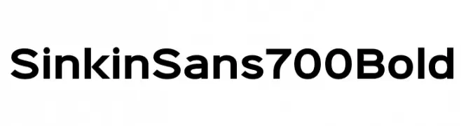
( K-Type - www.k-type.com )
A bold, modern sans-serif font with clean lines and balanced proportions.
![Sinkin Sans 700 Bold تنزيل الخطوط]() تنزيل 325 التنزيلات@WebFont
تنزيل 325 التنزيلات@WebFont -
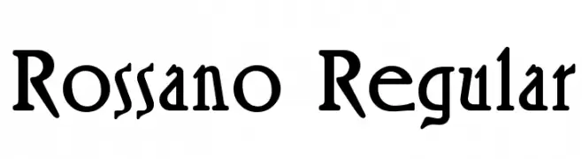
( Fonts by Dieter Steffmann )
A bold, slightly condensed serif font with a classic yet modern appeal.
![Rossano Regular تنزيل الخطوط]() تنزيل 325 التنزيلات@WebFont
تنزيل 325 التنزيلات@WebFont -
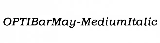
( Fonts by Castcraft Software - opti.netii.net - check the website before use )
A medium-weight, italic serif font with a classic and elegant style.
![OPTIBarMay-MediumItalic تنزيل الخطوط]() تنزيل 325 التنزيلات@WebFont
تنزيل 325 التنزيلات@WebFont -
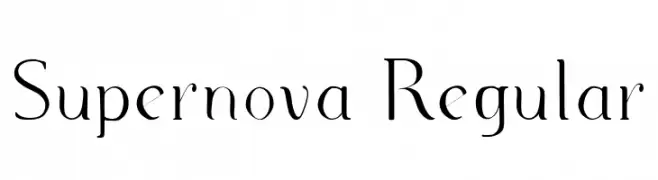
( Fonts by Mycandythemes - Filia - Personal-use only. For commercial use please contact owner. )
An elegant serif font with high contrast and refined details.
![Supernova Regular تنزيل الخطوط]() تنزيل 325 التنزيلات@WebFont
تنزيل 325 التنزيلات@WebFont -
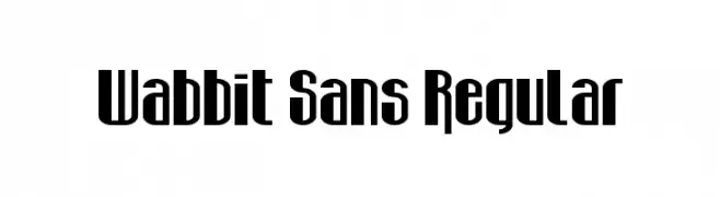
( Fonts by Andrew McCluskey - nalgames.com )
A bold, modern font with a geometric and condensed style.
![Wabbit Sans Regular تنزيل الخطوط]() تنزيل 325 التنزيلات@WebFont
تنزيل 325 التنزيلات@WebFont -
( Fonts by Daniel Zadorozny - www.iconian.com - Free for personal use )
A bold, futuristic, and angular italic font with a high-tech appearance.
![Replicant Laser Italic تنزيل الخطوط]() تنزيل 325 التنزيلات@WebFont
تنزيل 325 التنزيلات@WebFont -
![Sweetie Love تنزيل الخطوط]() تنزيل 325 التنزيلات@WebFont
تنزيل 325 التنزيلات@WebFont -
( Fonts by Knackpack Studio - www.knackpack.studio - Personal-use only. For commercial use please contact owner. )
A bold, distressed font with a rugged, grunge appearance.
![The Flast Demo تنزيل الخطوط]() تنزيل 325 التنزيلات@WebFont
تنزيل 325 التنزيلات@WebFont -
![Solve تنزيل الخطوط]() تنزيل 325 التنزيلات@WebFont
تنزيل 325 التنزيلات@WebFont -
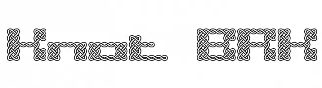
( Fonts by www.aenigmafonts.com )
An intricate, knot-inspired decorative font with a complex, interwoven design.
![Knot BRK تنزيل الخطوط]() تنزيل 325 التنزيلات@WebFont
تنزيل 325 التنزيلات@WebFont -
![Antilles Academy تنزيل الخطوط]() تنزيل 325 التنزيلات@WebFont
تنزيل 325 التنزيلات@WebFont -
![SALVAGE تنزيل الخطوط]() تنزيل 325 التنزيلات@WebFont
تنزيل 325 التنزيلات@WebFont -
( Fonts by www.chequered.ink - Chequered Ink - Personal-use only. For commercial use please contact owner. )
A bold, geometric font with strong, sharp angles and a modern style.
![Ineptic تنزيل الخطوط]() تنزيل 325 التنزيلات@WebFont
تنزيل 325 التنزيلات@WebFont -
( Fonts by a Anton Krylov . Personal-use only. For commercial use please contact owner. )
A bold, decorative font with a striped, vintage Western style.
![RioGrande Striped Bold تنزيل الخطوط]() تنزيل 325 التنزيلات@WebFont
تنزيل 325 التنزيلات@WebFont


ما هي أبرز الخطوط الآن؟
تحظى Icklips, FreeSans Oblique, La Monte, americano and Giovanni بشعبية لخطوطها النظيفة وتطبيقاتها الواسعة — من الهوية البصرية إلى الصفحات المقصودة والملصقات.
أي الخطوط تُستخدم كثيرًا في الشعارات؟
تُعد السان سيريف الهندسية (مثل Poppins وعائلات على نمط Gotham) خيارًا شائعًا لعلامات نظيفة قابلة للتوسع. ولإضفاء طابع ودي، تبقى السكريبت واليدوية خيارًا كلاسيكيًا. اجمع عنوانًا بارزًا مع خط نصي محايد لتحقيق التوازن والتميّز.
كم مرة يتم تحديث قائمة أعلى الخطوط؟
نحدّثها بانتظام استنادًا إلى التنزيلات والنشاط الفعلي. عُد إليها كثيرًا لاكتشاف النجوم الصاعدة مبكرًا.
💡 نصيحة: أضف هذه الصفحة إلى العلامات — تتغير الاتجاهات بسرعة وقد تُلهم خطوط اليوم الرائجة إعادة العلامة غدًا.