مرحبًا بك في قسم أعلى الخطوط — حيث تلتقي الشعبية بالجودة. هذه هي الخطوط الأكثر تنزيلًا واستخدامًا هذا العام من قبل مجتمعنا. إذا كنت بحاجة إلى اختيار موثوق للشعارات أو الويب أو وسائل التواصل، فابدأ من هنا.
يتميز كل خط رائج بتوازن جيد وقابلية قراءة وتعدد استخدامات. ستجد سان سيريف حديثة، وسكريبتات أنيقة، وسيريف كلاسيكية، وخطوط عرض minimal مختارة بعناية.
-
( Copyright 2016 The Archivo Project Authors (omnibus.type@gmail.com) )
A modern, geometric sans-serif font with clean and readable letterforms.
 تنزيل 1507 التنزيلات@WebFont
 -
( Fonts by Jovanny Lemonad - typetype.ru - Personal-use only. For commercial use please contact owner. )
A modern, geometric sans-serif font with clean lines and balanced proportions.
![Prosto تنزيل الخطوط]() تنزيل 1507 التنزيلات@WebFont
تنزيل 1507 التنزيلات@WebFont -
( Fonts by New Typography - Vernon Adams. Personal-use only. For commercial use please contact owner. )
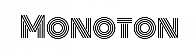
A bold, geometric font with parallel line detailing for a modern, decorative look.
![Monoton تنزيل الخطوط]() تنزيل 1507 التنزيلات@WebFont
تنزيل 1507 التنزيلات@WebFont -
( Fonts by Andrew McCluskey - nalgames.com. Personal-use only. For commercial use please contact owner. )
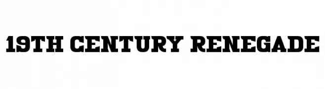
A bold, vintage serif font with a strong, Western-inspired aesthetic.
![19th Century Renegade تنزيل الخطوط]() تنزيل 1507 التنزيلات@WebFont
تنزيل 1507 التنزيلات@WebFont -
( Fonts by Chris Simpkins )
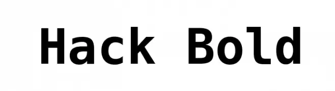
A bold, modern sans-serif font with clean lines and a slightly condensed style.
![Hack Bold تنزيل الخطوط]() تنزيل 1507 التنزيلات@WebFont
تنزيل 1507 التنزيلات@WebFont -
-
( Copyright (c) 2012, Eduardo Tunni (http://www.tipo.net.ar), with Reserved Font Name 'Offside' )
A modern, geometric font with rounded edges and a clean, minimalistic style.
![Offside تنزيل الخطوط]() تنزيل 1507 التنزيلات@WebFont
تنزيل 1507 التنزيلات@WebFont -
( Fonts by Apostrophic Lab )
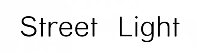
A modern, geometric sans-serif font with consistent stroke width and minimalistic design.
![Street Light تنزيل الخطوط]() تنزيل 1507 التنزيلات@WebFont
تنزيل 1507 التنزيلات@WebFont -
( Fonts by Jester Font Studio )
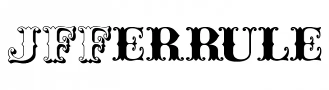
An ornate and decorative font with vintage, theatrical flair.
![JFFerrule تنزيل الخطوط]() تنزيل 1507 التنزيلات@WebFont
تنزيل 1507 التنزيلات@WebFont -
( Fonts by ShyFonts )
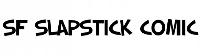
A playful, bold font with comic-style, exaggerated letterforms.
![SF Slapstick Comic تنزيل الخطوط]() تنزيل 1507 التنزيلات@WebFont
تنزيل 1507 التنزيلات@WebFont -
![Tibetan Unicode تنزيل الخطوط]() تنزيل 1507 التنزيلات@WebFont
تنزيل 1507 التنزيلات@WebFont


ما هي أبرز الخطوط الآن؟
تحظى Archivo VF Beta Regular, Prosto, Monoton, 19th Century Renegade and Hack Bold بشعبية لخطوطها النظيفة وتطبيقاتها الواسعة — من الهوية البصرية إلى الصفحات المقصودة والملصقات.
أي الخطوط تُستخدم كثيرًا في الشعارات؟
تُعد السان سيريف الهندسية (مثل Poppins وعائلات على نمط Gotham) خيارًا شائعًا لعلامات نظيفة قابلة للتوسع. ولإضفاء طابع ودي، تبقى السكريبت واليدوية خيارًا كلاسيكيًا. اجمع عنوانًا بارزًا مع خط نصي محايد لتحقيق التوازن والتميّز.
كم مرة يتم تحديث قائمة أعلى الخطوط؟
نحدّثها بانتظام استنادًا إلى التنزيلات والنشاط الفعلي. عُد إليها كثيرًا لاكتشاف النجوم الصاعدة مبكرًا.
💡 نصيحة: أضف هذه الصفحة إلى العلامات — تتغير الاتجاهات بسرعة وقد تُلهم خطوط اليوم الرائجة إعادة العلامة غدًا.