مرحبًا بك في قسم أعلى الخطوط — حيث تلتقي الشعبية بالجودة. هذه هي الخطوط الأكثر تنزيلًا واستخدامًا هذا العام من قبل مجتمعنا. إذا كنت بحاجة إلى اختيار موثوق للشعارات أو الويب أو وسائل التواصل، فابدأ من هنا.
يتميز كل خط رائج بتوازن جيد وقابلية قراءة وتعدد استخدامات. ستجد سان سيريف حديثة، وسكريبتات أنيقة، وسيريف كلاسيكية، وخطوط عرض minimal مختارة بعناية.
-
 تنزيل 1539 التنزيلات@WebFont
 -
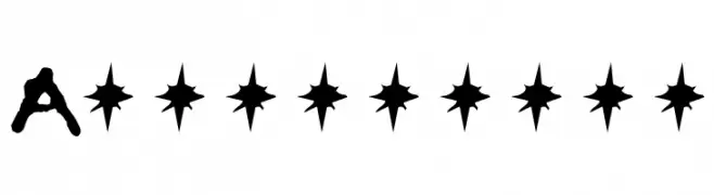
( Craft Supply Co. - creativemarket.com/craftsupplyco )
A rough, hand-drawn font with a vintage, organic feel.
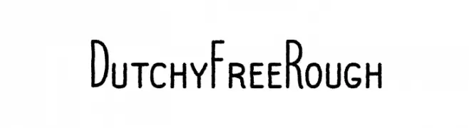
![Dutchy Free Rough تنزيل الخطوط]() تنزيل 1538 التنزيلات@WebFont
تنزيل 1538 التنزيلات@WebFont -
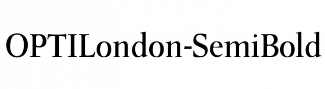
( Fonts by Castcraft Software - opti.netii.net - check the website before use )
A classic serif font with semi-bold weight and moderate contrast, ideal for elegant and readable text.
![OPTILondon-SemiBold تنزيل الخطوط]() تنزيل 1538 التنزيلات@WebFont
تنزيل 1538 التنزيلات@WebFont -
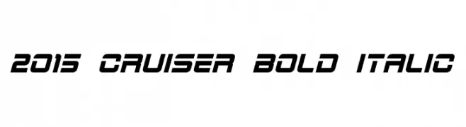
( Fonts by a Neale Davidson - www.pixelsagas.com. Personal-use only. For commercial use please contact owner. )
A bold, italicized font with a modern and dynamic style.
![2015 Cruiser Bold Italic تنزيل الخطوط]() تنزيل 1538 التنزيلات@WebFont
تنزيل 1538 التنزيلات@WebFont -
( Fonts by Lee Batchelor http://leeviathan.com/portfolio/fonts/ )
A casual, handwritten font with a playful and dynamic style.
![#1Ichiro تنزيل الخطوط]() تنزيل 1538 التنزيلات@WebFont
تنزيل 1538 التنزيلات@WebFont -
-
( Fonts by Arkandis Digital Foundry )
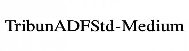
A classic serif font with medium weight and elegant style.
![TribunADFStd-Medium تنزيل الخطوط]() تنزيل 1538 التنزيلات@WebFont
تنزيل 1538 التنزيلات@WebFont -
( Fonts by www.typodermicfonts.com - Ray Larabie )
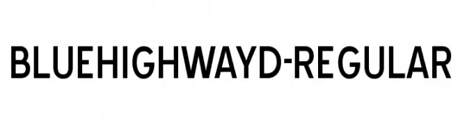
A modern, bold sans-serif font with clean lines and geometric structure.
![BlueHighwayD-Regular تنزيل الخطوط]() تنزيل 1538 التنزيلات@WebFont
تنزيل 1538 التنزيلات@WebFont -
( Fonts by Anke Arnold - www.anke-art.de )
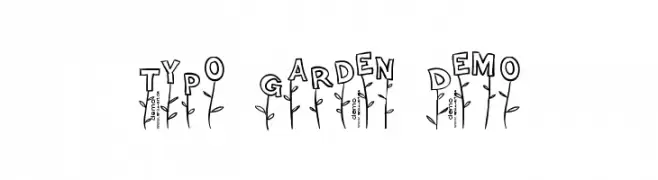
A playful, garden-themed decorative font with a hand-drawn style.
![Typo Garden Demo تنزيل الخطوط]() تنزيل 1538 التنزيلات@WebFont
تنزيل 1538 التنزيلات@WebFont -
( Fonts by Manfred Klein. Free for private and charity use. Free for commercial with donation to organizations )
A classic serif font with elegant italics and refined serifs.
![MediaevalItalique تنزيل الخطوط]() تنزيل 1538 التنزيلات@WebFont
تنزيل 1538 التنزيلات@WebFont -
( Fonts by Graham Meade - GemFonts )
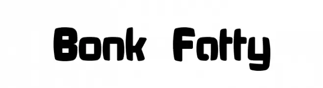
A bold, rounded font with a playful and chunky style.
![Bonk Fatty تنزيل الخطوط]() تنزيل 1538 التنزيلات@WebFont
تنزيل 1538 التنزيلات@WebFont


ما هي أبرز الخطوط الآن؟
تحظى Armageddon, Dutchy Free Rough, OPTILondon-SemiBold, 2015 Cruiser Bold Italic and #1Ichiro بشعبية لخطوطها النظيفة وتطبيقاتها الواسعة — من الهوية البصرية إلى الصفحات المقصودة والملصقات.
أي الخطوط تُستخدم كثيرًا في الشعارات؟
تُعد السان سيريف الهندسية (مثل Poppins وعائلات على نمط Gotham) خيارًا شائعًا لعلامات نظيفة قابلة للتوسع. ولإضفاء طابع ودي، تبقى السكريبت واليدوية خيارًا كلاسيكيًا. اجمع عنوانًا بارزًا مع خط نصي محايد لتحقيق التوازن والتميّز.
كم مرة يتم تحديث قائمة أعلى الخطوط؟
نحدّثها بانتظام استنادًا إلى التنزيلات والنشاط الفعلي. عُد إليها كثيرًا لاكتشاف النجوم الصاعدة مبكرًا.
💡 نصيحة: أضف هذه الصفحة إلى العلامات — تتغير الاتجاهات بسرعة وقد تُلهم خطوط اليوم الرائجة إعادة العلامة غدًا.