مرحبًا بك في قسم أعلى الخطوط — حيث تلتقي الشعبية بالجودة. هذه هي الخطوط الأكثر تنزيلًا واستخدامًا هذا العام من قبل مجتمعنا. إذا كنت بحاجة إلى اختيار موثوق للشعارات أو الويب أو وسائل التواصل، فابدأ من هنا.
يتميز كل خط رائج بتوازن جيد وقابلية قراءة وتعدد استخدامات. ستجد سان سيريف حديثة، وسكريبتات أنيقة، وسيريف كلاسيكية، وخطوط عرض minimal مختارة بعناية.
-
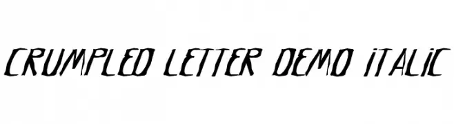
( Fonts by Noah Type - noahtype.com - Personal-use only. For commercial use please contact owner. )
A dynamic, edgy font with sharp, angular strokes and a crumpled appearance.
 تنزيل 54 التنزيلات@WebFont
 -
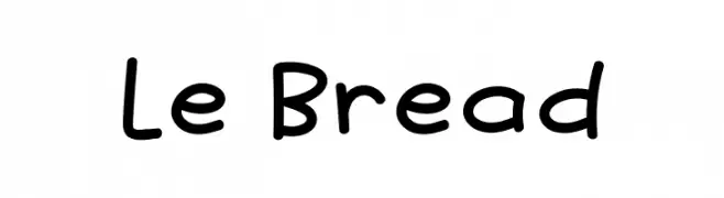
( Fonts by Khurasan - Syaf Rizal - Personal-use only. For commercial use please contact owner. )
A playful, rounded font with a hand-drawn, whimsical style.
![Le Bread تنزيل الخطوط]() تنزيل 54 التنزيلات@WebFont
تنزيل 54 التنزيلات@WebFont -
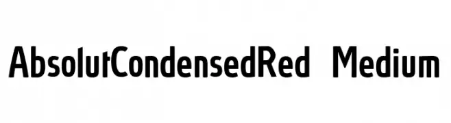
( Fonts by ingoFonts - Ingo Zimmermann - Personal-use only. For commercial use please contact owner. )
A modern, condensed font with clean lines and a bold presence.
![AbsolutCondensedRed-Medium تنزيل الخطوط]() تنزيل 54 التنزيلات@WebFont
تنزيل 54 التنزيلات@WebFont -
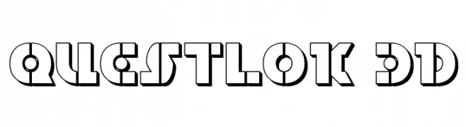
( Iconian Fonts - Daniel Zadorozny - www.iconian.com )
A bold, geometric 3D font with a futuristic and industrial style.
![Questlok 3D تنزيل الخطوط]() تنزيل 54 التنزيلات@WebFont
تنزيل 54 التنزيلات@WebFont -
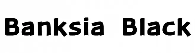
( Fonts by Daniel Midgley )
A bold, dynamic font with a playful and slightly irregular style.
![Banksia Black تنزيل الخطوط]() تنزيل 54 التنزيلات@WebFont
تنزيل 54 التنزيلات@WebFont -
-
( Fonts by Nirmala Creative )
A lively and fluid handwritten font with smooth, flowing lines.
![Brittane تنزيل الخطوط]() تنزيل 54 التنزيلات@WebFont
تنزيل 54 التنزيلات@WebFont -
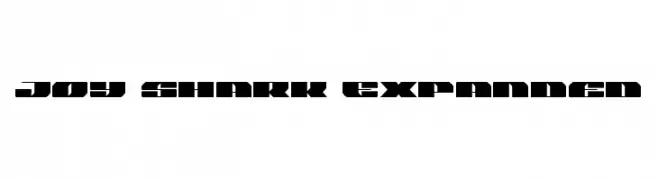
![Joy Shark Expanded تنزيل الخطوط]() تنزيل 54 التنزيلات@WebFont
تنزيل 54 التنزيلات@WebFont -
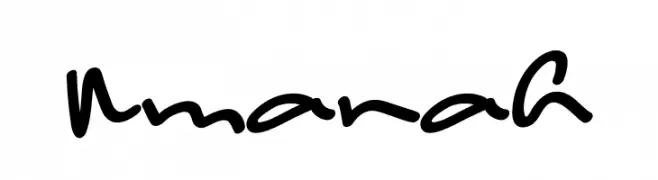
( Fonts by Muharima Rasyid - Personal-use only. For commercial use please contact owner. )
A lively and dynamic handwritten font with fluid, connected strokes.
![Amanah تنزيل الخطوط]() تنزيل 54 التنزيلات@WebFont
تنزيل 54 التنزيلات@WebFont -
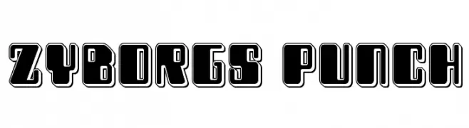
( Iconian Fonts - Daniel Zadorozny - www.iconian.com )
A bold, futuristic font with geometric shapes and thick outlines.
![Zyborgs Punch تنزيل الخطوط]() تنزيل 54 التنزيلات@WebFont
تنزيل 54 التنزيلات@WebFont -
( Marc Clancy - www.marcclancy.com/ )
A bold, geometric font with a 3D effect and modern style.
![MinidibEmb تنزيل الخطوط]() تنزيل 54 التنزيلات@WebFont
تنزيل 54 التنزيلات@WebFont


ما هي أبرز الخطوط الآن؟
تحظى Crumpled Letter Demo Italic, Le Bread, AbsolutCondensedRed-Medium, Questlok 3D and Banksia Black بشعبية لخطوطها النظيفة وتطبيقاتها الواسعة — من الهوية البصرية إلى الصفحات المقصودة والملصقات.
أي الخطوط تُستخدم كثيرًا في الشعارات؟
تُعد السان سيريف الهندسية (مثل Poppins وعائلات على نمط Gotham) خيارًا شائعًا لعلامات نظيفة قابلة للتوسع. ولإضفاء طابع ودي، تبقى السكريبت واليدوية خيارًا كلاسيكيًا. اجمع عنوانًا بارزًا مع خط نصي محايد لتحقيق التوازن والتميّز.
كم مرة يتم تحديث قائمة أعلى الخطوط؟
نحدّثها بانتظام استنادًا إلى التنزيلات والنشاط الفعلي. عُد إليها كثيرًا لاكتشاف النجوم الصاعدة مبكرًا.
💡 نصيحة: أضف هذه الصفحة إلى العلامات — تتغير الاتجاهات بسرعة وقد تُلهم خطوط اليوم الرائجة إعادة العلامة غدًا.