مرحبًا بك في قسم أعلى الخطوط — حيث تلتقي الشعبية بالجودة. هذه هي الخطوط الأكثر تنزيلًا واستخدامًا هذا العام من قبل مجتمعنا. إذا كنت بحاجة إلى اختيار موثوق للشعارات أو الويب أو وسائل التواصل، فابدأ من هنا.
يتميز كل خط رائج بتوازن جيد وقابلية قراءة وتعدد استخدامات. ستجد سان سيريف حديثة، وسكريبتات أنيقة، وسيريف كلاسيكية، وخطوط عرض minimal مختارة بعناية.
-
( Fonts by Iconian Fonts )
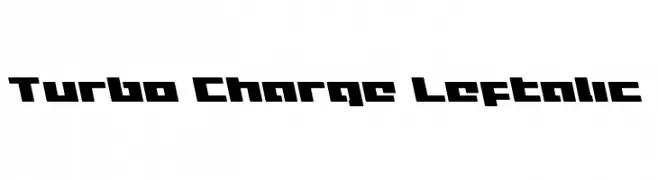
A bold, angular font with a futuristic and dynamic style.
 تنزيل 55 التنزيلات@WebFont
 -
( Zetafonts - www.zetafonts.com )
A bold, rounded, and italicized font with a playful and friendly style.
![KabrioSoft-HeavyItalic تنزيل الخطوط]() تنزيل 55 التنزيلات@WebFont
تنزيل 55 التنزيلات@WebFont -
( Fonts by Letterena Studios )
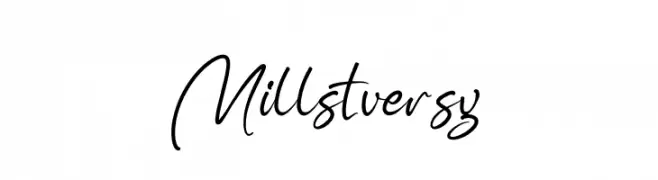
A flowing, elegant cursive font with graceful curves and artistic flair.
![Millstversy تنزيل الخطوط]() تنزيل 55 التنزيلات@WebFont
تنزيل 55 التنزيلات@WebFont -
![Proton SemiBold Extended تنزيل الخطوط]() تنزيل 55 التنزيلات@WebFont
تنزيل 55 التنزيلات@WebFont -
![Pointer HyperCondensed تنزيل الخطوط]() تنزيل 55 التنزيلات@WebFont
تنزيل 55 التنزيلات@WebFont -
-
( Me )
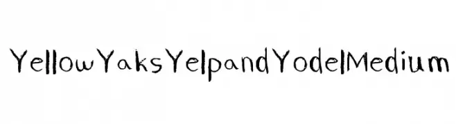
A playful, hand-drawn font with uneven strokes and a whimsical style.
![Yellow Yaks Yelp and Yodel Medium تنزيل الخطوط]() تنزيل 55 التنزيلات@WebFont
تنزيل 55 التنزيلات@WebFont -
( Fonts by www.junkohanhero.com - Personal-use only. For commercial use please contact owner. )
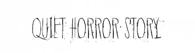
A haunting, distressed font with tall, narrow letterforms and a scratchy texture.
![Quiet Horror Story تنزيل الخطوط]() تنزيل 55 التنزيلات@WebFont
تنزيل 55 التنزيلات@WebFont -
( Fonts by Rémi Godefroid - Personal-use only. For commercial use please contact owner. )
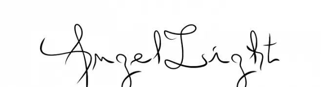
An elegant, flowing script font with smooth, continuous strokes.
![Angel Light تنزيل الخطوط]() تنزيل 55 التنزيلات@WebFont
تنزيل 55 التنزيلات@WebFont -
( Fonts by Out of Step Font Company - Dan Steinbok - outofstepfontco.com - Personal-use only. For commercial use please contact owner. )
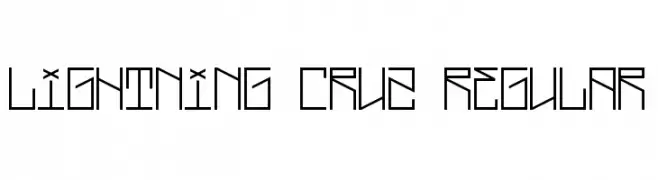
A geometric, angular font with a futuristic and modern design.
![Lightning Cruz Regular تنزيل الخطوط]() تنزيل 55 التنزيلات@WebFont
تنزيل 55 التنزيلات@WebFont -
( Fonts by Wino S Kadir - weknow - www.revolge.com/shop/weknow/ - Personal-use only. For commercial use please contact owner. )
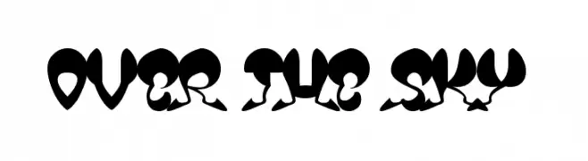
A bold, whimsical font with high contrast and playful, artistic elements.
![OVER THE SKY تنزيل الخطوط]() تنزيل 55 التنزيلات@WebFont
تنزيل 55 التنزيلات@WebFont

ما هي أبرز الخطوط الآن؟
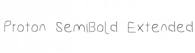
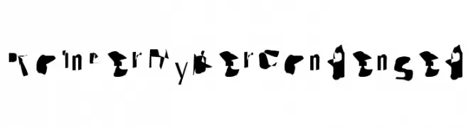
تحظى Turbo Charge Leftalic, KabrioSoft-HeavyItalic, Millstversy, Proton SemiBold Extended and Pointer HyperCondensed بشعبية لخطوطها النظيفة وتطبيقاتها الواسعة — من الهوية البصرية إلى الصفحات المقصودة والملصقات.
أي الخطوط تُستخدم كثيرًا في الشعارات؟
تُعد السان سيريف الهندسية (مثل Poppins وعائلات على نمط Gotham) خيارًا شائعًا لعلامات نظيفة قابلة للتوسع. ولإضفاء طابع ودي، تبقى السكريبت واليدوية خيارًا كلاسيكيًا. اجمع عنوانًا بارزًا مع خط نصي محايد لتحقيق التوازن والتميّز.
كم مرة يتم تحديث قائمة أعلى الخطوط؟
نحدّثها بانتظام استنادًا إلى التنزيلات والنشاط الفعلي. عُد إليها كثيرًا لاكتشاف النجوم الصاعدة مبكرًا.
💡 نصيحة: أضف هذه الصفحة إلى العلامات — تتغير الاتجاهات بسرعة وقد تُلهم خطوط اليوم الرائجة إعادة العلامة غدًا.