مرحبًا بك في قسم أعلى الخطوط — حيث تلتقي الشعبية بالجودة. هذه هي الخطوط الأكثر تنزيلًا واستخدامًا هذا العام من قبل مجتمعنا. إذا كنت بحاجة إلى اختيار موثوق للشعارات أو الويب أو وسائل التواصل، فابدأ من هنا.
يتميز كل خط رائج بتوازن جيد وقابلية قراءة وتعدد استخدامات. ستجد سان سيريف حديثة، وسكريبتات أنيقة، وسيريف كلاسيكية، وخطوط عرض minimal مختارة بعناية.
-
( Fonts by CannotIntoSpaceFonts - KineticPlasma Fonts - Personal-use only. For commercial use please contact owner. )
A bold, angular, and oblique font with a futuristic and edgy style.
 تنزيل 59 التنزيلات@WebFont
 -
( Fonts by Muhammad Yafinuha )
Hand-drawn, sketch-style arrows and symbols with a casual, informal look.
![Ardot تنزيل الخطوط]() تنزيل 59 التنزيلات@WebFont
تنزيل 59 التنزيلات@WebFont -
( Fonts by Letterena Studios )
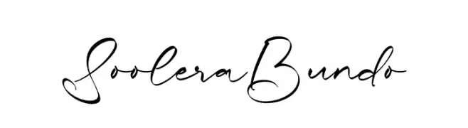
Elegant cursive script with a handwritten feel.
![Soolera Bundo تنزيل الخطوط]() تنزيل 59 التنزيلات@WebFont
تنزيل 59 التنزيلات@WebFont -
( Fonts by Iconian Fonts )
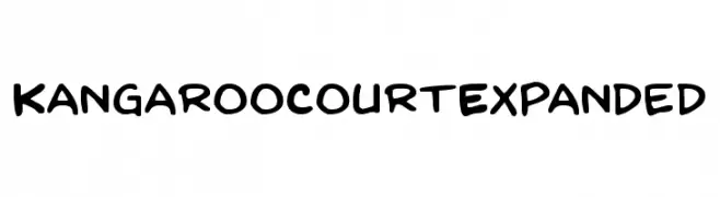
A playful, bold handwritten font with rounded edges and a casual style.
![Kangaroo Court Expanded تنزيل الخطوط]() تنزيل 59 التنزيلات@WebFont
تنزيل 59 التنزيلات@WebFont -
( Zulkhairi M Saleh - fontbundles.net/zulkhairilettering )
A creative, hand-drawn style font with elongated, artistic letterforms.
![NYOEHOKA تنزيل الخطوط]() تنزيل 59 التنزيلات@WebFont
تنزيل 59 التنزيلات@WebFont -
-
( Fonts by Noah Type - noahtype.com - Personal-use only. For commercial use please contact owner. )
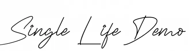
A flowing, cursive script with elegant, connected strokes.
![Single Life Demo تنزيل الخطوط]() تنزيل 59 التنزيلات@WebFont
تنزيل 59 التنزيلات@WebFont -
( Fonts by WolfBainX - Personal-use only. For commercial use please contact owner. )
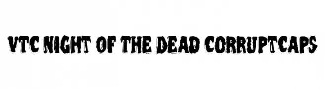
A bold, distressed font with jagged, eroded edges for dramatic impact.
![VTC Night Of The Dead CorruptCaps تنزيل الخطوط]() تنزيل 59 التنزيلات@WebFont
تنزيل 59 التنزيلات@WebFont -
( Fonts by Edric Studio www.creativefabrica.com/designer/edricstudio/ - Personal-use only. For commercial use please contact owner. )
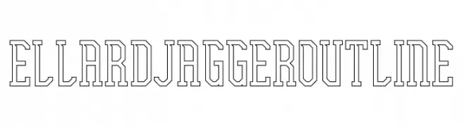
A bold, outlined font with a geometric and modern style.
![Ellard Jagger Outline تنزيل الخطوط]() تنزيل 59 التنزيلات@WebFont
تنزيل 59 التنزيلات@WebFont -
( Fonts by Sawarna Studio - Personal-use only. For commercial use please contact owner. )
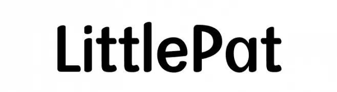
A modern sans-serif font with rounded edges and excellent readability.
![Little Pat تنزيل الخطوط]() تنزيل 59 التنزيلات@WebFont
تنزيل 59 التنزيلات@WebFont -
( Caramel Syrup Font Shop - caramelsyrup.infoseek.ne.jp/ )
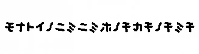
A bold, playful font with a hand-drawn, dynamic style.
![musekinin-katakana تنزيل الخطوط]() تنزيل 59 التنزيلات@WebFont
تنزيل 59 التنزيلات@WebFont


ما هي أبرز الخطوط الآن؟
تحظى Stormning Bold Oblique, Ardot, Soolera Bundo, Kangaroo Court Expanded and NYOEHOKA بشعبية لخطوطها النظيفة وتطبيقاتها الواسعة — من الهوية البصرية إلى الصفحات المقصودة والملصقات.
أي الخطوط تُستخدم كثيرًا في الشعارات؟
تُعد السان سيريف الهندسية (مثل Poppins وعائلات على نمط Gotham) خيارًا شائعًا لعلامات نظيفة قابلة للتوسع. ولإضفاء طابع ودي، تبقى السكريبت واليدوية خيارًا كلاسيكيًا. اجمع عنوانًا بارزًا مع خط نصي محايد لتحقيق التوازن والتميّز.
كم مرة يتم تحديث قائمة أعلى الخطوط؟
نحدّثها بانتظام استنادًا إلى التنزيلات والنشاط الفعلي. عُد إليها كثيرًا لاكتشاف النجوم الصاعدة مبكرًا.
💡 نصيحة: أضف هذه الصفحة إلى العلامات — تتغير الاتجاهات بسرعة وقد تُلهم خطوط اليوم الرائجة إعادة العلامة غدًا.