مرحبًا بك في قسم أعلى الخطوط — حيث تلتقي الشعبية بالجودة. هذه هي الخطوط الأكثر تنزيلًا واستخدامًا هذا العام من قبل مجتمعنا. إذا كنت بحاجة إلى اختيار موثوق للشعارات أو الويب أو وسائل التواصل، فابدأ من هنا.
يتميز كل خط رائج بتوازن جيد وقابلية قراءة وتعدد استخدامات. ستجد سان سيريف حديثة، وسكريبتات أنيقة، وسيريف كلاسيكية، وخطوط عرض minimal مختارة بعناية.
-
( Copyright (c) 2014, Dunwich Type Founders (http://dunwichtype.com). Rhodium is a trademark of Dunwich Type Founders. )
A clean, modern font with balanced proportions and moderate stroke contrast.
 تنزيل 1627 التنزيلات@WebFont
 -
( Copyright (c) 2011 Silicon Andhra (fonts.siliconandhra.org). )
A playful and whimsical font with bold, dynamic strokes and unique shapes.
![Lakki Reddy تنزيل الخطوط]() تنزيل 1627 التنزيلات@WebFont
تنزيل 1627 التنزيلات@WebFont -
( Copyright (c) 2011, Andreas Kalpakides (hello@inderesting.com) )
A modern, semi-bold sans-serif font with a clean and balanced design.
![Advent Pro SemiBold تنزيل الخطوط]() تنزيل 1627 التنزيلات@WebFont
تنزيل 1627 التنزيلات@WebFont -
( Fonts by www.haroldsfonts.com )
A bold, italicized font with a double-line shadow effect for a modern, dynamic look.
![Dilemma Demo تنزيل الخطوط]() تنزيل 1627 التنزيلات@WebFont
تنزيل 1627 التنزيلات@WebFont -
![KR Lippy تنزيل الخطوط]() تنزيل 1627 التنزيلات@WebFont
تنزيل 1627 التنزيلات@WebFont -
-
( Fonts by David Rakowski )
An ornate Gothic font with intricate decorative elements and a dramatic style.
![Uechi Gothic تنزيل الخطوط]() تنزيل 1627 التنزيلات
تنزيل 1627 التنزيلات -
( Pablo Impallari - www.impallari.com/ )
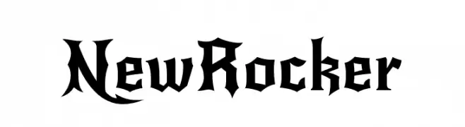
A bold, gothic-inspired font with sharp, angular lines and dramatic serifs.
![NewRocker تنزيل الخطوط]() تنزيل 1626 التنزيلات@WebFont
تنزيل 1626 التنزيلات@WebFont -
( Fonts by Måns Grebäck )
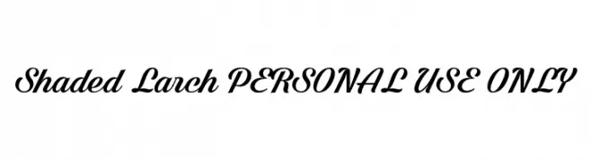
A bold, elegant script font with dynamic curves and smooth connections.
![Shaded Larch PERSONAL USE ONLY تنزيل الخطوط]() تنزيل 1626 التنزيلات@WebFont
تنزيل 1626 التنزيلات@WebFont -
( Fonts by Daniel Zadorozny - www.iconian.com )
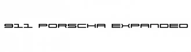
A modern, geometric font with a sleek, futuristic design.
![911 Porscha Expanded تنزيل الخطوط]() تنزيل 1626 التنزيلات@WebFont
تنزيل 1626 التنزيلات@WebFont -
( Copyright (c) 2011, Edgar Tolentino and Pablo Impallari (www.impallari.com|impallari@gmail.com) )
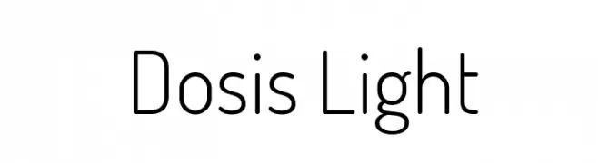
A clean, geometric sans-serif font with rounded edges and a modern, minimalistic style.
![Dosis Light تنزيل الخطوط]() تنزيل 1626 التنزيلات@WebFont
تنزيل 1626 التنزيلات@WebFont


ما هي أبرز الخطوط الآن؟
تحظى Rhodium Libre, Lakki Reddy, Advent Pro SemiBold, Dilemma Demo and KR Lippy بشعبية لخطوطها النظيفة وتطبيقاتها الواسعة — من الهوية البصرية إلى الصفحات المقصودة والملصقات.
أي الخطوط تُستخدم كثيرًا في الشعارات؟
تُعد السان سيريف الهندسية (مثل Poppins وعائلات على نمط Gotham) خيارًا شائعًا لعلامات نظيفة قابلة للتوسع. ولإضفاء طابع ودي، تبقى السكريبت واليدوية خيارًا كلاسيكيًا. اجمع عنوانًا بارزًا مع خط نصي محايد لتحقيق التوازن والتميّز.
كم مرة يتم تحديث قائمة أعلى الخطوط؟
نحدّثها بانتظام استنادًا إلى التنزيلات والنشاط الفعلي. عُد إليها كثيرًا لاكتشاف النجوم الصاعدة مبكرًا.
💡 نصيحة: أضف هذه الصفحة إلى العلامات — تتغير الاتجاهات بسرعة وقد تُلهم خطوط اليوم الرائجة إعادة العلامة غدًا.