مرحبًا بك في قسم أعلى الخطوط — حيث تلتقي الشعبية بالجودة. هذه هي الخطوط الأكثر تنزيلًا واستخدامًا هذا العام من قبل مجتمعنا. إذا كنت بحاجة إلى اختيار موثوق للشعارات أو الويب أو وسائل التواصل، فابدأ من هنا.
يتميز كل خط رائج بتوازن جيد وقابلية قراءة وتعدد استخدامات. ستجد سان سيريف حديثة، وسكريبتات أنيقة، وسيريف كلاسيكية، وخطوط عرض minimal مختارة بعناية.
-
( Fonts by Anton Bohlin - Personal-use only. For commercial use please contact owner. )
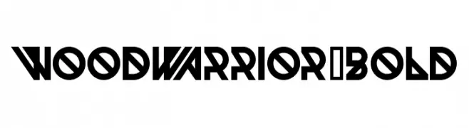
A bold, geometric font with sharp angles and a modern aesthetic.
 تنزيل 56 التنزيلات@WebFont
 -
( Fonts by Fenotype - Personal-use only. For commercial use please contact owner. )
A bold, rounded font with a modern and playful design.
![FT Roundabout round تنزيل الخطوط]() تنزيل 56 التنزيلات@WebFont
تنزيل 56 التنزيلات@WebFont -
( Iconian Fonts - Daniel Zadorozny - www.iconian.com )
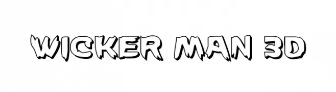
A bold, 3D font with jagged edges and a playful, dynamic style.
![Wicker Man 3D تنزيل الخطوط]() تنزيل 56 التنزيلات@WebFont
تنزيل 56 التنزيلات@WebFont -
( Studio Dot by dot - Sjoerd Kulsdom - www.dotbydot.nl/fonts )
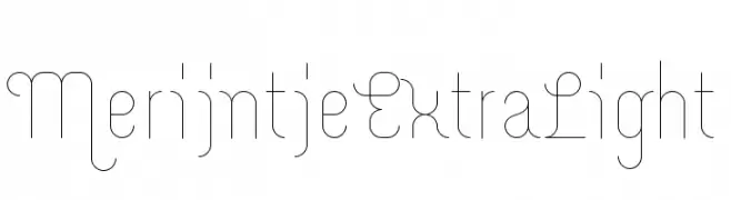
A modern, ultra-lightweight font with a minimalistic and geometric design.
![Merijntje ExtraLight تنزيل الخطوط]() تنزيل 56 التنزيلات@WebFont
تنزيل 56 التنزيلات@WebFont -
( GeelynEdits - plus.google.com/u/0/108461348931992643310/ )
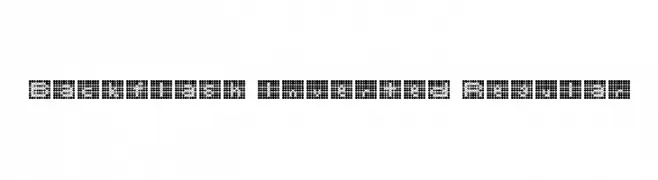
A pixelated, dot-based font with a retro digital aesthetic.
![Backflash Inverted Regular تنزيل الخطوط]() تنزيل 56 التنزيلات@WebFont
تنزيل 56 التنزيلات@WebFont -
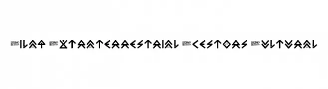
-
![Zilap Extraterrestrial Acestors Cultural تنزيل الخطوط]() تنزيل 56 التنزيلات@WebFont
تنزيل 56 التنزيلات@WebFont -
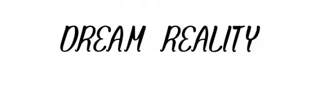
( Fonts by Wino S Kadir - weknow - www.revolge.com/shop/weknow/ - Personal-use only. For commercial use please contact owner. )
A charming and fluid script font with elegant, flowing curves.
![DREAM REALITY تنزيل الخطوط]() تنزيل 56 التنزيلات@WebFont
تنزيل 56 التنزيلات@WebFont -
( Fonts by Mans Greback - Personal-use only. For commercial use please contact owner. )
A clean, modern sans-serif font with a light weight and balanced proportions.
![Famiar PERSONAL USE ONLY Light تنزيل الخطوط]() تنزيل 56 التنزيلات@WebFont
تنزيل 56 التنزيلات@WebFont -
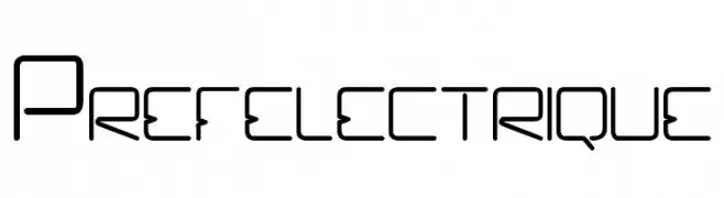
( Célia Astori - riffgraphisme.wix.com/book )
A futuristic, geometric font with clean lines and a modern aesthetic.
![Prefelectrique تنزيل الخطوط]() تنزيل 56 التنزيلات@WebFont
تنزيل 56 التنزيلات@WebFont -
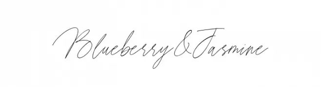
( Fonts by Letterative Studio )
A graceful, cursive font with thin, flowing strokes and elegant connections.
![Blueberry & Jasmine تنزيل الخطوط]() تنزيل 56 التنزيلات@WebFont
تنزيل 56 التنزيلات@WebFont


ما هي أبرز الخطوط الآن؟
تحظى Woodwarrior-Bold, FT Roundabout round, Wicker Man 3D, Merijntje ExtraLight and Backflash Inverted Regular بشعبية لخطوطها النظيفة وتطبيقاتها الواسعة — من الهوية البصرية إلى الصفحات المقصودة والملصقات.
أي الخطوط تُستخدم كثيرًا في الشعارات؟
تُعد السان سيريف الهندسية (مثل Poppins وعائلات على نمط Gotham) خيارًا شائعًا لعلامات نظيفة قابلة للتوسع. ولإضفاء طابع ودي، تبقى السكريبت واليدوية خيارًا كلاسيكيًا. اجمع عنوانًا بارزًا مع خط نصي محايد لتحقيق التوازن والتميّز.
كم مرة يتم تحديث قائمة أعلى الخطوط؟
نحدّثها بانتظام استنادًا إلى التنزيلات والنشاط الفعلي. عُد إليها كثيرًا لاكتشاف النجوم الصاعدة مبكرًا.
💡 نصيحة: أضف هذه الصفحة إلى العلامات — تتغير الاتجاهات بسرعة وقد تُلهم خطوط اليوم الرائجة إعادة العلامة غدًا.