مرحبًا بك في قسم أعلى الخطوط — حيث تلتقي الشعبية بالجودة. هذه هي الخطوط الأكثر تنزيلًا واستخدامًا هذا العام من قبل مجتمعنا. إذا كنت بحاجة إلى اختيار موثوق للشعارات أو الويب أو وسائل التواصل، فابدأ من هنا.
يتميز كل خط رائج بتوازن جيد وقابلية قراءة وتعدد استخدامات. ستجد سان سيريف حديثة، وسكريبتات أنيقة، وسيريف كلاسيكية، وخطوط عرض minimal مختارة بعناية.
-
( Fonts by Vladimir Nikolic - https://www.creativefabrica.com/product/educated-deers/ref/144265/ - Personal-use only. For commercial use please contact owner. )
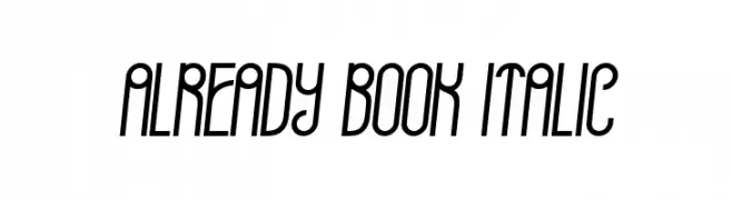
A modern, narrow, and slightly italic font with a retro touch.
 تنزيل 57 التنزيلات@WebFont
 -
![AccanthisADFStdNo3-Regular تنزيل الخطوط]() تنزيل 57 التنزيلات@WebFont
تنزيل 57 التنزيلات@WebFont -
( Sodina )
A dynamic, brush-stroke font with an expressive and artistic style.
![Otrack تنزيل الخطوط]() تنزيل 57 التنزيلات@WebFont
تنزيل 57 التنزيلات@WebFont -
( Noto is a trademark of Google Inc. Noto fonts are open source. All Noto fonts are published under the SIL Open Font License, Version 1.1 )
Ultra-light, extra condensed sans-serif with tall, narrow forms.
![Noto Sans Khmer UI ExtraCondensed ExtraLight تنزيل الخطوط]() تنزيل 57 التنزيلات@WebFont
تنزيل 57 التنزيلات@WebFont -
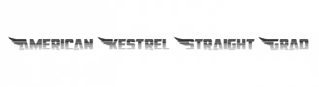
![American Kestrel Straight Grad تنزيل الخطوط]() تنزيل 57 التنزيلات@WebFont
تنزيل 57 التنزيلات@WebFont -
-
( Fonts by ingoFonts - Ingo Zimmermann - Personal-use only. For commercial use please contact owner. )
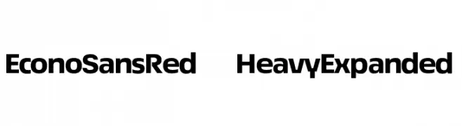
A bold, expanded sans-serif font with a modern and geometric style.
![EconoSansRed-83HeavyExpanded تنزيل الخطوط]() تنزيل 57 التنزيلات@WebFont
تنزيل 57 التنزيلات@WebFont -
( Fonts by Aleksandar Stevanov - Personal-use only. For commercial use please contact owner. )
A classic and elegant light italic font with medium contrast and smooth strokes.
![IBM Selectric Light Italic تنزيل الخطوط]() تنزيل 57 التنزيلات@WebFont
تنزيل 57 التنزيلات@WebFont -
( Fonts by Greg Medina - www.dcoxy.com - Personal-use only. For commercial use please contact owner. )
An elegant, decorative font with ornate uppercase and smooth script lowercase.
![Anne Exilum تنزيل الخطوط]() تنزيل 57 التنزيلات@WebFont
تنزيل 57 التنزيلات@WebFont -
( Fonts by Yahhya Anas - Personal-use only. For commercial use please contact owner. )
A bold, playful script font with rounded strokes and smooth curves.
![DaddyBee تنزيل الخطوط]() تنزيل 57 التنزيلات@WebFont
تنزيل 57 التنزيلات@WebFont -
( Gil N. )
A modern, geometric font with clean lines and a technical appearance.
![NeuroticaSans تنزيل الخطوط]() تنزيل 57 التنزيلات@WebFont
تنزيل 57 التنزيلات@WebFont


ما هي أبرز الخطوط الآن؟
تحظى Already Book Italic, AccanthisADFStdNo3-Regular, Otrack, Noto Sans Khmer UI ExtraCondensed ExtraLight and American Kestrel Straight Grad بشعبية لخطوطها النظيفة وتطبيقاتها الواسعة — من الهوية البصرية إلى الصفحات المقصودة والملصقات.
أي الخطوط تُستخدم كثيرًا في الشعارات؟
تُعد السان سيريف الهندسية (مثل Poppins وعائلات على نمط Gotham) خيارًا شائعًا لعلامات نظيفة قابلة للتوسع. ولإضفاء طابع ودي، تبقى السكريبت واليدوية خيارًا كلاسيكيًا. اجمع عنوانًا بارزًا مع خط نصي محايد لتحقيق التوازن والتميّز.
كم مرة يتم تحديث قائمة أعلى الخطوط؟
نحدّثها بانتظام استنادًا إلى التنزيلات والنشاط الفعلي. عُد إليها كثيرًا لاكتشاف النجوم الصاعدة مبكرًا.
💡 نصيحة: أضف هذه الصفحة إلى العلامات — تتغير الاتجاهات بسرعة وقد تُلهم خطوط اليوم الرائجة إعادة العلامة غدًا.