مرحبًا بك في قسم أعلى الخطوط — حيث تلتقي الشعبية بالجودة. هذه هي الخطوط الأكثر تنزيلًا واستخدامًا هذا العام من قبل مجتمعنا. إذا كنت بحاجة إلى اختيار موثوق للشعارات أو الويب أو وسائل التواصل، فابدأ من هنا.
يتميز كل خط رائج بتوازن جيد وقابلية قراءة وتعدد استخدامات. ستجد سان سيريف حديثة، وسكريبتات أنيقة، وسيريف كلاسيكية، وخطوط عرض minimal مختارة بعناية.
-
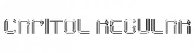
( Fonts by Vladimir Nikolic )
A futuristic, multi-line font with a geometric and symmetrical design.
 تنزيل 62 التنزيلات@WebFont
 -
( Fonts by Giga Typography - GigaType - www.deviantart.com/wolves-fonts - Personal-use only. For commercial use please contact owner. )
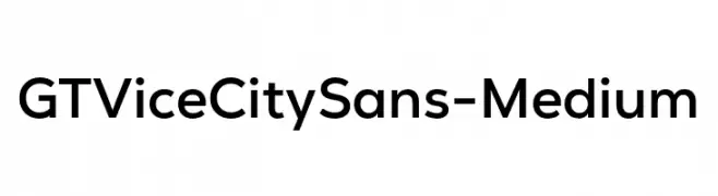
Modern geometric sans-serif font.
![GT Vice City Sans - Medium تنزيل الخطوط]() تنزيل 62 التنزيلات@WebFont
تنزيل 62 التنزيلات@WebFont -
( Fonts by Darrell Flood )
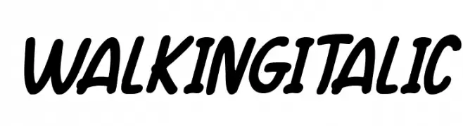
A bold, italic script font with smooth curves and dynamic flow.
![Walking Italic تنزيل الخطوط]() تنزيل 62 التنزيلات@WebFont
تنزيل 62 التنزيلات@WebFont -
( Fonts by Kong Font - fontkong.com - Personal-use only. For commercial use please contact owner. )
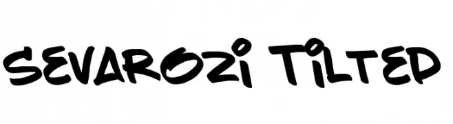
A bold, playful handwritten font with a dynamic, tilted style.
![Sevarozi Tilted تنزيل الخطوط]() تنزيل 62 التنزيلات@WebFont
تنزيل 62 التنزيلات@WebFont -
( Noto is a trademark of Google Inc. Noto fonts are open source. All Noto fonts are published under the SIL Open Font License, Version 1.1 )
The image shows placeholder symbols instead of a valid font.
![Noto Serif Khmer Condensed SemiBold تنزيل الخطوط]() تنزيل 62 التنزيلات@WebFont
تنزيل 62 التنزيلات@WebFont -
-
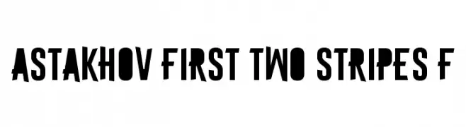
( Fonts by Dmitry Astakhov - www.behance.net/adonis-abe1e - Personal-use only. For commercial use please contact owner. )
A bold, modern font with thick strokes and tight spacing, perfect for impactful designs.
![Astakhov First Two Stripes F تنزيل الخطوط]() تنزيل 62 التنزيلات@WebFont
تنزيل 62 التنزيلات@WebFont -
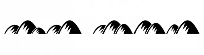
( Fonts by Vladimir Nikolic )
A border font made of illustrated hills or mountains.
![Hills Regular تنزيل الخطوط]() تنزيل 62 التنزيلات@WebFont
تنزيل 62 التنزيلات@WebFont -
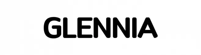
( Fonts by typeformerstudio.com - Personal-use only. For commercial use please contact owner. )
A bold, rounded sans-serif font with smooth curves and uniform strokes.
![Glennia تنزيل الخطوط]() تنزيل 62 التنزيلات@WebFont
تنزيل 62 التنزيلات@WebFont -
( Fonts by odi Prasetya - Personal-use only. For commercial use please contact owner. )
A playful, hand-drawn font with a whimsical and casual style.
![Melodi تنزيل الخطوط]() تنزيل 62 التنزيلات@WebFont
تنزيل 62 التنزيلات@WebFont -
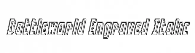
![Battleworld Engraved Italic تنزيل الخطوط]() تنزيل 62 التنزيلات@WebFont
تنزيل 62 التنزيلات@WebFont

ما هي أبرز الخطوط الآن؟
تحظى Capitol Regular, GT Vice City Sans - Medium, Walking Italic, Sevarozi Tilted and Noto Serif Khmer Condensed SemiBold بشعبية لخطوطها النظيفة وتطبيقاتها الواسعة — من الهوية البصرية إلى الصفحات المقصودة والملصقات.
أي الخطوط تُستخدم كثيرًا في الشعارات؟
تُعد السان سيريف الهندسية (مثل Poppins وعائلات على نمط Gotham) خيارًا شائعًا لعلامات نظيفة قابلة للتوسع. ولإضفاء طابع ودي، تبقى السكريبت واليدوية خيارًا كلاسيكيًا. اجمع عنوانًا بارزًا مع خط نصي محايد لتحقيق التوازن والتميّز.
كم مرة يتم تحديث قائمة أعلى الخطوط؟
نحدّثها بانتظام استنادًا إلى التنزيلات والنشاط الفعلي. عُد إليها كثيرًا لاكتشاف النجوم الصاعدة مبكرًا.
💡 نصيحة: أضف هذه الصفحة إلى العلامات — تتغير الاتجاهات بسرعة وقد تُلهم خطوط اليوم الرائجة إعادة العلامة غدًا.