مرحبًا بك في قسم أعلى الخطوط — حيث تلتقي الشعبية بالجودة. هذه هي الخطوط الأكثر تنزيلًا واستخدامًا هذا العام من قبل مجتمعنا. إذا كنت بحاجة إلى اختيار موثوق للشعارات أو الويب أو وسائل التواصل، فابدأ من هنا.
يتميز كل خط رائج بتوازن جيد وقابلية قراءة وتعدد استخدامات. ستجد سان سيريف حديثة، وسكريبتات أنيقة، وسيريف كلاسيكية، وخطوط عرض minimal مختارة بعناية.
-
( 'Sanz Fonts - sanzclouds.blogspot.com )
A playful, handwritten-style font with quirky, uneven strokes.
 تنزيل 60 التنزيلات@WebFont
 -
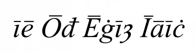
( Peter S. Baker - faculty.virginia.edu/oldenglish/ )
An elegant italic font with classic calligraphic influences and modern refinement.
![Times Old English Italic تنزيل الخطوط]() تنزيل 60 التنزيلات@WebFont
تنزيل 60 التنزيلات@WebFont -
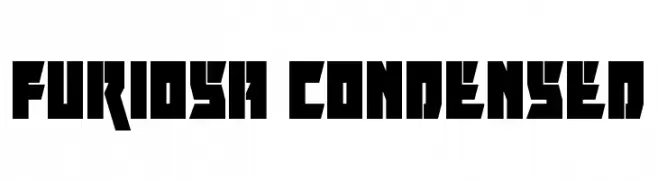
![Furiosa Condensed تنزيل الخطوط]() تنزيل 60 التنزيلات@WebFont
تنزيل 60 التنزيلات@WebFont -
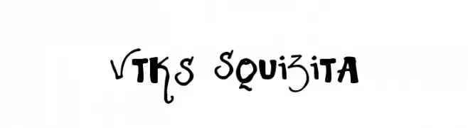
( Fonts by Douglas Vitkauskas - www.vtksdesign.com. Personal-use only. For commercial use please contact owner. )
A playful and artistic font with dynamic, hand-drawn letterforms.
![Vtks Squizita تنزيل الخطوط]() تنزيل 60 التنزيلات@WebFont
تنزيل 60 التنزيلات@WebFont -
( Twicolabs Fontdation - Fahrizal Tawakkal - fontdation.com )
A bold, modern sans-serif font with clean lines and strong presence.
![HaarlemSans تنزيل الخطوط]() تنزيل 60 التنزيلات@WebFont
تنزيل 60 التنزيلات@WebFont -
-
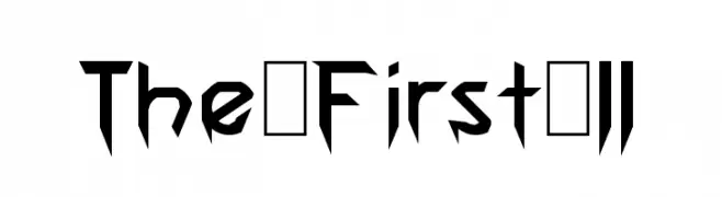
( LJ Design Studios - www.ljdesignstudios.com )
A bold, angular font with a futuristic, geometric style.
![The First II تنزيل الخطوط]() تنزيل 60 التنزيلات@WebFont
تنزيل 60 التنزيلات@WebFont -
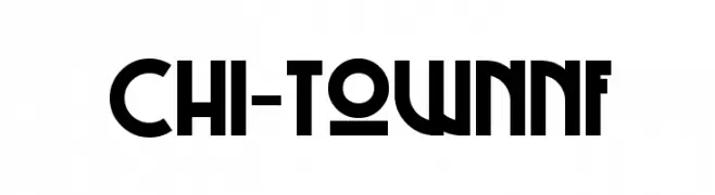
( Fonts by Nick Curtis - Personal-use only. For commercial use please contact owner. )
A bold, geometric font with Art Deco influences, ideal for modern and retro designs.
![Chi-TownNF تنزيل الخطوط]() تنزيل 60 التنزيلات@WebFont
تنزيل 60 التنزيلات@WebFont -
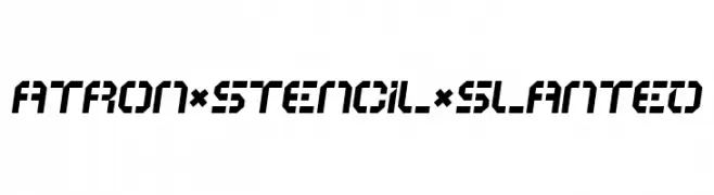
( Helldunkel - www.helldunkel.com )
A bold, slanted stencil font with geometric precision and industrial flair.
![ATRON*STENCIL*SLANTED تنزيل الخطوط]() تنزيل 60 التنزيلات@WebFont
تنزيل 60 التنزيلات@WebFont -
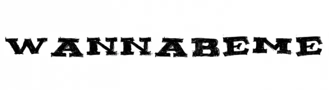
( Fonts by Billy Argel - www.billyargel.com - Personal-use only. For commercial use please contact owner. )
A bold, distressed font with a vintage, grunge aesthetic.
![WANNABEME تنزيل الخطوط]() تنزيل 60 التنزيلات@WebFont
تنزيل 60 التنزيلات@WebFont -
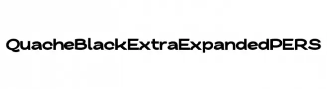
( Fonts by Mans Greback - Personal-use only. For commercial use please contact owner. )
A bold, extra-expanded font with geometric shapes and modern appeal.
![QuacheBlackExtraExpandedPERS تنزيل الخطوط]() تنزيل 60 التنزيلات@WebFont
تنزيل 60 التنزيلات@WebFont

ما هي أبرز الخطوط الآن؟
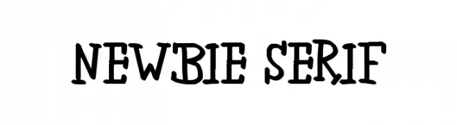
تحظى newbie serif, Times Old English Italic, Furiosa Condensed, Vtks Squizita and HaarlemSans بشعبية لخطوطها النظيفة وتطبيقاتها الواسعة — من الهوية البصرية إلى الصفحات المقصودة والملصقات.
أي الخطوط تُستخدم كثيرًا في الشعارات؟
تُعد السان سيريف الهندسية (مثل Poppins وعائلات على نمط Gotham) خيارًا شائعًا لعلامات نظيفة قابلة للتوسع. ولإضفاء طابع ودي، تبقى السكريبت واليدوية خيارًا كلاسيكيًا. اجمع عنوانًا بارزًا مع خط نصي محايد لتحقيق التوازن والتميّز.
كم مرة يتم تحديث قائمة أعلى الخطوط؟
نحدّثها بانتظام استنادًا إلى التنزيلات والنشاط الفعلي. عُد إليها كثيرًا لاكتشاف النجوم الصاعدة مبكرًا.
💡 نصيحة: أضف هذه الصفحة إلى العلامات — تتغير الاتجاهات بسرعة وقد تُلهم خطوط اليوم الرائجة إعادة العلامة غدًا.