مرحبًا بك في قسم أعلى الخطوط — حيث تلتقي الشعبية بالجودة. هذه هي الخطوط الأكثر تنزيلًا واستخدامًا هذا العام من قبل مجتمعنا. إذا كنت بحاجة إلى اختيار موثوق للشعارات أو الويب أو وسائل التواصل، فابدأ من هنا.
يتميز كل خط رائج بتوازن جيد وقابلية قراءة وتعدد استخدامات. ستجد سان سيريف حديثة، وسكريبتات أنيقة، وسيريف كلاسيكية، وخطوط عرض minimal مختارة بعناية.
-
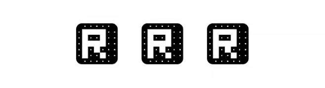
( Reese Fonts - reeseworks.tk )
A bold, decorative font with rounded, dotted characters enclosed in squares.
 تنزيل 66 التنزيلات@WebFont
 -
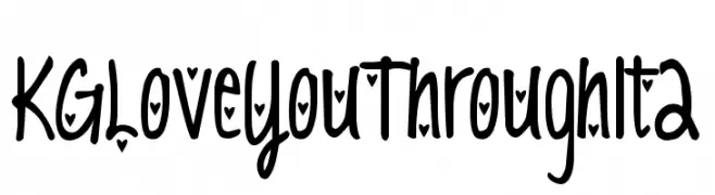
![KG Love You Through It 2 تنزيل الخطوط]() تنزيل 66 التنزيلات@WebFont
تنزيل 66 التنزيلات@WebFont -
( Fonts by CannotIntoSpaceFonts - KineticPlasma Fonts - Personal-use only. For commercial use please contact owner. )
A playful, hand-drawn font with irregular strokes and a whimsical style.
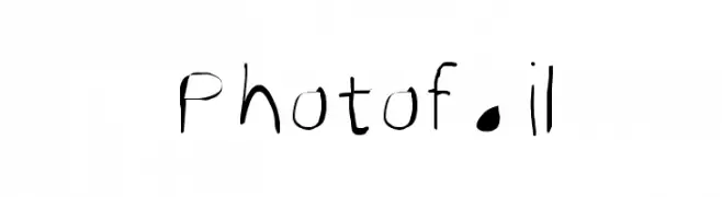
![Photofail تنزيل الخطوط]() تنزيل 66 التنزيلات@WebFont
تنزيل 66 التنزيلات@WebFont -
( Vladimir Nikolic - www.coroflot.com/vladimirnikolic )
A bold, rounded font with a playful shadow effect for a dynamic, three-dimensional look.
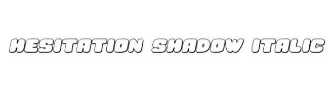
![Hesitation Shadow Italic تنزيل الخطوط]() تنزيل 66 التنزيلات@WebFont
تنزيل 66 التنزيلات@WebFont -
( Fonts by Dwi Krisdiantoro - Personal-use only. For commercial use please contact owner. )
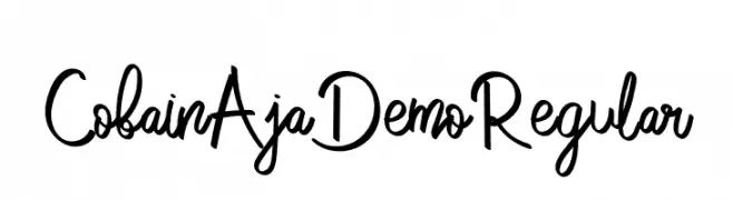
A playful and casual handwritten font with fluid strokes.
![CobainAjaDemoRegular تنزيل الخطوط]() تنزيل 66 التنزيلات@WebFont
تنزيل 66 التنزيلات@WebFont -
-
( Fonts by Cooldesignlab - Kurniadi Saputra - Personal-use only. For commercial use please contact owner. )
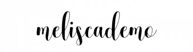
An elegant script font with high contrast and flowing, cursive style.
![meliscademo تنزيل الخطوط]() تنزيل 66 التنزيلات@WebFont
تنزيل 66 التنزيلات@WebFont -
![QuickTech Expanded تنزيل الخطوط]() تنزيل 66 التنزيلات@WebFont
تنزيل 66 التنزيلات@WebFont -
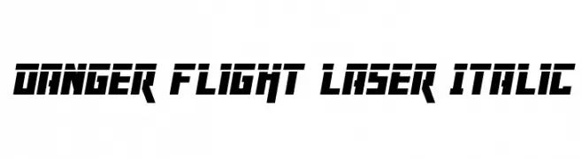
( Fonts by Daniel Zadorozny - www.iconian.com )
A bold, angular, and futuristic italic font with a dynamic appearance.
![Danger Flight Laser Italic تنزيل الخطوط]() تنزيل 66 التنزيلات@WebFont
تنزيل 66 التنزيلات@WebFont -
( Fonts by www.woodcutter.es - woodcutter Manero - Personal-use only. For commercial use please contact owner. )
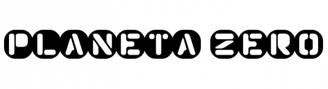
A bold, futuristic font with geometric shapes and high contrast, ideal for modern themes.
![Planeta Zero تنزيل الخطوط]() تنزيل 66 التنزيلات@WebFont
تنزيل 66 التنزيلات@WebFont -
( Fonts by Iconian Fonts )
A bold, geometric font with a three-dimensional effect created by parallel lines.
![Domino Jack Chrome تنزيل الخطوط]() تنزيل 66 التنزيلات@WebFont
تنزيل 66 التنزيلات@WebFont

ما هي أبرز الخطوط الآن؟
تحظى Reese Rounded Regular, KG Love You Through It 2, Photofail, Hesitation Shadow Italic and CobainAjaDemoRegular بشعبية لخطوطها النظيفة وتطبيقاتها الواسعة — من الهوية البصرية إلى الصفحات المقصودة والملصقات.
أي الخطوط تُستخدم كثيرًا في الشعارات؟
تُعد السان سيريف الهندسية (مثل Poppins وعائلات على نمط Gotham) خيارًا شائعًا لعلامات نظيفة قابلة للتوسع. ولإضفاء طابع ودي، تبقى السكريبت واليدوية خيارًا كلاسيكيًا. اجمع عنوانًا بارزًا مع خط نصي محايد لتحقيق التوازن والتميّز.
كم مرة يتم تحديث قائمة أعلى الخطوط؟
نحدّثها بانتظام استنادًا إلى التنزيلات والنشاط الفعلي. عُد إليها كثيرًا لاكتشاف النجوم الصاعدة مبكرًا.
💡 نصيحة: أضف هذه الصفحة إلى العلامات — تتغير الاتجاهات بسرعة وقد تُلهم خطوط اليوم الرائجة إعادة العلامة غدًا.