مرحبًا بك في قسم أعلى الخطوط — حيث تلتقي الشعبية بالجودة. هذه هي الخطوط الأكثر تنزيلًا واستخدامًا هذا العام من قبل مجتمعنا. إذا كنت بحاجة إلى اختيار موثوق للشعارات أو الويب أو وسائل التواصل، فابدأ من هنا.
يتميز كل خط رائج بتوازن جيد وقابلية قراءة وتعدد استخدامات. ستجد سان سيريف حديثة، وسكريبتات أنيقة، وسيريف كلاسيكية، وخطوط عرض minimal مختارة بعناية.
-
( Fonts by www.aenigmafonts.com )
A bold, slanted font with sharp, angular edges and consistent thickness.
 تنزيل 1753 التنزيلات@WebFont
 -
( Fonts by http://perso.calixo.net/~uzim/ )
A bold, distressed font with a rugged, eroded appearance.
![Apocalypse تنزيل الخطوط]() تنزيل 1753 التنزيلات@WebFont
تنزيل 1753 التنزيلات@WebFont -
( Fonts by MadeType - Personal-use only. For commercial use please contact owner. )
A bold, geometric sans-serif font with a modern and clean design.
![MADEFutureX-Black تنزيل الخطوط]() تنزيل 1752 التنزيلات@WebFont
تنزيل 1752 التنزيلات@WebFont -
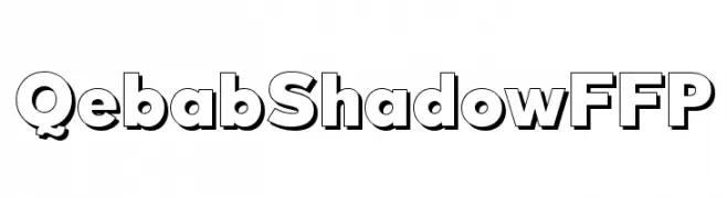
خط بواسطة defharo. For commercial use please contact the owner.
![QebabShadowFFP تنزيل الخطوط]() تنزيل 1752 التنزيلات@WebFont
تنزيل 1752 التنزيلات@WebFont -
( Fonts by Dieter Steffmann )
A bold blackletter font with sharp, angular strokes and ornate detailing.
![Fenwick Woodtype تنزيل الخطوط]() تنزيل 1752 التنزيلات@WebFont
تنزيل 1752 التنزيلات@WebFont -
-
( Fonts by Manfred Klein - manfred-klein.ina-mar.com )
A festive, decorative font with numbers embellished with birthday-themed elements.
![BirthdayDigits تنزيل الخطوط]() تنزيل 1752 التنزيلات@WebFont
تنزيل 1752 التنزيلات@WebFont -
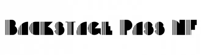
( Fonts by Nick Curtis - www.nicksfonts.com )
A bold, geometric font with a mix of solid and striped elements for a striking visual impact.
![Backstage Pass NF تنزيل الخطوط]() تنزيل 1752 التنزيلات@WebFont
تنزيل 1752 التنزيلات@WebFont -
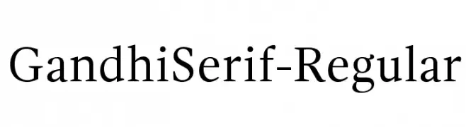
( Fonts by Cristobal Henestrosa and Raul Plancarte - Personal-use only. For commercial use please contact owner. )
A classic serif typeface with elegant proportions and refined serifs.
![GandhiSerif-Regular تنزيل الخطوط]() تنزيل 1751 التنزيلات@WebFont
تنزيل 1751 التنزيلات@WebFont -
( Fonts by Typo )
A bold, decorative blackletter font with intricate and ornate letterforms.
![Berry Rotunda Regular تنزيل الخطوط]() تنزيل 1751 التنزيلات@WebFont
تنزيل 1751 التنزيلات@WebFont -
( Fonts by Salvo Nicolosi - ficod.deviantart.com )
A clean, modern sans-serif font with geometric structure and uniform width.
![Atype 1 تنزيل الخطوط]() تنزيل 1751 التنزيلات@WebFont
تنزيل 1751 التنزيلات@WebFont


ما هي أبرز الخطوط الآن؟
تحظى Gesture Slant BRK, Apocalypse, MADEFutureX-Black, QebabShadowFFP and Fenwick Woodtype بشعبية لخطوطها النظيفة وتطبيقاتها الواسعة — من الهوية البصرية إلى الصفحات المقصودة والملصقات.
أي الخطوط تُستخدم كثيرًا في الشعارات؟
تُعد السان سيريف الهندسية (مثل Poppins وعائلات على نمط Gotham) خيارًا شائعًا لعلامات نظيفة قابلة للتوسع. ولإضفاء طابع ودي، تبقى السكريبت واليدوية خيارًا كلاسيكيًا. اجمع عنوانًا بارزًا مع خط نصي محايد لتحقيق التوازن والتميّز.
كم مرة يتم تحديث قائمة أعلى الخطوط؟
نحدّثها بانتظام استنادًا إلى التنزيلات والنشاط الفعلي. عُد إليها كثيرًا لاكتشاف النجوم الصاعدة مبكرًا.
💡 نصيحة: أضف هذه الصفحة إلى العلامات — تتغير الاتجاهات بسرعة وقد تُلهم خطوط اليوم الرائجة إعادة العلامة غدًا.