مرحبًا بك في قسم أعلى الخطوط — حيث تلتقي الشعبية بالجودة. هذه هي الخطوط الأكثر تنزيلًا واستخدامًا هذا العام من قبل مجتمعنا. إذا كنت بحاجة إلى اختيار موثوق للشعارات أو الويب أو وسائل التواصل، فابدأ من هنا.
يتميز كل خط رائج بتوازن جيد وقابلية قراءة وتعدد استخدامات. ستجد سان سيريف حديثة، وسكريبتات أنيقة، وسيريف كلاسيكية، وخطوط عرض minimal مختارة بعناية.
-
( Fonts by Georg Duffner - Personal-use only. For commercial use please contact owner. )
A classic serif font with high contrast and elegant letterforms.
 تنزيل 69 التنزيلات@WebFont
 -
( Fonts by ndiscovered - Personal-use only. For commercial use please contact owner. )
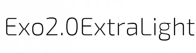
A sleek, modern font with clean lines and geometric structure.
![Exo 2.0 Extra Light تنزيل الخطوط]() تنزيل 69 التنزيلات@WebFont
تنزيل 69 التنزيلات@WebFont -
( گالری فانت فارسی پژوهش آريانا - only compatible with Farsi and Arabic )
A bold, geometric, and decorative font with a futuristic style.
![Sinaa Fancy تنزيل الخطوط]() تنزيل 69 التنزيلات@WebFont
تنزيل 69 التنزيلات@WebFont -
( Fonts by Eko Bimantara - Personal-use only. For commercial use please contact owner. )
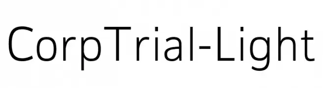
A modern, light sans-serif font with clean lines and low contrast.
![CorpTrial-Light تنزيل الخطوط]() تنزيل 69 التنزيلات@WebFont
تنزيل 69 التنزيلات@WebFont -
( Fonts by Geronimo Fonts - Personal-use only. For commercial use please contact owner. )
A playful, hand-drawn font with wavy lines and a casual feel.
![grean تنزيل الخطوط]() تنزيل 69 التنزيلات@WebFont
تنزيل 69 التنزيلات@WebFont -
-
( hechicero - www.ff-omeganebula.com )
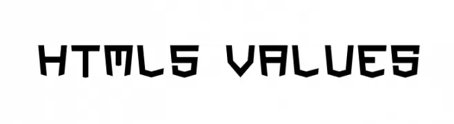
A bold, geometric font with angular edges and a modern, futuristic style.
![HTML5 Values تنزيل الخطوط]() تنزيل 69 التنزيلات@WebFont
تنزيل 69 التنزيلات@WebFont -
( wonoayu79 - Agung Harto - www.creativefabrica.com/designer/wny79/ )
A whimsical and elegant cursive font with flowing, graceful strokes.
![beautyforest تنزيل الخطوط]() تنزيل 69 التنزيلات@WebFont
تنزيل 69 التنزيلات@WebFont -
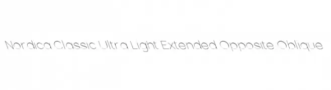
![Nordica Classic Ultra Light Extended Opposite Oblique تنزيل الخطوط]() تنزيل 69 التنزيلات@WebFont
تنزيل 69 التنزيلات@WebFont -
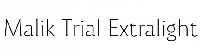
( Fonts by Zetafonts - Personal-use only. For commercial use please contact owner. )
A clean, elegant font with thin strokes and a modern touch.
![Malik Trial Extralight تنزيل الخطوط]() تنزيل 69 التنزيلات@WebFont
تنزيل 69 التنزيلات@WebFont -
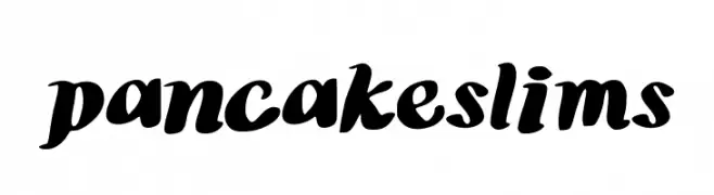
( Johnny Vance - www.johnnyterrific.com )
A bold, playful handwritten font with rounded, smooth characters.
![pancakeslims تنزيل الخطوط]() تنزيل 69 التنزيلات@WebFont
تنزيل 69 التنزيلات@WebFont


ما هي أبرز الخطوط الآن؟
تحظى EB Garamond Initials Fill2, Exo 2.0 Extra Light, Sinaa Fancy, CorpTrial-Light and grean بشعبية لخطوطها النظيفة وتطبيقاتها الواسعة — من الهوية البصرية إلى الصفحات المقصودة والملصقات.
أي الخطوط تُستخدم كثيرًا في الشعارات؟
تُعد السان سيريف الهندسية (مثل Poppins وعائلات على نمط Gotham) خيارًا شائعًا لعلامات نظيفة قابلة للتوسع. ولإضفاء طابع ودي، تبقى السكريبت واليدوية خيارًا كلاسيكيًا. اجمع عنوانًا بارزًا مع خط نصي محايد لتحقيق التوازن والتميّز.
كم مرة يتم تحديث قائمة أعلى الخطوط؟
نحدّثها بانتظام استنادًا إلى التنزيلات والنشاط الفعلي. عُد إليها كثيرًا لاكتشاف النجوم الصاعدة مبكرًا.
💡 نصيحة: أضف هذه الصفحة إلى العلامات — تتغير الاتجاهات بسرعة وقد تُلهم خطوط اليوم الرائجة إعادة العلامة غدًا.