مرحبًا بك في قسم أعلى الخطوط — حيث تلتقي الشعبية بالجودة. هذه هي الخطوط الأكثر تنزيلًا واستخدامًا هذا العام من قبل مجتمعنا. إذا كنت بحاجة إلى اختيار موثوق للشعارات أو الويب أو وسائل التواصل، فابدأ من هنا.
يتميز كل خط رائج بتوازن جيد وقابلية قراءة وتعدد استخدامات. ستجد سان سيريف حديثة، وسكريبتات أنيقة، وسيريف كلاسيكية، وخطوط عرض minimal مختارة بعناية.
-
( Copyright (c) 2013 by Sorkin Type Co (www.sorkintype.com), with Reserved Font Name 'Tauri' )
A modern, clean sans-serif font with consistent stroke width and excellent readability.
 تنزيل 1771 التنزيلات@WebFont
 -
( Fonts by Manfred Klein - manfred-klein.ina-mar.com )
A modern, geometric sans-serif font with clean lines and balanced proportions.
![PetitaMedium تنزيل الخطوط]() تنزيل 1771 التنزيلات@WebFont
تنزيل 1771 التنزيلات@WebFont -
![ap_hearts تنزيل الخطوط]() تنزيل 1771 التنزيلات@WebFont
تنزيل 1771 التنزيلات@WebFont -
![BowersShadow تنزيل الخطوط]() تنزيل 1771 التنزيلات@WebFont
تنزيل 1771 التنزيلات@WebFont -
( Fonts by Vladimir Nikolic - www.creativefabrica.com/designer/vladimirnikolic/ - Personal-use only. For commercial use please contact owner. )
A bold, three-dimensional font with an industrial and futuristic design.
![Athens Regular تنزيل الخطوط]() تنزيل 1770 التنزيلات@WebFont
تنزيل 1770 التنزيلات@WebFont -
-
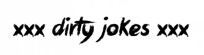
( Font by Jonathan Harris - www.tattoowoo.com )
A bold, expressive brush-style font with a textured, hand-painted look.
![xxx Dirty Jokes xxx تنزيل الخطوط]() تنزيل 1770 التنزيلات@WebFont
تنزيل 1770 التنزيلات@WebFont -
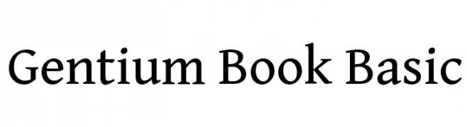
( Copyright (c) 2003-2013 SIL International (http://www.sil.org/) )
A classic serif typeface with elegant, readable letterforms and balanced proportions.
![Gentium Book Basic تنزيل الخطوط]() تنزيل 1770 التنزيلات@WebFont
تنزيل 1770 التنزيلات@WebFont -
![Paghetti تنزيل الخطوط]() تنزيل 1770 التنزيلات@WebFont
تنزيل 1770 التنزيلات@WebFont -
خط بواسطة glyphstyle. For commercial use please contact the owner.
( NOTE: This demo font is for PERSONAL USE ONLY! But any donation are very appreciated. Paypal account for donation : https://www.paypal.me/dimasardhi full version: https://www.glyphstyle.net/bestone/ contact us at styleglyph@gmail.com )
A fluid, elegant handwritten font with a personal touch.
![Bestone تنزيل الخطوط]() تنزيل 1769 التنزيلات@WebFont
تنزيل 1769 التنزيلات@WebFont -
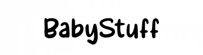
( Fonts by Pustudio )
A playful, rounded font with a hand-drawn, whimsical style.
![BabyStuff تنزيل الخطوط]() تنزيل 1769 التنزيلات@WebFont
تنزيل 1769 التنزيلات@WebFont


ما هي أبرز الخطوط الآن؟
تحظى Tauri-Regular, PetitaMedium, ap_hearts, BowersShadow and Athens Regular بشعبية لخطوطها النظيفة وتطبيقاتها الواسعة — من الهوية البصرية إلى الصفحات المقصودة والملصقات.
أي الخطوط تُستخدم كثيرًا في الشعارات؟
تُعد السان سيريف الهندسية (مثل Poppins وعائلات على نمط Gotham) خيارًا شائعًا لعلامات نظيفة قابلة للتوسع. ولإضفاء طابع ودي، تبقى السكريبت واليدوية خيارًا كلاسيكيًا. اجمع عنوانًا بارزًا مع خط نصي محايد لتحقيق التوازن والتميّز.
كم مرة يتم تحديث قائمة أعلى الخطوط؟
نحدّثها بانتظام استنادًا إلى التنزيلات والنشاط الفعلي. عُد إليها كثيرًا لاكتشاف النجوم الصاعدة مبكرًا.
💡 نصيحة: أضف هذه الصفحة إلى العلامات — تتغير الاتجاهات بسرعة وقد تُلهم خطوط اليوم الرائجة إعادة العلامة غدًا.