مرحبًا بك في قسم أعلى الخطوط — حيث تلتقي الشعبية بالجودة. هذه هي الخطوط الأكثر تنزيلًا واستخدامًا هذا العام من قبل مجتمعنا. إذا كنت بحاجة إلى اختيار موثوق للشعارات أو الويب أو وسائل التواصل، فابدأ من هنا.
يتميز كل خط رائج بتوازن جيد وقابلية قراءة وتعدد استخدامات. ستجد سان سيريف حديثة، وسكريبتات أنيقة، وسيريف كلاسيكية، وخطوط عرض minimal مختارة بعناية.
-
( Fonts by Zkhai Creative - Personal-use only. For commercial use please contact owner. )
A playful, rounded font with smooth curves and consistent stroke width.
 تنزيل 76 التنزيلات@WebFont
 -
( Fonts by Qwerks )
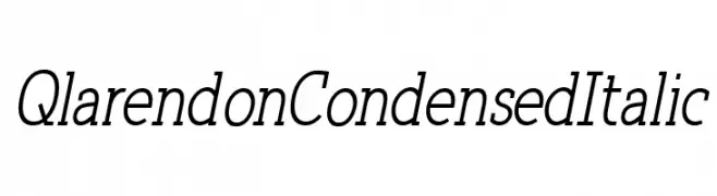
A condensed, italic serif font with elegant, elongated strokes.
![Qlarendon Condensed Italic تنزيل الخطوط]() تنزيل 76 التنزيلات@WebFont
تنزيل 76 التنزيلات@WebFont -
( Iordanis Passas - http:/ip-art.info )
A bold, italic font with a playful shadow effect and rounded characters.
![dPopper-Italic تنزيل الخطوط]() تنزيل 76 التنزيلات@WebFont
تنزيل 76 التنزيلات@WebFont -
( Fonts by Timur Type )
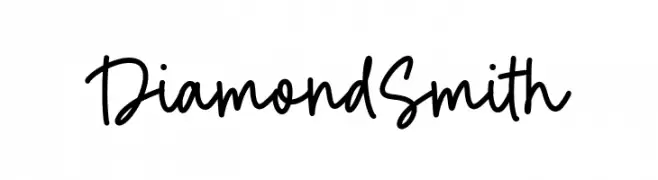
Casual handwritten script font.
![Diamond Smith تنزيل الخطوط]() تنزيل 76 التنزيلات@WebFont
تنزيل 76 التنزيلات@WebFont -
( Fonts by Daniel Zadorozny - www.iconian.com - Free for personal use )
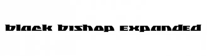
A bold, geometric font with a modern and angular design.
![Black Bishop Expanded تنزيل الخطوط]() تنزيل 76 التنزيلات@WebFont
تنزيل 76 التنزيلات@WebFont -
-
( Fonts by Geronimo Fonts - Personal-use only. For commercial use please contact owner. )
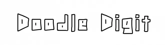
A playful, hand-drawn font with a doodle-like appearance and bold outlines.
![Doodle Digit تنزيل الخطوط]() تنزيل 76 التنزيلات@WebFont
تنزيل 76 التنزيلات@WebFont -
( Iconian Fonts - Daniel Zadorozny - www.iconian.com )
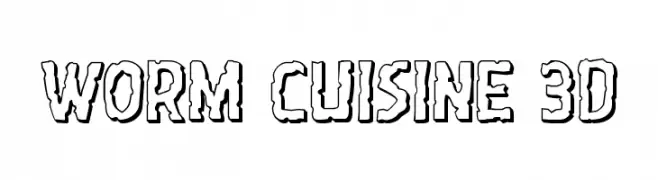
A playful, 3D worm-like font with bold, outlined characters.
![Worm Cuisine 3D تنزيل الخطوط]() تنزيل 76 التنزيلات@WebFont
تنزيل 76 التنزيلات@WebFont -
( Cheryl Killian - www.whimsicalinklings.com )
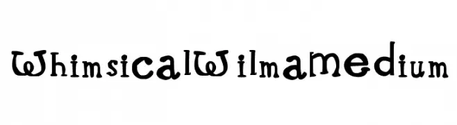
A playful and whimsical font with quirky, irregular letterforms.
![Whimsical Wilma Medium تنزيل الخطوط]() تنزيل 76 التنزيلات@WebFont
تنزيل 76 التنزيلات@WebFont -
( Iconian Fonts - Daniel Zadorozny - www.iconian.com )
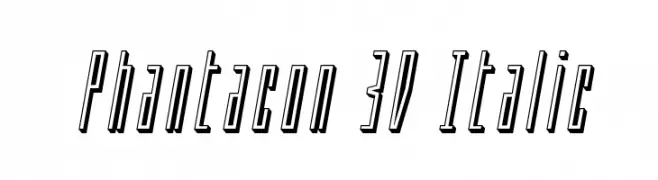
A dynamic 3D italic font with elongated, narrow characters and a futuristic style.
![Phantacon 3D Italic تنزيل الخطوط]() تنزيل 76 التنزيلات@WebFont
تنزيل 76 التنزيلات@WebFont -
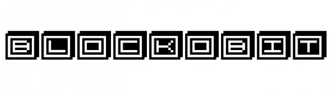
( TwoNineFive - Maximillian Limpo )
A bold, blocky font with a digital, pixelated style enclosed in squares.
![BlockoBit تنزيل الخطوط]() تنزيل 76 التنزيلات@WebFont
تنزيل 76 التنزيلات@WebFont

ما هي أبرز الخطوط الآن؟
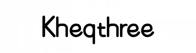
تحظى Kheqthree, Qlarendon Condensed Italic, dPopper-Italic, Diamond Smith and Black Bishop Expanded بشعبية لخطوطها النظيفة وتطبيقاتها الواسعة — من الهوية البصرية إلى الصفحات المقصودة والملصقات.
أي الخطوط تُستخدم كثيرًا في الشعارات؟
تُعد السان سيريف الهندسية (مثل Poppins وعائلات على نمط Gotham) خيارًا شائعًا لعلامات نظيفة قابلة للتوسع. ولإضفاء طابع ودي، تبقى السكريبت واليدوية خيارًا كلاسيكيًا. اجمع عنوانًا بارزًا مع خط نصي محايد لتحقيق التوازن والتميّز.
كم مرة يتم تحديث قائمة أعلى الخطوط؟
نحدّثها بانتظام استنادًا إلى التنزيلات والنشاط الفعلي. عُد إليها كثيرًا لاكتشاف النجوم الصاعدة مبكرًا.
💡 نصيحة: أضف هذه الصفحة إلى العلامات — تتغير الاتجاهات بسرعة وقد تُلهم خطوط اليوم الرائجة إعادة العلامة غدًا.