مرحبًا بك في قسم أعلى الخطوط — حيث تلتقي الشعبية بالجودة. هذه هي الخطوط الأكثر تنزيلًا واستخدامًا هذا العام من قبل مجتمعنا. إذا كنت بحاجة إلى اختيار موثوق للشعارات أو الويب أو وسائل التواصل، فابدأ من هنا.
يتميز كل خط رائج بتوازن جيد وقابلية قراءة وتعدد استخدامات. ستجد سان سيريف حديثة، وسكريبتات أنيقة، وسيريف كلاسيكية، وخطوط عرض minimal مختارة بعناية.
-
( Fonts by Vladimir Nikolic - Personal-use only. For commercial use please contact owner. )
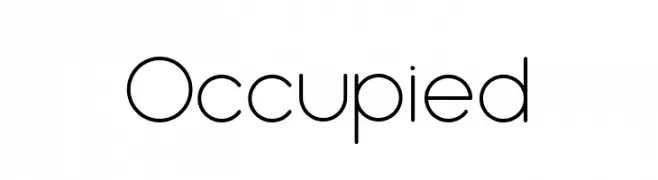
A modern, geometric sans-serif font with clean lines and uniform strokes.
 تنزيل 76 التنزيلات@WebFont
 -
( Fonts by Airotype Studio )
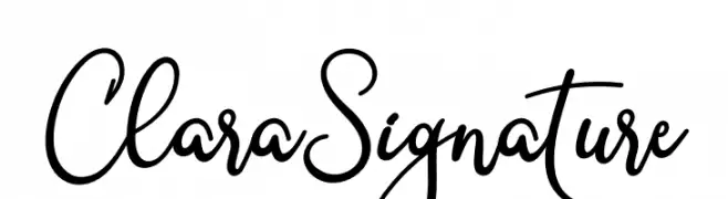
A sophisticated and elegant handwritten script with fluid, graceful letterforms.
![Clara Signature تنزيل الخطوط]() تنزيل 76 التنزيلات@WebFont
تنزيل 76 التنزيلات@WebFont -
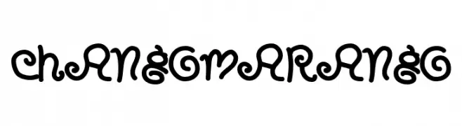
![CHANGO MARANGO تنزيل الخطوط]() تنزيل 76 التنزيلات@WebFont
تنزيل 76 التنزيلات@WebFont -
( Fonts by a Max Infeld - XEROGRAPHER FONTS - xerographer.blogspot.com . Personal-use only. For commercial use please contact owner. )
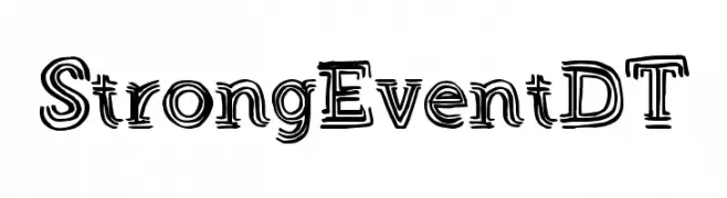
A bold, decorative font with a layered, dimensional style.
![StrongEventDT تنزيل الخطوط]() تنزيل 76 التنزيلات@WebFont
تنزيل 76 التنزيلات@WebFont -
( Fonts by Peax Webdesign - www.peax-webdesign.com. Personal-use only. For commercial use please contact owner. )
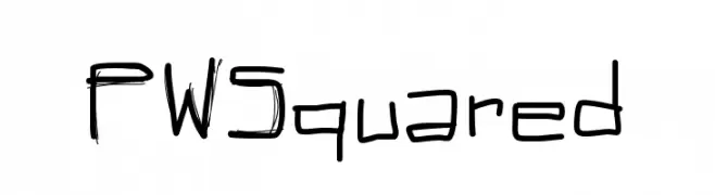
A sketch-like, hand-drawn font with dynamic and energetic characters.
![PWSquared تنزيل الخطوط]() تنزيل 76 التنزيلات@WebFont
تنزيل 76 التنزيلات@WebFont -
-
( Fonts by www.hindson.com.au )
A symbolic font for saxophone tablature notation using geometric shapes.
![Woodwind Tablature SaxUS تنزيل الخطوط]() تنزيل 76 التنزيلات@WebFont
تنزيل 76 التنزيلات@WebFont -
( Fonts by Manfred Klein. Free for private and charity use. Free for commercial with donation to organizations )
A decorative font with characters designed as tombstones and mourning symbols.
![MourningTrauerInverse تنزيل الخطوط]() تنزيل 76 التنزيلات@WebFont
تنزيل 76 التنزيلات@WebFont -
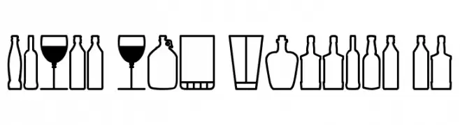
( Southype - Rodrigo Gonzalez - www.southype.com )
A display font made from glass and bottle silhouettes.
![Glass and bottles St تنزيل الخطوط]() تنزيل 76 التنزيلات@WebFont
تنزيل 76 التنزيلات@WebFont -
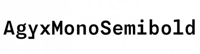
( Fonts by Fitrah Type )
A clean, monospaced font with a semi-bold weight, ideal for technical and digital applications.
![Agyx Mono Semibold تنزيل الخطوط]() تنزيل 76 التنزيلات@WebFont
تنزيل 76 التنزيلات@WebFont -
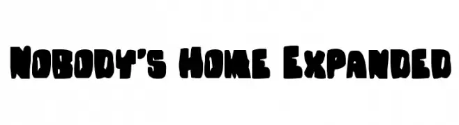
( Donationware - www.iconian.com )
A bold, playful font with chunky, irregular shapes and tight spacing.
![Nobody's Home Expanded تنزيل الخطوط]() تنزيل 76 التنزيلات@WebFont
تنزيل 76 التنزيلات@WebFont

ما هي أبرز الخطوط الآن؟
تحظى Occupied, Clara Signature, CHANGO MARANGO, StrongEventDT and PWSquared بشعبية لخطوطها النظيفة وتطبيقاتها الواسعة — من الهوية البصرية إلى الصفحات المقصودة والملصقات.
أي الخطوط تُستخدم كثيرًا في الشعارات؟
تُعد السان سيريف الهندسية (مثل Poppins وعائلات على نمط Gotham) خيارًا شائعًا لعلامات نظيفة قابلة للتوسع. ولإضفاء طابع ودي، تبقى السكريبت واليدوية خيارًا كلاسيكيًا. اجمع عنوانًا بارزًا مع خط نصي محايد لتحقيق التوازن والتميّز.
كم مرة يتم تحديث قائمة أعلى الخطوط؟
نحدّثها بانتظام استنادًا إلى التنزيلات والنشاط الفعلي. عُد إليها كثيرًا لاكتشاف النجوم الصاعدة مبكرًا.
💡 نصيحة: أضف هذه الصفحة إلى العلامات — تتغير الاتجاهات بسرعة وقد تُلهم خطوط اليوم الرائجة إعادة العلامة غدًا.