مرحبًا بك في قسم أعلى الخطوط — حيث تلتقي الشعبية بالجودة. هذه هي الخطوط الأكثر تنزيلًا واستخدامًا هذا العام من قبل مجتمعنا. إذا كنت بحاجة إلى اختيار موثوق للشعارات أو الويب أو وسائل التواصل، فابدأ من هنا.
يتميز كل خط رائج بتوازن جيد وقابلية قراءة وتعدد استخدامات. ستجد سان سيريف حديثة، وسكريبتات أنيقة، وسيريف كلاسيكية، وخطوط عرض minimal مختارة بعناية.
-
( Fonts by www.junkohanhero.com - Personal-use only. For commercial use please contact owner. )
A bold, distressed font with a vintage, handcrafted feel.
 تنزيل 78 التنزيلات@WebFont
 -
( Fonts by Chris Vile - fontmonger.com - Personal-use only. For commercial use please contact owner. )
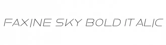
A sleek, modern italic font with geometric precision and futuristic style.
![Faxine Sky Bold Italic تنزيل الخطوط]() تنزيل 78 التنزيلات@WebFont
تنزيل 78 التنزيلات@WebFont -
( Fonts by Klaus Johansen - www.listemageren.dK )
Not a valid font; contains illustrations and placeholders.
![WW1 A تنزيل الخطوط]() تنزيل 78 التنزيلات@WebFont
تنزيل 78 التنزيلات@WebFont -
( Font Bureau - beinghairless.com )
A pixelated, retro-style font inspired by classic video game graphics.
![Bowser Rampages Again Regular تنزيل الخطوط]() تنزيل 78 التنزيلات@WebFont
تنزيل 78 التنزيلات@WebFont -
( London's Letters - www.londonsletters.com/ )
A decorative font with an integrated ankh symbol in each character.
![LMS Everlasting تنزيل الخطوط]() تنزيل 78 التنزيلات@WebFont
تنزيل 78 التنزيلات@WebFont -
-
( Fonts by Woodcutter )
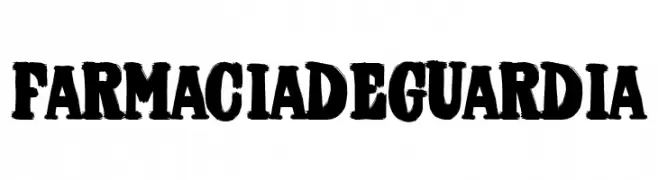
A bold, textured font with a rugged, vintage appearance.
![Farmacia de Guardia تنزيل الخطوط]() تنزيل 78 التنزيلات@WebFont
تنزيل 78 التنزيلات@WebFont -
( Fonts by Daniel Zadorozny - www.iconian.com - Personal-use only. For commercial use please contact owner. )
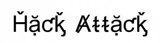
A bold, geometric sans-serif font with a modern and clean design.
![Hack Attack تنزيل الخطوط]() تنزيل 78 التنزيلات@WebFont
تنزيل 78 التنزيلات@WebFont -
( Fonts by Daniel Zadorozny - www.iconian.com )
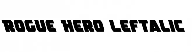
A bold, dynamic font with sharp angles and a strong presence.
![Rogue Hero Leftalic تنزيل الخطوط]() تنزيل 78 التنزيلات@WebFont
تنزيل 78 التنزيلات@WebFont -
( Fonts by Iconian Fonts )
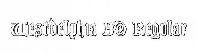
A bold, decorative 3D font with gothic influences and intricate detailing.
![Westdelphia 3D Regular تنزيل الخطوط]() تنزيل 78 التنزيلات@WebFont
تنزيل 78 التنزيلات@WebFont -
( Anke-Art - www.anke-art.de/ )
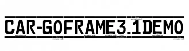
A bold, geometric sans-serif font ideal for signage and high-visibility applications.
![Car-GoFrame3.1Demo تنزيل الخطوط]() تنزيل 78 التنزيلات@WebFont
تنزيل 78 التنزيلات@WebFont


ما هي أبرز الخطوط الآن؟
تحظى Rough Simple, Faxine Sky Bold Italic, WW1 A, Bowser Rampages Again Regular and LMS Everlasting بشعبية لخطوطها النظيفة وتطبيقاتها الواسعة — من الهوية البصرية إلى الصفحات المقصودة والملصقات.
أي الخطوط تُستخدم كثيرًا في الشعارات؟
تُعد السان سيريف الهندسية (مثل Poppins وعائلات على نمط Gotham) خيارًا شائعًا لعلامات نظيفة قابلة للتوسع. ولإضفاء طابع ودي، تبقى السكريبت واليدوية خيارًا كلاسيكيًا. اجمع عنوانًا بارزًا مع خط نصي محايد لتحقيق التوازن والتميّز.
كم مرة يتم تحديث قائمة أعلى الخطوط؟
نحدّثها بانتظام استنادًا إلى التنزيلات والنشاط الفعلي. عُد إليها كثيرًا لاكتشاف النجوم الصاعدة مبكرًا.
💡 نصيحة: أضف هذه الصفحة إلى العلامات — تتغير الاتجاهات بسرعة وقد تُلهم خطوط اليوم الرائجة إعادة العلامة غدًا.