مرحبًا بك في قسم أعلى الخطوط — حيث تلتقي الشعبية بالجودة. هذه هي الخطوط الأكثر تنزيلًا واستخدامًا هذا العام من قبل مجتمعنا. إذا كنت بحاجة إلى اختيار موثوق للشعارات أو الويب أو وسائل التواصل، فابدأ من هنا.
يتميز كل خط رائج بتوازن جيد وقابلية قراءة وتعدد استخدامات. ستجد سان سيريف حديثة، وسكريبتات أنيقة، وسيريف كلاسيكية، وخطوط عرض minimal مختارة بعناية.
-
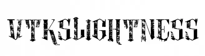
( Fonts by douglas vitkauskas - Personal-use only. For commercial use please contact owner. )
A bold, distressed font with a grungy, textured style.
 تنزيل 79 التنزيلات@WebFont
 -
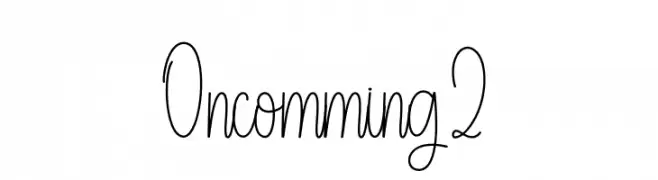
( Fonts by Andi Moz )
Whimsical handwritten script font.
![Oncomming 2 تنزيل الخطوط]() تنزيل 79 التنزيلات@WebFont
تنزيل 79 التنزيلات@WebFont -
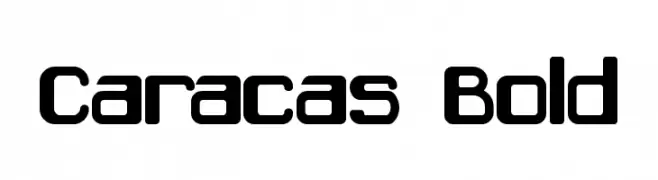
( Fonts by Jorge Algarin - Personal-use only. For commercial use please contact owner. )
A bold, modern font with a geometric and slightly rounded design.
![Caracas Bold تنزيل الخطوط]() تنزيل 79 التنزيلات@WebFont
تنزيل 79 التنزيلات@WebFont -
( Fonts by Roberto Mocci )
A pixelated Braille-inspired font with a minimalist and digital aesthetic.
![Braille pixel hc تنزيل الخطوط]() تنزيل 79 التنزيلات@WebFont
تنزيل 79 التنزيلات@WebFont -
![Phanith THAT تنزيل الخطوط]() تنزيل 79 التنزيلات@WebFont
تنزيل 79 التنزيلات@WebFont -
-
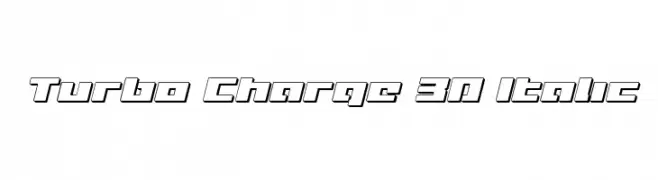
( Fonts by Iconian Fonts )
A bold, 3D italic font with a futuristic and dynamic style.
![Turbo Charge 3D Italic تنزيل الخطوط]() تنزيل 79 التنزيلات@WebFont
تنزيل 79 التنزيلات@WebFont -
( Sahirul Iman - creativemarket.com/nami_studio )
A bold, playful font with exaggerated curves and a whimsical style.
![Cogs and Crank DEMO تنزيل الخطوط]() تنزيل 79 التنزيلات@WebFont
تنزيل 79 التنزيلات@WebFont -
( Fonts by Apostrophic Lab )
A bold, italicized font with a modern, geometric design and tight character spacing.
![Republika III Bold Italic تنزيل الخطوط]() تنزيل 79 التنزيلات@WebFont
تنزيل 79 التنزيلات@WebFont -
( Fonts by Adam Jagosz - Personal-use only. For commercial use please contact owner. )
A geometric, angular font with a modern, technical style.
![Tektur Regular تنزيل الخطوط]() تنزيل 79 التنزيلات@WebFont
تنزيل 79 التنزيلات@WebFont -
( Fonts by Fachranheit - Fachrul Rozi - Personal-use only. For commercial use please contact owner. )
A bold, modern sans-serif font with clean lines and excellent readability.
![Havertize تنزيل الخطوط]() تنزيل 79 التنزيلات@WebFont
تنزيل 79 التنزيلات@WebFont

ما هي أبرز الخطوط الآن؟
تحظى vtks lightness 2, Oncomming 2, Caracas Bold, Braille pixel hc and Phanith THAT بشعبية لخطوطها النظيفة وتطبيقاتها الواسعة — من الهوية البصرية إلى الصفحات المقصودة والملصقات.
أي الخطوط تُستخدم كثيرًا في الشعارات؟
تُعد السان سيريف الهندسية (مثل Poppins وعائلات على نمط Gotham) خيارًا شائعًا لعلامات نظيفة قابلة للتوسع. ولإضفاء طابع ودي، تبقى السكريبت واليدوية خيارًا كلاسيكيًا. اجمع عنوانًا بارزًا مع خط نصي محايد لتحقيق التوازن والتميّز.
كم مرة يتم تحديث قائمة أعلى الخطوط؟
نحدّثها بانتظام استنادًا إلى التنزيلات والنشاط الفعلي. عُد إليها كثيرًا لاكتشاف النجوم الصاعدة مبكرًا.
💡 نصيحة: أضف هذه الصفحة إلى العلامات — تتغير الاتجاهات بسرعة وقد تُلهم خطوط اليوم الرائجة إعادة العلامة غدًا.