مرحبًا بك في قسم أعلى الخطوط — حيث تلتقي الشعبية بالجودة. هذه هي الخطوط الأكثر تنزيلًا واستخدامًا هذا العام من قبل مجتمعنا. إذا كنت بحاجة إلى اختيار موثوق للشعارات أو الويب أو وسائل التواصل، فابدأ من هنا.
يتميز كل خط رائج بتوازن جيد وقابلية قراءة وتعدد استخدامات. ستجد سان سيريف حديثة، وسكريبتات أنيقة، وسيريف كلاسيكية، وخطوط عرض minimal مختارة بعناية.
-
( Fonts by Press Gang Studios - Andeh Pinkard - www.pressgang-studios.com )
A bold, geometric font with sharp angles and a blocky appearance.
 تنزيل 82 التنزيلات@WebFont
 -
( Fonts by Pizzadude )
A whimsical and decorative font with each character represented by a unique object or character.
![Things DEMO Regular تنزيل الخطوط]() تنزيل 82 التنزيلات@WebFont
تنزيل 82 التنزيلات@WebFont -
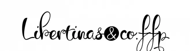
![Libertinas-co.ffp تنزيل الخطوط]() تنزيل 82 التنزيلات@WebFont
تنزيل 82 التنزيلات@WebFont -
( Fonts by elharrak )
A dingbat font featuring various solid shapes and symbols.
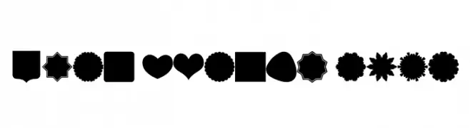
![Font Shapes 2019 تنزيل الخطوط]() تنزيل 82 التنزيلات@WebFont
تنزيل 82 التنزيلات@WebFont -
( Iconian Fonts - Daniel Zadorozny - www.iconian.com )
A bold, jagged, and aggressive decorative font with sharp edges.
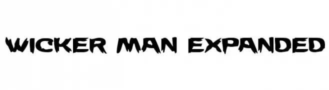
![Wicker Man Expanded تنزيل الخطوط]() تنزيل 82 التنزيلات@WebFont
تنزيل 82 التنزيلات@WebFont -
-
( Fonts by glukfonty - Grzegorz l - Personal-use only. For commercial use please contact owner. )
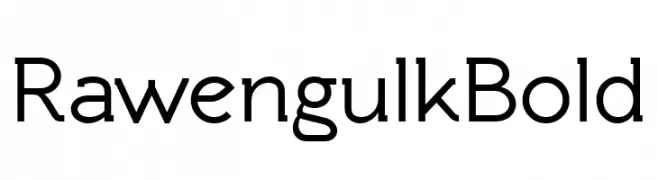
A bold, modern sans-serif font with excellent legibility and balance.
![Rawengulk Bold تنزيل الخطوط]() تنزيل 82 التنزيلات@WebFont
تنزيل 82 التنزيلات@WebFont -
( Fonts by Masato Shimojima - Personal-use only. For commercial use please contact owner. )
A bold, geometric font with a modern, digital aesthetic.
![Comdotbold تنزيل الخطوط]() تنزيل 82 التنزيلات@WebFont
تنزيل 82 التنزيلات@WebFont -
( Fonts by Wahyu Eka Prasetya - wepfont.com - Personal-use only. For commercial use please contact owner. )
A bold, textured font with a hand-drawn, chalk-like appearance.
![Gaharu تنزيل الخطوط]() تنزيل 82 التنزيلات@WebFont
تنزيل 82 التنزيلات@WebFont -
( Fonts by MJType )
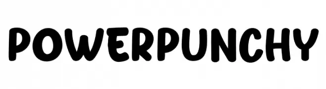
A bold, playful font with thick, rounded strokes and a hand-drawn appearance.
![Power Punchy تنزيل الخطوط]() تنزيل 82 التنزيلات@WebFont
تنزيل 82 التنزيلات@WebFont -
( Fonts by Daniel Zadorozny - www.iconian.com - Free for personal use )
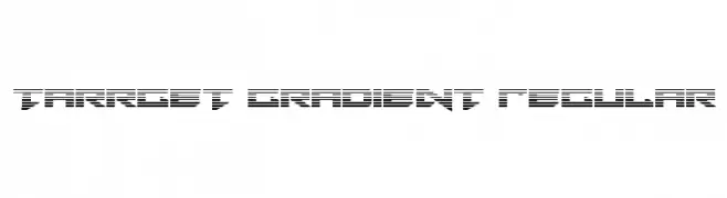
A futuristic, gradient-style font with bold, geometric characters.
![Tarrget Gradient Regular تنزيل الخطوط]() تنزيل 82 التنزيلات@WebFont
تنزيل 82 التنزيلات@WebFont


ما هي أبرز الخطوط الآن؟
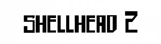
تحظى shellhead 2, Things DEMO Regular, Libertinas-co.ffp, Font Shapes 2019 and Wicker Man Expanded بشعبية لخطوطها النظيفة وتطبيقاتها الواسعة — من الهوية البصرية إلى الصفحات المقصودة والملصقات.
أي الخطوط تُستخدم كثيرًا في الشعارات؟
تُعد السان سيريف الهندسية (مثل Poppins وعائلات على نمط Gotham) خيارًا شائعًا لعلامات نظيفة قابلة للتوسع. ولإضفاء طابع ودي، تبقى السكريبت واليدوية خيارًا كلاسيكيًا. اجمع عنوانًا بارزًا مع خط نصي محايد لتحقيق التوازن والتميّز.
كم مرة يتم تحديث قائمة أعلى الخطوط؟
نحدّثها بانتظام استنادًا إلى التنزيلات والنشاط الفعلي. عُد إليها كثيرًا لاكتشاف النجوم الصاعدة مبكرًا.
💡 نصيحة: أضف هذه الصفحة إلى العلامات — تتغير الاتجاهات بسرعة وقد تُلهم خطوط اليوم الرائجة إعادة العلامة غدًا.