مرحبًا بك في قسم أعلى الخطوط — حيث تلتقي الشعبية بالجودة. هذه هي الخطوط الأكثر تنزيلًا واستخدامًا هذا العام من قبل مجتمعنا. إذا كنت بحاجة إلى اختيار موثوق للشعارات أو الويب أو وسائل التواصل، فابدأ من هنا.
يتميز كل خط رائج بتوازن جيد وقابلية قراءة وتعدد استخدامات. ستجد سان سيريف حديثة، وسكريبتات أنيقة، وسيريف كلاسيكية، وخطوط عرض minimal مختارة بعناية.
-
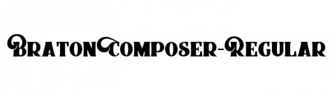
( Fonts by alitdesign - Personal-use only. For commercial use please contact owner. )
A bold, decorative font with intricate swirls and vintage flair.
 تنزيل 82 التنزيلات@WebFont
 -
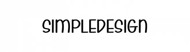
( Fonts by Etik Fatimah )
A playful, rounded font with smooth curves and a modern, whimsical style.
![Simple Design تنزيل الخطوط]() تنزيل 82 التنزيلات@WebFont
تنزيل 82 التنزيلات@WebFont -
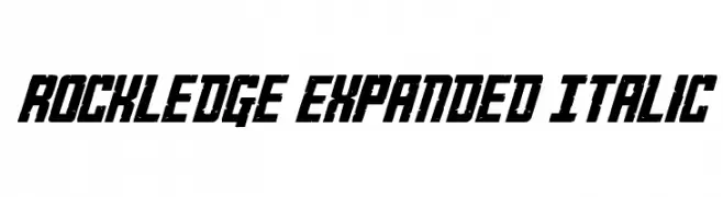
( Fonts by Daniel Zadorozny - www.iconian.com - Personal-use only. For commercial use please contact owner. )
A bold, expanded, and italicized font with a modern, geometric style.
![Rockledge Expanded Italic تنزيل الخطوط]() تنزيل 82 التنزيلات@WebFont
تنزيل 82 التنزيلات@WebFont -
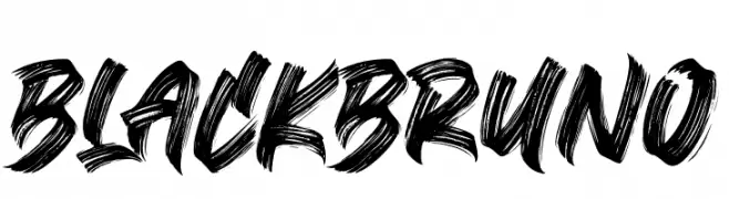
( Fonts by Subectype & Orenari - Rangga Subekti & Ari - Personal-use only. For commercial use please contact owner. )
A bold, brushstroke font with a dynamic and artistic style.
![Black Bruno تنزيل الخطوط]() تنزيل 82 التنزيلات@WebFont
تنزيل 82 التنزيلات@WebFont -
( Benjamin Wyler )
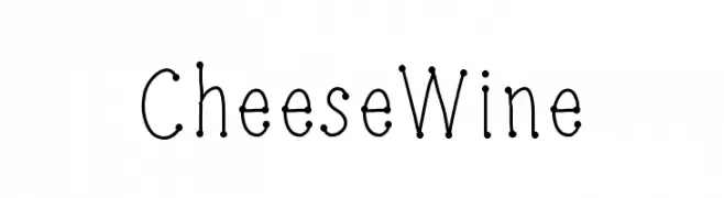
A playful, dotted line font with a whimsical, hand-drawn style.
![CheeseWine تنزيل الخطوط]() تنزيل 82 التنزيلات@WebFont
تنزيل 82 التنزيلات@WebFont -
-
( Fonts by Manfred Klein. Free for private and charity use. Free for commercial with donation to organizations )
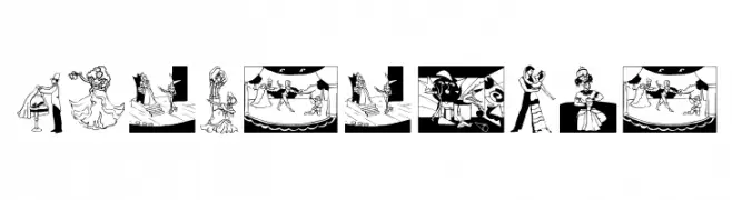
A theatrical, illustrated display font featuring dance and performance scenes for each character.
![PerformTwo تنزيل الخطوط]() تنزيل 82 التنزيلات@WebFont
تنزيل 82 التنزيلات@WebFont -
( Sorena )
A minimalist font featuring a single bold dot.
![Ahuramzda تنزيل الخطوط]() تنزيل 82 التنزيلات@WebFont
تنزيل 82 التنزيلات@WebFont -
( Fonts by Lunas Type )
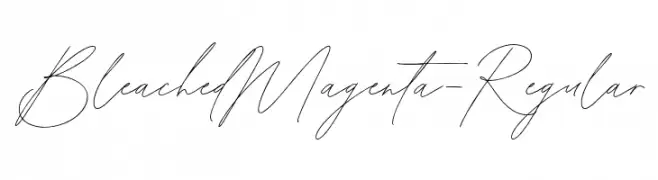
A thin, slanted, handwritten script with a loose and airy feel.
![BleachedMagenta-Regular تنزيل الخطوط]() تنزيل 82 التنزيلات@WebFont
تنزيل 82 التنزيلات@WebFont -
( Darrell Flood )
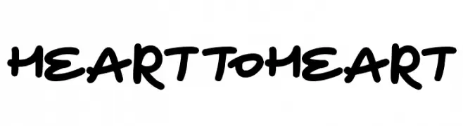
A playful, handwritten font with rounded edges and a casual style.
![Heart To Heart تنزيل الخطوط]() تنزيل 82 التنزيلات@WebFont
تنزيل 82 التنزيلات@WebFont -
( Fonts by Wino S Kadir - weknow - www.revolge.com/shop/weknow/ - Personal-use only. For commercial use please contact owner. )
A bold, geometric font with a futuristic and industrial design.
![BIZZARE تنزيل الخطوط]() تنزيل 82 التنزيلات@WebFont
تنزيل 82 التنزيلات@WebFont


ما هي أبرز الخطوط الآن؟
تحظى BratonComposer-Regular, Simple Design, Rockledge Expanded Italic, Black Bruno and CheeseWine بشعبية لخطوطها النظيفة وتطبيقاتها الواسعة — من الهوية البصرية إلى الصفحات المقصودة والملصقات.
أي الخطوط تُستخدم كثيرًا في الشعارات؟
تُعد السان سيريف الهندسية (مثل Poppins وعائلات على نمط Gotham) خيارًا شائعًا لعلامات نظيفة قابلة للتوسع. ولإضفاء طابع ودي، تبقى السكريبت واليدوية خيارًا كلاسيكيًا. اجمع عنوانًا بارزًا مع خط نصي محايد لتحقيق التوازن والتميّز.
كم مرة يتم تحديث قائمة أعلى الخطوط؟
نحدّثها بانتظام استنادًا إلى التنزيلات والنشاط الفعلي. عُد إليها كثيرًا لاكتشاف النجوم الصاعدة مبكرًا.
💡 نصيحة: أضف هذه الصفحة إلى العلامات — تتغير الاتجاهات بسرعة وقد تُلهم خطوط اليوم الرائجة إعادة العلامة غدًا.