مرحبًا بك في قسم أعلى الخطوط — حيث تلتقي الشعبية بالجودة. هذه هي الخطوط الأكثر تنزيلًا واستخدامًا هذا العام من قبل مجتمعنا. إذا كنت بحاجة إلى اختيار موثوق للشعارات أو الويب أو وسائل التواصل، فابدأ من هنا.
يتميز كل خط رائج بتوازن جيد وقابلية قراءة وتعدد استخدامات. ستجد سان سيريف حديثة، وسكريبتات أنيقة، وسيريف كلاسيكية، وخطوط عرض minimal مختارة بعناية.
-
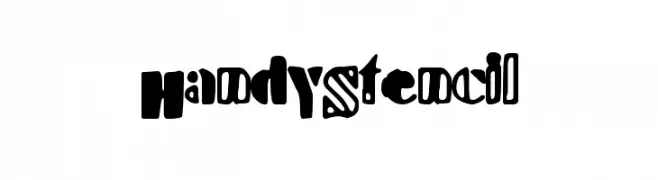
( Fonts by a Max Infeld - XEROGRAPHER FONTS - xerographer.blogspot.com . Personal-use only. For commercial use please contact owner. )
A bold, playful stencil font with a modern-retro vibe.
 تنزيل 84 التنزيلات@WebFont
 -
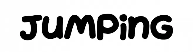
( Fonts by Darrell Flood )
A playful, bold font with rounded, bubbly characters ideal for fun projects.
![Jumping تنزيل الخطوط]() تنزيل 84 التنزيلات@WebFont
تنزيل 84 التنزيلات@WebFont -
![CRU-Sukkawitt-Regular تنزيل الخطوط]() تنزيل 84 التنزيلات@WebFont
تنزيل 84 التنزيلات@WebFont -
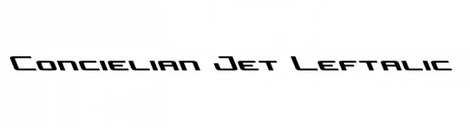
( Fonts by Daniel Zadorozny - www.iconian.com )
A futuristic, angular font with a leftward italic slant, ideal for dynamic designs.
![Concielian Jet Leftalic تنزيل الخطوط]() تنزيل 84 التنزيلات@WebFont
تنزيل 84 التنزيلات@WebFont -
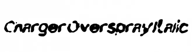
![Charger Overspray Italic تنزيل الخطوط]() تنزيل 84 التنزيلات@WebFont
تنزيل 84 التنزيلات@WebFont -
-
( Fonts by Manuel Viergutz - Typo Graphic Design - www.typographicdesign.de )
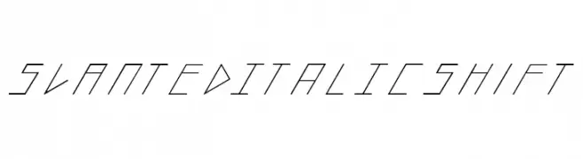
A geometric, slanted italic font with sharp, angular lines and a modern aesthetic.
![slantedITALICshift تنزيل الخطوط]() تنزيل 84 التنزيلات@WebFont
تنزيل 84 التنزيلات@WebFont -
( Fonts by Vladimir Nikolic )
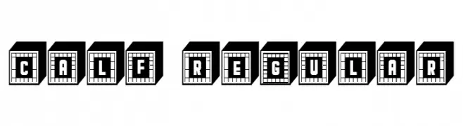
A bold, geometric font with 3D block effects and sans-serif style.
![Calf Regular تنزيل الخطوط]() تنزيل 84 التنزيلات@WebFont
تنزيل 84 التنزيلات@WebFont -
( Fonts by HollieInk )
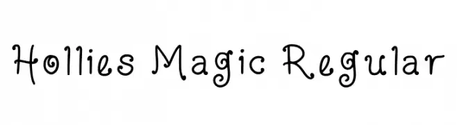
A playful, hand-drawn style font with curly, rounded edges.
![Hollies Magic Regular تنزيل الخطوط]() تنزيل 84 التنزيلات@WebFont
تنزيل 84 التنزيلات@WebFont -
( Fonts by huawei.com - Personal-use only. For commercial use please contact owner. )
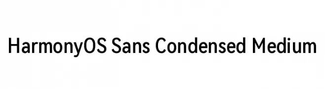
A modern, condensed sans-serif font with clean lines and balanced proportions.
![HarmonyOS Sans Condensed Medium تنزيل الخطوط]() تنزيل 84 التنزيلات@WebFont
تنزيل 84 التنزيلات@WebFont -
( Fonts by Kong Font - https://fontkong.com/ - Personal-use only. For commercial use please contact owner. )
A playful, bold font with a hand-drawn, whimsical style.
![Polka تنزيل الخطوط]() تنزيل 84 التنزيلات@WebFont
تنزيل 84 التنزيلات@WebFont


ما هي أبرز الخطوط الآن؟
تحظى HandyStencil, Jumping, CRU-Sukkawitt-Regular, Concielian Jet Leftalic and Charger Overspray Italic بشعبية لخطوطها النظيفة وتطبيقاتها الواسعة — من الهوية البصرية إلى الصفحات المقصودة والملصقات.
أي الخطوط تُستخدم كثيرًا في الشعارات؟
تُعد السان سيريف الهندسية (مثل Poppins وعائلات على نمط Gotham) خيارًا شائعًا لعلامات نظيفة قابلة للتوسع. ولإضفاء طابع ودي، تبقى السكريبت واليدوية خيارًا كلاسيكيًا. اجمع عنوانًا بارزًا مع خط نصي محايد لتحقيق التوازن والتميّز.
كم مرة يتم تحديث قائمة أعلى الخطوط؟
نحدّثها بانتظام استنادًا إلى التنزيلات والنشاط الفعلي. عُد إليها كثيرًا لاكتشاف النجوم الصاعدة مبكرًا.
💡 نصيحة: أضف هذه الصفحة إلى العلامات — تتغير الاتجاهات بسرعة وقد تُلهم خطوط اليوم الرائجة إعادة العلامة غدًا.