مرحبًا بك في قسم أعلى الخطوط — حيث تلتقي الشعبية بالجودة. هذه هي الخطوط الأكثر تنزيلًا واستخدامًا هذا العام من قبل مجتمعنا. إذا كنت بحاجة إلى اختيار موثوق للشعارات أو الويب أو وسائل التواصل، فابدأ من هنا.
يتميز كل خط رائج بتوازن جيد وقابلية قراءة وتعدد استخدامات. ستجد سان سيريف حديثة، وسكريبتات أنيقة، وسيريف كلاسيكية، وخطوط عرض minimal مختارة بعناية.
-
 تنزيل 89 التنزيلات@WebFont
 -
( Fonts by Jovanny Lemonad - typetype.ru - Personal-use only. For commercial use please contact owner. )
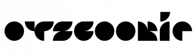
A bold, geometric font with a futuristic and cohesive design.
![Otscookie تنزيل الخطوط]() تنزيل 89 التنزيلات@WebFont
تنزيل 89 التنزيلات@WebFont -
( Fonts by Omaikraf Studio - Omaikraf - Personal-use only. For commercial use please contact owner. )
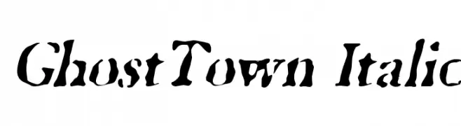
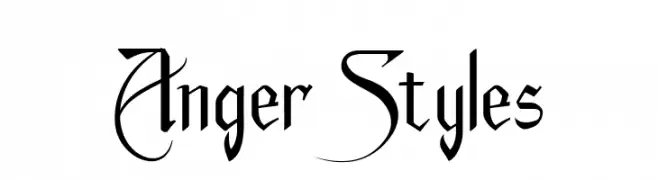
A dramatic, calligraphic font with sharp, angular strokes and expressive details.
![Anger Styles تنزيل الخطوط]() تنزيل 89 التنزيلات@WebFont
تنزيل 89 التنزيلات@WebFont -
( Fonts by Runsell Studio - Personal-use only. For commercial use please contact owner. )
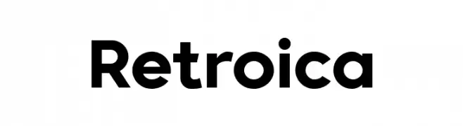
A bold, modern sans-serif font with clean lines and strong visual impact.
![Retroica تنزيل الخطوط]() تنزيل 89 التنزيلات@WebFont
تنزيل 89 التنزيلات@WebFont -
( Fonts by Daniel Zadorozny - www.iconian.com )
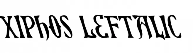
A bold, left-leaning font with sharp, angular edges and high contrast.
![Xiphos Leftalic تنزيل الخطوط]() تنزيل 89 التنزيلات@WebFont
تنزيل 89 التنزيلات@WebFont -
-
( Fonts by Fikryal studio )
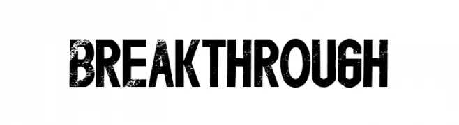
A bold, distressed font with a vintage, textured appearance.
![Breakthrough تنزيل الخطوط]() تنزيل 89 التنزيلات@WebFont
تنزيل 89 التنزيلات@WebFont -
( Fonts by tomchalky.com - Personal-use only. For commercial use please contact owner. )
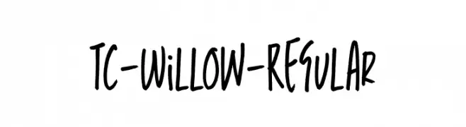
A playful, casual handwritten font with smooth, flowing lines and consistent stroke thickness.
![TC-Willow-Regular تنزيل الخطوط]() تنزيل 89 التنزيلات@WebFont
تنزيل 89 التنزيلات@WebFont -
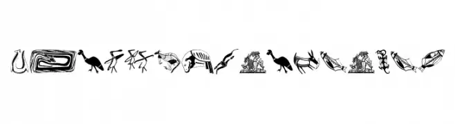
![TribalDesignsUno تنزيل الخطوط]() تنزيل 89 التنزيلات@WebFont
تنزيل 89 التنزيلات@WebFont -
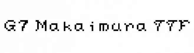
( Genshichi Yasui - www.jttk.zaq.ne.jp/babwp701/hpfont/font.html )
A pixelated, retro-style font inspired by early digital typography.
![G7 Makaimura TTF تنزيل الخطوط]() تنزيل 89 التنزيلات@WebFont
تنزيل 89 التنزيلات@WebFont -
( Fonts by Danu Setyaji Nugroho - Personal-use only. For commercial use please contact owner. )
A playful, bold handwritten font with rounded edges and a casual style.
![raindrops تنزيل الخطوط]() تنزيل 89 التنزيلات@WebFont
تنزيل 89 التنزيلات@WebFont

ما هي أبرز الخطوط الآن؟
تحظى GhostTown Italic, Otscookie, Anger Styles, Retroica and Xiphos Leftalic بشعبية لخطوطها النظيفة وتطبيقاتها الواسعة — من الهوية البصرية إلى الصفحات المقصودة والملصقات.
أي الخطوط تُستخدم كثيرًا في الشعارات؟
تُعد السان سيريف الهندسية (مثل Poppins وعائلات على نمط Gotham) خيارًا شائعًا لعلامات نظيفة قابلة للتوسع. ولإضفاء طابع ودي، تبقى السكريبت واليدوية خيارًا كلاسيكيًا. اجمع عنوانًا بارزًا مع خط نصي محايد لتحقيق التوازن والتميّز.
كم مرة يتم تحديث قائمة أعلى الخطوط؟
نحدّثها بانتظام استنادًا إلى التنزيلات والنشاط الفعلي. عُد إليها كثيرًا لاكتشاف النجوم الصاعدة مبكرًا.
💡 نصيحة: أضف هذه الصفحة إلى العلامات — تتغير الاتجاهات بسرعة وقد تُلهم خطوط اليوم الرائجة إعادة العلامة غدًا.