مرحبًا بك في قسم أعلى الخطوط — حيث تلتقي الشعبية بالجودة. هذه هي الخطوط الأكثر تنزيلًا واستخدامًا هذا العام من قبل مجتمعنا. إذا كنت بحاجة إلى اختيار موثوق للشعارات أو الويب أو وسائل التواصل، فابدأ من هنا.
يتميز كل خط رائج بتوازن جيد وقابلية قراءة وتعدد استخدامات. ستجد سان سيريف حديثة، وسكريبتات أنيقة، وسيريف كلاسيكية، وخطوط عرض minimal مختارة بعناية.
-
( Fonts by Muhammad Yafinuha )
A playful, bold typeface with rounded, bubble-like characters.
 تنزيل 1990 التنزيلات@WebFont
 -
( Fonts by Hanken Design Co. - Personal-use only. For commercial use please contact owner. )
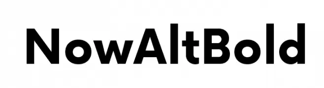
A bold, modern sans-serif font with geometric lines and strong presence.
![Now Alt Bold تنزيل الخطوط]() تنزيل 1990 التنزيلات@WebFont
تنزيل 1990 التنزيلات@WebFont -
( Copyright (c) 2017 by TAE System & Typefaces Co.. All rights reserved. )
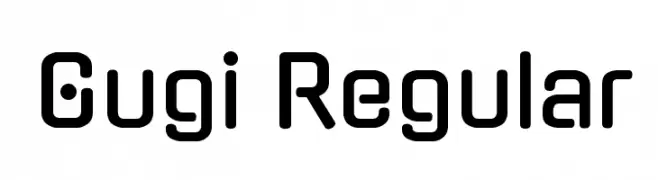
A modern, geometric font with rounded edges and a minimalist style.
![Gugi Regular تنزيل الخطوط]() تنزيل 1990 التنزيلات@WebFont
تنزيل 1990 التنزيلات@WebFont -
( Fonts by www.kimberlygeswein.com - Kimberly Geswein )
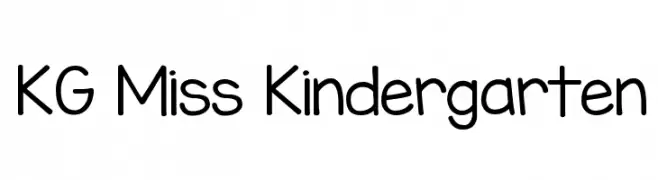
A playful, rounded handwritten font perfect for child-friendly designs.
![KG Miss Kindergarten تنزيل الخطوط]() تنزيل 1990 التنزيلات@WebFont
تنزيل 1990 التنزيلات@WebFont -
( Fonts by Pi Luo Chiu - thisisallenchiu.tumblr.com )
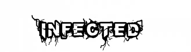
A bold, distressed font with a grungy, cracked texture and jagged edges.
![INFECTED تنزيل الخطوط]() تنزيل 1990 التنزيلات@WebFont
تنزيل 1990 التنزيلات@WebFont -
-
( Fonts by Zdenek Gromnica - www.futuremillennium.com )
A classic serif font with elegant, sharp serifs and medium contrast.
![InfraRed تنزيل الخطوط]() تنزيل 1990 التنزيلات@WebFont
تنزيل 1990 التنزيلات@WebFont -
( Fonts by Jacob Fisher - www.pizzadude.dk )
A bold, playful font with characters in rounded square borders, resembling game tiles.
![JoyCards تنزيل الخطوط]() تنزيل 1990 التنزيلات@WebFont
تنزيل 1990 التنزيلات@WebFont -
( Fonts by Khurasan )
A playful, bold handwritten font with rounded edges and a casual style.
![Jhal Muri تنزيل الخطوط]() تنزيل 1989 التنزيلات@WebFont
تنزيل 1989 التنزيلات@WebFont -
( Locomotype - Arwan Sutanto - www.locomotype.com )
A sleek, modern font with clean lines and a light weight, perfect for contemporary designs.
![Sumptuous-Light تنزيل الخطوط]() تنزيل 1989 التنزيلات@WebFont
تنزيل 1989 التنزيلات@WebFont -
( Fonts by a Claude Pelletier . Personal-use only. For commercial use please contact owner. )
A classic serif font with elegant curves and medium contrast, ideal for sophisticated designs.
![RitaSmith تنزيل الخطوط]() تنزيل 1989 التنزيلات@WebFont
تنزيل 1989 التنزيلات@WebFont


ما هي أبرز الخطوط الآن؟
تحظى Bublles, Now Alt Bold, Gugi Regular, KG Miss Kindergarten and INFECTED بشعبية لخطوطها النظيفة وتطبيقاتها الواسعة — من الهوية البصرية إلى الصفحات المقصودة والملصقات.
أي الخطوط تُستخدم كثيرًا في الشعارات؟
تُعد السان سيريف الهندسية (مثل Poppins وعائلات على نمط Gotham) خيارًا شائعًا لعلامات نظيفة قابلة للتوسع. ولإضفاء طابع ودي، تبقى السكريبت واليدوية خيارًا كلاسيكيًا. اجمع عنوانًا بارزًا مع خط نصي محايد لتحقيق التوازن والتميّز.
كم مرة يتم تحديث قائمة أعلى الخطوط؟
نحدّثها بانتظام استنادًا إلى التنزيلات والنشاط الفعلي. عُد إليها كثيرًا لاكتشاف النجوم الصاعدة مبكرًا.
💡 نصيحة: أضف هذه الصفحة إلى العلامات — تتغير الاتجاهات بسرعة وقد تُلهم خطوط اليوم الرائجة إعادة العلامة غدًا.